Image Sequence
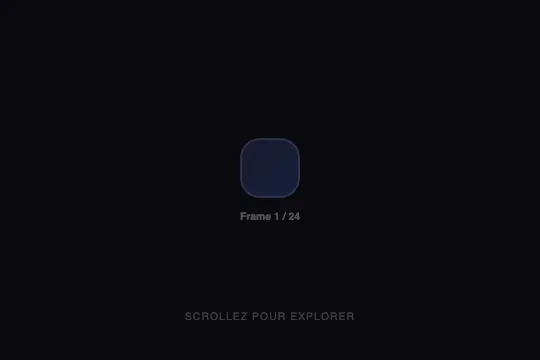
A single div whose 24 states (gradient, corner radius, rotation, size from 60 to 118 px) live in a JS array and switch according to the position of a 280 px scroll container with 920 px of travel — one step every 38 px, no image, 1.9 KB of CSS and 3.5 KB of JS. The first 12 steps are nearly invisible on the background.
You'll get access to the interactive demo with a free account.
This effect is part of Effect.Labs — 811 vanilla effects, some free, some premium. Scroll has 70 effects, including 12 free. Explore the category →
3 usage examples



How it works
The .scroll-container (100% × 280px, overflow: hidden auto, scroll-behavior: smooth, a 4 px scrollbar styled through ::-webkit-scrollbar only) holds .imgseq-inner, an empty 1200px block: the travel is therefore 1200 − 280 = 920 px. Inside, .imgseq-display is position: sticky; top: 0 with a height of 280px, the container's own — the stage fills the frame from start to end. It carries the “film”, .imgseq-frame, and the counter .imgseq-counter (“Frame 1 / 24”, 10.4 px, white at 30%). The sold HTML already sets state 1 on the frame as a style attribute, exactly as the script had left it (gradient #1a1a2e → #16213e, 20 px radius, 60 × 60); the script rewrites it on load, which is harmless — but the CSS's 120px never applies, nor do font-size: 1.5rem and font-weight: 800 on a box with no text. The ::before is a 10% white ring whose radius stays at 20 px whatever the state, and .scroll-hint-label (“Scrollez pour explorer”) pulses from .3 to .7 opacity every 2 s.
The frameStates array holds 24 objects {bg, shape, rot, size}. On every scroll event of the container, the script computes r = scrollTop / (scrollHeight − clientHeight), then i = min(floor(r × 24), 23), and writes five inline styles: background, border-radius, transform: rotate(), width, height, plus the counter text. Measured: the steps fall at 0, 39, 77, 115 … 882 px — 38.33 px each, the 24th spanning 882 to 920. The frame's transition: .2s eases size, radius and rotation (60 → 118 px in 240 ms on a jump from 0 to 700 px) but not the gradient, which browsers don't interpolate: it is already replaced 61 ms after the jump. With a notched mouse (100 px per notch in Chrome), one notch is worth 2.6 steps: measured, the displayed sequence is 1, 3, 6, 8, 11, 14, 16, 19, 21, 24 — 10 states out of 24; only a trackpad or a free-spinning wheel goes through all of them.
The states themselves: twelve dark gradients first (from midnight blue #1a1a2e → #16213e to plum #6a1a3c → #6e2168), whose contrast against the #0a0a0f background measures 1.20 to 1.83:1 — for the first 460 pixels, half the travel, you see a disc barely lighter than black grow from 60 to 95 px and turn from 0 to 165°; at state 13 the gradient jumps to indigo #6366f1 → #7c3aed (3.84:1), then violet, fuchsia, pink, orange, amber, lime, cyan (12.24:1 at state 22) and back to indigo. The radius goes from 20 to 10 px (states 1–7), becomes a circle (50%, 8–14), comes down from 45 to 25% then from 22 to 14 px; the rotation advances 15° per step up to 345°. It is a nested scroller: measured with 2000 px of page below the zone, the first ten notches (920 px) are absorbed by the container before the page resumes, and as many on the way back up. The scroll listener is attached to the container only and never removed — it goes away with the element; no requestAnimationFrame, no resize listener (the travel is re-read on every event). No console error, no site CSS variable.
Accessibility
- prefers-reduced-motion not handled: measured under
reduce, the hint still pulses (pulseHint2 s infinite), the .2 s transition stays active and the states still switch — including a 270° spin in 200 ms when a wheel jump crosses 18 steps. The scroll-driven change is user-initiated (tolerated by WCAG 2.3.3); the pulsing and the spin are not: add@media (prefers-reduced-motion: reduce) { .imgseq-frame { transition: none } .scroll-hint-label { animation: none } }and setrotto 0 in the array. - Keyboard: the zone is a
divwithouttabindex. Chromium nevertheless makes scroll containers focusable — measured: Tab lands on.scroll-container, each Arrow Down is worth 40 px, two presses show state 3; Firefox does the same, Safari doesn't. Settabindex="0"and anaria-label(orrole="region") so it holds everywhere; Page Down covers 245 px, six steps at once. - Screen readers: the counter is rewritten on every
scrollevent withoutaria-live, the frame is an emptydivand the ring a::before— nothing is announced, nothing is named. Putaria-hidden="true"on.imgseq-frameand on the hint; if a state carries meaning (a finish name, a step number), announce it in arole="status"region updated only when the index changes — the script itself writes its five styles and the text even when the index hasn't moved. - Contrast and text: counter and hint in
rgba(255,255,255,.3)on#0a0a0fmeasure 2.62:1 at 10.4 px, below 4.5:1 — raise to.5(5.36:1) or.6(7.30:1). The counter says “Frame” (a JS string), the hint “Scrollez pour explorer” (HTML): two languages in the sold code. Finally, the zone captures 920 px of wheel before handing the page back — ten notches — with no signal other than the hint; shorten.imgseq-inneror keep the zone away from the main reading flow.
Browser compatibility
ES2015 JavaScript (const, arrow function, template string). CSS: position: sticky, inset, two-value overflow, font-variant-numeric, scroll-behavior. The switching relies on a plain scroll listener: it works in Firefox, unlike the effects of this category written with animation-timeline: scroll() (fx-0585, fx-0545…), which no Firefox version enables. Zero dependencies.
Without JavaScript, the zone scrolls its 920 px for nothing: the frame stays at state 1 written in the attribute (60 px, midnight blue) and the counter reads “Frame 1 / 24” (measured). Without inset (pre-2020 browsers), only the 10% white ring disappears. Without position: sticky, the stage scrolls away with the 1200 px block and leaves the frame.
The code
HTML structure to paste into your page (CSS + JS available with a premium account):
<div class="scroll-container" id="imgseq-scroll">
  <div class="imgseq-inner">
    <div class="imgseq-display">
      <div class="imgseq-frame" id="imgseq-frame"></div>
      <div class="imgseq-counter" id="imgseq-counter">Frame 1 / 24</div>
    </div>
  </div>
</div>
<span class="scroll-hint-label">Scrollez pour explorer</span>Full HTML + CSS + JS, copy-paste ready — with hundreds of premium effects.
Customize
Options passed to the API or data-* attributes:
| Option / property | Default | Effect |
|---|---|---|
State array (JS — frameStates) |
24 objects {bg, shape, rot, size} |
Add or remove entries: the count follows (totalFrames = frameStates.length) and the steps are recomputed (travel ÷ n). bg accepts any background value: a gradient list, a solid colour, the url() of a preloaded image. |
Travel (CSS — .imgseq-inner { height: 1200px } and .scroll-container { height: 280px }) |
1200 − 280 = 920 px, i.e. 38 px per step | The difference between the two heights is the distance to cover. At a 600 px block, the travel drops to 320 px and one wheel notch (100 px) skips seven steps; aim for at least 100 px per state if a notched mouse must show them all. |
Rotation (JS — rot) |
0 → 345° in 15° steps | Written as transform: rotate() and eased by the transition: a jump of several steps turns the shape by as much in 200 ms. Set 0 everywhere for a product photo or a figure. |
Size (JS — size) |
60 → 118 (state 19) → 95 px | Applied to both width and height: the frame is always square. For a rectangle, add a field and write the two dimensions separately. |
Transition (CSS — .imgseq-frame { transition: .2s }) |
.2s on all properties | Eases size, radius and rotation; the gradient always snaps (measured: replaced within 61 ms). 0s for a film with hard steps, .4s for a slower morph, none under prefers-reduced-motion. |
Palette (JS — bg) |
12 dark gradients (#1a1a2e → #6a1a3c) then 12 vivid ones (#6366f1 → #22d3ee) |
The dark half measures 1.20 to 1.83:1 on #0a0a0f, barely visible. Start the array at state 13, or lighten the first twelve; on a light background it is the reverse: the lime and amber states weaken. |
Counter (JS — `Frame ${i+1} / ${totalFrames}`; CSS — .imgseq-counter) |
“Frame n / 24”, 10.4 px, white at 30% | Rewritten on every event. Replace the template with a field of the state (t.name) to show a name; raise the opacity to .5 (5.36:1) to clear the 4.5:1 threshold. |
Hint (HTML — .scroll-hint-label; CSS — pulseHint) |
“Scrollez pour explorer”, 2 s infinite pulse | French text hard-coded in the HTML, to translate or remove; the animation never stops and is not gated on prefers-reduced-motion. |
FAQ
frameStates and applied to a single div; nothing is loaded. For real photos, give each state bg: "url(frame-01.jpg) center / cover", keep size constant and rot: 0, and preload the files (new Image().src = … on load): the swap happens at scroll time, an image that hasn't arrived leaves the frame empty, and the .2 s transition interpolates two images no more than it does two gradients. The version with a real 3D object is fx-0795 (Pinned Image Sequence): a .glb model in <model-viewer>, hence WebGL and a file to host. This one costs 5.4 KB and runs on any browser that executes JavaScript.@keyframes (0, 25, 50, 75%) on animation-timeline: scroll(), no JavaScript — but also nothing to read: no index, no name, no event, and no Firefox version enables animation-timeline, so there the block stays on its first gradient. fx-0583 goes through a scroll listener: it works in Firefox 66+, and it exposes i and the state object on every event — enough to display a name, sync a caption or trigger a load. The price: six style writes per event instead of a composited animation. Pick fx-0585 for a backdrop nothing else needs to follow, fx-0583 as soon as a state has a name or other elements must follow it.#0a0a0f background, below the 3:1 expected of a graphical element; the ::before ring at 10% white is 1.05:1 on state 1. During these first 460 pixels — exactly half of the 920 px travel — only the size (60 → 95 px) and the rotation (0 → 165°) change, on a shape you can hardly make out. At state 13 (from 460 px), the gradient jumps to #6366f1 → #7c3aed (3.84:1) and the palette stays vivid to the end. Two remedies: start the array at state 13 (twelve 77 px steps, easier to read with a wheel), or raise the lightness of the first twelve gradients.