Layered Parallax

Five absolute layers in a 900 px section, each on its own animation-timeline: scroll() path: background scale 1 → 1.3, shapes translateY 60 → −80 px with a −5° → +10° rotation, rings 40 → −60 px with +5° → −8°, title 20 → −20 px with opacity .7 → 1, dots 80 → −100 px. Pure CSS, no script, 620 px of travel.
Updated
This effect is part of Effect.Labs — 811 vanilla effects, some free, some premium. Scroll has 70 effects, including 12 free. Explore the category →
3 usage examples



How it works
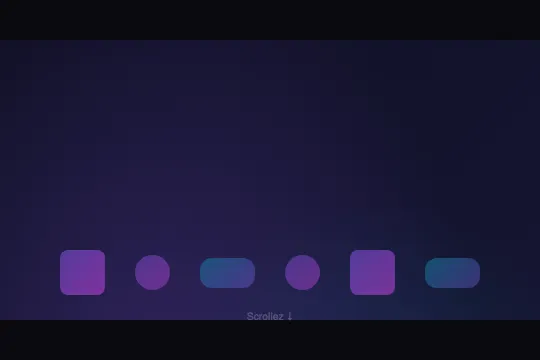
Four levels in the sold HTML: the frame .demo-preview (centered flex, min-height: 300px, position: relative, #0a0a0f background), the box .sdc-scroll-container (100% × 280px, overflow-y: auto, scroll-behavior: smooth, a 4 px scrollbar via ::-webkit-scrollbar), the section .ss-parallax-content (900 px, position: relative, overflow: clip, 135° gradient #0f0f23 → #1a1a3e) and five .ss-parallax-layer in position: absolute; inset: 0. Layer 1: two radial glows, purple at 30% 40% and cyan at 70% 60%. Layer 2: eight .ss-parallax-shape in a centered flex-wrap — a 45 px square, a 35 px circle on even positions, a 55 × 30 pill on multiples of 3, opacities .5 / .4 / .35, purple → magenta and cyan → purple gradients. Layer 3: five .ss-parallax-ring, circles with a 2 px border, 60 px cyan and 40 px purple alternating. Layer 4 (z-index: 2): a 20.8 px weight 800 title and a 12 px subtitle in white at 60%, hard-coded texts (“Parallax Layers”, “Chaque couche se deplace a une vitesse differente”, French without accents). Layer 5: twelve .ss-parallax-dot of 8, 12 and 6 px. Below the box, span.sdc-scroll-hint “Scrollez ↓”, absolute 8 px from the bottom of the frame, 10.4 px, pulsing .3 ↔ .7 every 2 s. Empty JavaScript field. Travel: 900 − 280 = 620 px, identical at 1,264 and 374 px wide (measured).
Five @keyframes (ssPlx1 to ssPlx5), one per layer, each bound with animation-timeline: scroll(), animation-duration: auto, animation-range: normal, linear, animation-fill-mode: none. scroll() means scroll(nearest block): the timeline follows the nearest scroll container — the 280 px box — and progress is scrollTop ÷ 620. Measured in Chromium at 0 / 310 / 620 px: background scale 1 / 1.15 / 1.3 (the 1,264 × 900 px layer becomes 1,643 × 1,170, clipped by overflow: clip); shapes translateY 60 / −10 / −80 px and rotate −5° / 2.5° / 10°; rings 40 / −10 / −60 px and 5° / −1.5° / −8°; title 20 / 0 / −20 px and opacity .7 / .85 / 1; dots 80 / −10 / −100 px. At the end of the travel the animation reports finished yet stays applied (scale(1.3) read back at 620 px). For 620 px of wheel, five apparent speeds: the background 620 px (it grows, it does not rise), the title 660, the rings 720, the shapes 760, the dots 800. The two opposite rotations turn full-width layers around their center: the first shape, 280 px left of center, rises 209 px (140 of translation + 69 of rotation) while the eighth, on the right, rises only 73; for the rings it is the reverse, 69 px on the left and 133 on the right. This crossed twist builds the depth, more than the speeds do.
Shipped with overflow: hidden on the section, the effect was inert: hidden turns the section into a scroll container with zero travel, and scroll() was binding to it — measured on the original, timeline.source = .ss-parallax-content, currentTime null, five layers at transform: none from 0 to 620 px. overflow: clip clips identically without creating a scroll container: the timeline climbs to .sdc-scroll-container. That is the only line changed. No id, no script: pasted twice, each copy follows its own box (measured: the first at rest at translateY(80px), the second at the end of its travel at −100). The title, 449 px from the top of the section at rest, only enters the 280 px window at scrollTop 160 and leaves it at 440: centered mid-travel, invisible at rest.
Accessibility
- prefers-reduced-motion not in the code: measured under emulation, nothing changes — scale 1.3, −100 px and 10° at the end of the travel, hint still pulsing. The motion follows the reader's gesture, but WCAG 2.3.3 also covers interaction-triggered animations: add
@media (prefers-reduced-motion: reduce) { .ss-parallax-layer { animation: none } .sdc-scroll-hint { animation: none } .sdc-scroll-container { scroll-behavior: auto } }. The five layers then freeze in their base state (transform: none, opacity 1) — exactly what Firefox shows, everything stays readable. - Keyboard: measured on the sold code, Tab focuses the box without a
tabindexin Chromium 151 as in Firefox 153; Arrow Down moves 40 px in Chromium (6.5% of the travel) and 51 in Firefox, Page Down reaches 285 and 303, End 620 — in Firefox the box scrolls from the keyboard but the layers stay flat (see Compatibility). WebKit 26.5 does not focus the box withouttabindex="0": Tab stays on the page, arrows and End do nothing; with the attribute, 40, 280 and 620. Add it on.sdc-scroll-container, with anaria-labeland a:focus-visiblestyle. On touch, the gesture must start inside the 280 px;overscroll-behavior: containkeeps the page from being dragged along at the end. - Contrast: the 20.8 px white title reads 16.7 to 18.9:1 on the gradient, still 11:1 as it enters the window (layer at 78% opacity). The subtitle in white at 60% inside a .7 layer drops to 4.0:1 at rest — but it is not visible at rest: 4.7:1 as it enters (scrollTop 160), 5.3:1 at the center, 6.0:1 on the way out, a narrow pass for 12 px. Do not lower the starting opacity of
ssPlx4below .7 if the subtitle carries information. The hint at 30% reads 2.6:1: decorative,aria-hidden="true". - Screen readers: shapes, rings and dots are empty
divs, nothing is announced; the title and subtitle are read in DOM order, the scroll position changes nothing. Putaria-hidden="true"on layers 1, 2, 3 and 5, and give layer 4 a real heading level (h2/h3) if the section opens a page. The two sold texts are French without accents: replace them.
Browser compatibility
CSS only: animation-timeline: scroll(), animation-duration: auto, animation-range, overflow: clip, flexbox, gradients, 2D transforms. Zero JavaScript, zero dependencies. Scroll-driven animations exist in Chrome and Edge 115+, Safari and iOS 26; Firefox runs them in no version at all. Measured in Playwright's Firefox on a blank page: CSS.supports('animation-timeline: scroll()') returns false, so does animation-duration: auto — the duration falls back to 0 s and, with animation-fill-mode: none, the five layers stay in their base state: transform: none, opacity 1, read back at 0, 155, 310, 465 and 620 px. A Firefox visitor sees a fixed 900 px section scrolling inside the 280 px box: glows, shapes, rings, title (visible from scrollTop 150 to about 450), dots — no parallax, nothing hidden, nothing out of frame, nothing overlapping. No @supports block in the code: the base state already is the flat fallback.
Before Chrome/Edge 115 and Safari 26, same state as in Firefox: the animation-timeline and animation-duration: auto declarations are ignored, the layers stay flat and the section scrolls. overflow: clip is unknown before Chrome 90, Firefox 81 and Safari 16: the declaration is dropped, the section becomes overflow: visible, but nothing overflows since nothing is animated there (layers in inset: 0). Without the .demo-preview frame, the “Scrollez ↓” hint loses its anchor (position: absolute) and drops to the bottom of the page: remove it or keep a parent in position: relative.
The code
HTML structure to paste into your page (the CSS + JS come with Premium):
<div class="demo-preview">
  <div class="sdc-scroll-container">
    <div class="ss-parallax-content">
      <div class="ss-parallax-layer ss-parallax-layer-1"></div>
      <div class="ss-parallax-layer ss-parallax-layer-2">
        <div class="ss-parallax-shape"></div> ×8
      </div>
      <div class="ss-parallax-layer ss-parallax-layer-3">
        <div class="ss-parallax-ring"></div> ×5
      </div>
      <div class="ss-parallax-layer ss-parallax-layer-4">
        <div>
          <div class="ss-parallax-title">…</div>
          <div class="ss-parallax-subtitle">…</div>
        </div>
      </div>
      <div class="ss-parallax-layer ss-parallax-layer-5">
        <div class="ss-parallax-dot"></div> ×12
      </div>
    </div>
  </div>
  <span class="sdc-scroll-hint">…</span>
</div>The full HTML + CSS + JS of Layered Parallax, ready to paste — plus all 811 effects. Or €299 once, lifetime access.
Customize
Options passed to the API or data-* attributes:
| Option / property | Default | Effect |
|---|---|---|
Travel (CSS — .ss-parallax-content { height: 900px }, .sdc-scroll-container { height: 280px }) |
620 px | Progress is scrollTop ÷ (section height − box height): every amplitude plays out over that travel. A 1,500 px section = 1,220 px of travel, a slower parallax; 400 px = 120 px, very lively (measured 180 px in scene 3). The box can take the height of your layout, or go away: without a box, scroll() follows the page. |
Amplitudes (CSS — @keyframes ssPlx1 to ssPlx5) |
scale 1 → 1.3 · 60 → −80 px and −5° → 10° · 40 → −60 px and 5° → −8° · 20 → −20 px and .7 → 1 · 80 → −100 px | Each layer has its two keyframes: change a value, its relative speed changes. Rotations turn the whole layer around its center: at 10°, a point 600 px from the center moves 104 px — on a wide section, reduce them to 3–5° or the edge shapes leave the frame (clipped by overflow: clip). |
Background (CSS — .ss-parallax-content { background }, .ss-parallax-layer-1 { background }) |
135° gradient #0f0f23 → #1a1a3e, two purple and cyan glows | Layer 1 only carries the glows and grows from 1 to 1.3: at 1.3 it overflows by 190 px on each side, clipped. The .demo-preview frame stays #0a0a0f behind the box: match it to your page if it is light. The three scenes turn it into a warm, a neon and a navy palette. |
Shapes, rings, dots (CSS — .ss-parallax-shape, -ring, -dot and their :nth-child) |
8 shapes (45, 35 and 55 × 30 px), 5 rings (60/40 px), 12 dots (8/12/6 px) | Three rules :nth-child(2n), (3n) and (5n) vary sizes and colors — the sixth shape is both 2n and 3n, the 3n rule written later wins. Add or remove divs, no count is imposed; the layout is a centered flex-wrap (gap 30, 20 and 20 px): flex-direction: column and a margin-left per element give stacked bars (scene 2). |
Title (HTML + CSS — .ss-parallax-title, .ss-parallax-subtitle, .ss-parallax-layer-4) |
“Parallax Layers” 20.8 px weight 800, 12 px subtitle at 60%, centered 449 px from the top | Layer 4 is a centered flex: at rest, the title sits outside the 280 px window, visible only between 160 and 440 px of scrolling. For a title readable from the start, align-items: flex-start; padding-top (scenes 1 and 3) or a shorter section. The .7 → 1 opacity lives in ssPlx4. |
“Scrollez ↓” hint (HTML + CSS — .sdc-scroll-hint, @keyframes sdcHintPulse) |
8 px from the bottom of the frame, 10.4 px, 30 → 70% every 2 s | Absolute relative to the .demo-preview frame (position: relative): without the frame, it drops to the bottom of the page. Decorative and in French: remove the span, the keyframe goes with it. |
Scrollbar and easing (CSS — .sdc-scroll-container) |
4 px purple scrollbar (WebKit), scroll-behavior: smooth |
::-webkit-scrollbar does not exist in Firefox (native bar); scrollbar-width: thin and scrollbar-color cover every engine. smooth only affects positions set by script or anchor: switch to auto if a button drives the box. |
Timeline (CSS — animation-timeline: scroll(), animation-range: normal) |
nearest scroller, block axis, whole travel | scroll(root) follows the page instead of the box; a named timeline (scroll-timeline: --plx y on the box, animation-timeline: --plx on the layers) binds the effect to a precise scroller even when an intermediate ancestor is overflow: auto or hidden — the trap that made the code inert before the repair. animation-range: 0 50% plays the whole amplitude over the first half of the travel. |
FAQ
scroll() with no argument takes the nearest scroll container, and an overflow: hidden element is one — programmable, with zero travel. As originally sold, every layer therefore followed the section itself: inactive timeline, five layers at transform: none whatever the position, and the same rule kept the catalog demo still. overflow: clip clips identically but is not a scroll container: the timeline climbs to the 280 px box. To check on your side, in the console: document.querySelector('.ss-parallax-layer-5').getAnimations()[0].timeline.source must return .sdc-scroll-container (or html if you removed the box), and getComputedStyle(…).transform must change between the top and the bottom of the travel. If you wrap the effect in an overflow: hidden or auto block closer than the real scroller, the same trap closes again: switch that block to clip or name the timeline (see “Timeline” in the settings).animation-timeline: scroll() mechanism — but fx-0548 animates vertical translations only: three radial glows (translateY 40 → −60 px), eight dots (20 → −40) and two centered texts, “PARALLAX” at 35 px and a caption (30 → −80 and 15 → −30, around a translate(-50%, -50%)). Four keyframes, four speeds, no rotation, no scale, no opacity. fx-0592 adds two dimensions: two rotations of opposite sign that twist the shapes layer and the rings layer in opposite directions (the left of the shapes rises 209 px, the right 73; the rings do the reverse), a background growing by 30% and a title emerging from .7 to 1 — on three families of elements (8 shapes in three variants, 5 rings, 12 dots) instead of glows and dots. Pick fx-0548 for a sober four-plane glide; fx-0592 when you want the twist and the background zoom, or typed volumes (bars, pills, rings) to recolor. The two twins in the catalog, Parallax Layers CSS and Parallax CSS (fx-0557, three blurred circles), carry the same section in overflow: hidden: the same console check applies to them..sdc-scroll-container to height: auto; overflow: visible): scroll() climbs to the page's scroller and the progress runs over the whole document height — the layers also move while the section is off screen, which wastes the amplitude. Better replace scroll() with view() on the five layers: measured in an 800 px window with the section placed after 1,000 px of content, progress is 0% when the top of the section touches the bottom of the window, 47% when it fills the top (scale(1.14)), 100% when its bottom leaves through the top — 1,700 px of travel; outside that range the animation no longer applies (fill-mode: none), with no visible effect since the section is out of view. Keep overflow: clip on the section. The pinned variant of scenes 1 and 3 (position: sticky; top: 0 on the section, content rising over it) also works in the page: the section stops moving, only its layers glide.