Sticky Horizontal Reveal
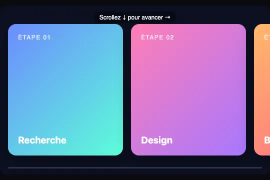
A 16/10 frame that scrolls over 300% of its own height: a sticky block stays pinned inside it and the JS turns every pixel of vertical scroll into a horizontal translation of a row of four panels, progress bar included. The panels are sized from the frame (40% of its width, 230 px minimum), so the row always overflows: measured, 626 px of travel in a 374 px frame, 670 px in a 984 px frame. No library, no external file.
You'll get access to the interactive demo with a free account.
This effect is part of Effect.Labs — 811 vanilla effects, some free, some premium. Scroll has 70 effects, including 12 free. Explore the category →
3 usage examples
How it works
The structure nests five boxes. .shr-scene (aspect-ratio: 16/10, overflow: hidden, isolation: isolate, #0c1022 background, 14 px radius) also carries everything that makes the block self-contained on a blank page: the text colour, the font stack (Inter, then the system fonts) and a box-sizing: border-box limited to its descendants — it expects no font, no background and no reset from the host page. It holds .shr-scroll, an absolute container covering the whole scene with overflow-y: auto and a hidden scrollbar (scrollbar-width: none + ::-webkit-scrollbar { width: 0 }). Inside, .shr-spacer is 300% of the height: it is what creates the vertical travel — measured at 984 px wide, a 615 px scene, an 1,845 px spacer, i.e. 1,230 px of scroll, exactly two frame heights. .shr-sticky (position: sticky; top: 0; height: 33.3333%, i.e. the frame height) stays pinned while the spacer scrolls beneath it; declared container-type: inline-size, it is the unit the panels are measured against. It holds .shr-row, a flex row at width: max-content (16 px gap, 0 16 px padding) of four .shr-panel elements sized max(230px, 40cqw) — 40% of the frame width, never less than 230 px — and 78% tall, each with its 135° gradient; the row is therefore 4 × 230 + 3 × 16 + 2 × 16 = 1,000 px in a 374 px frame, and 4 × 394 + 80 = 1,654 px in a 984 px frame. Two layers sit on top (z-index: 4, pointer-events: none): the .shr-hint pill “Scroll ↓ to move on →” and the 3 px .shr-prog bar whose fill is calc(var(--shr-p) * 100%).
The JS does one thing, with no loop. For each .shr-scene, it first reads prefers-reduced-motion: if the preference is on, it adds the shr-reduced class to the scene and stops there, the CSS takes over (see accessibility). Otherwise it listens to scroll on .shr-scroll (passive: true) and resize on window, and update() computes p = scrollTop / (scrollHeight − clientHeight) then travel = row.scrollWidth − sticky.clientWidth, the width of row that overflows the frame. It writes --shr-x = p × travel (rounded to a tenth) on the row, which the CSS applies as translate3d(calc(var(--shr-x) * -1px), 0, 0) with will-change: transform — the movement stays on the compositor —, --shr-p = p (four decimals) on the bar, and hides the pill as soon as p > 0.04 (0.3 s opacity transition). No requestAnimationFrame, no smoothing: measured, 0 rAF calls at rest and a position that follows the scroll 1:1. In a 374 px frame (234 px tall), one 100 px wheel notch moves the row by 134 px: the 626 px horizontal travel happens over 467 px of scroll, a 1.34 ratio; in a 984 px frame (615 px tall), 670 px of travel over 1,230 px of scroll, a 0.54 ratio — the crossing slows down as the frame gets taller. The end of travel lands exactly: at maximum, the right edge of the last panel is 16 px from the frame edge, which is the padding. Since .shr-scroll is a native scroll container, chaining applies: measured, four 120 px notches fill the 374 px frame, the fifth scrolls the page (window.scrollY = 120), and Chromium and Firefox both focus the container on Tab (ArrowDown = 40 px, PageDown = 204 px, i.e. 87.5% of the frame), WebKit does not.
The amplitude depends on a single subtraction, row width minus frame width, and that is why the panels do not have a fixed width. With four 230 px panels the row would be 1,000 px wide and only 16 px of travel would remain in a 984 px frame: everything already visible at rest, nothing to reveal. So .shr-sticky is declared container-type: inline-size and each panel is sized max(230px, 40cqw): 40% of the frame width, never less than 230 px. Four panels thus take up 160% of the frame plus gaps and padding, i.e. a travel of about 60% of its width plus 80 px, whatever column the block is pasted into — measured: 626 px in 374 px (panels at 230 px, the minimum), 670 px in 984 px (panels at 394 px), 838 px in 1,264 px (panels at 506 px). The width: 230px declaration just before it is the fallback for browsers without container queries (pre-2023): they ignore the second line and keep fixed panels — the effect is still right in a narrow frame, but has nothing left to reveal once the row fits inside the frame. The rest of the sold code is limited to the effect: a single IIFE of about 1.4 KB, no library, no image, no font and no file to host; background, text colour and font stack are declared on .shr-scene, and the box-sizing only touches its descendants, never the rest of your page.
Accessibility
prefers-reduced-motionactivates a fallback with no axis conversion: the script reads the preference and, if it is on, adds theshr-reducedclass to the scene before withdrawing, without attaching a single listener. The CSS takes over: spacer brought down to 100% (nothing left to scroll vertically),.shr-stickyinoverflow-x: autowith the transform cancelled, pill and progress bar hidden. Measured with reduced motion in a 1,264 px frame: zero vertical travel, a 2,102 px row in native horizontal scrolling over 838 px, the browser's scrollbar (permanent or shown during the gesture depending on the system), last panel reachable with the wheel, a finger or the arrow keys. Nothing moves on its own and nothing is converted: the person scrolls a row, like any horizontal list. To force this mode everywhere, add the class in the HTML: the script honours it.- Contrast of the texts on the sold gradients (pixels sampled under the text, Chromium): the

.nlabel (12 px, white at 85%) measures 1.6:1 to 2.55:1 on the four gradients, threshold 4.5:1; theh4title (19 px bold, 3:1 threshold for large text) from 1.32:1 on “Recherche” to 3.1:1 on “Design” — only one passes, barely. The light gradients are the effect's; if your panels carry text meant to be read, switch it to#0c1022(the scene background): measured, the same texts then hold 6.1:1 to 14.3:1 on all four panels —.shr-panel { color: #0c1022 }, which is what the “roadmap” scene below does. - Keyboard and scrolling:
.shr-scrollis adivwithoverflow-y: auto. Chromium and Firefox make it keyboard-focusable (measured: Tab stops on it, ArrowDown = 40 px, PageDown = 204 px out of 467), Safari does not (measured in WebKit: Tab stays on the page body, PageDown and ArrowDown have no effect) — addtabindex="0",role="region"and anaria-labelthat says how to move on, because the pill isaria-hiddenand the scrollbar is hidden: those are the only two visual cues, and the pill fades after 4% of the travel (19 px in a 374 px frame). With a finger, the native container works, but it holds the gesture for two frame heights before handing the page back (chaining measured with the wheel: four 120 px notches for the frame, the fifth for the page). - Screen readers: the four panels are text in DOM order, nothing is hidden or reordered (a transform hides nothing from the accessibility tree),
.shr-hintand.shr-progarearia-hidden, and the script only touches styles: no stray announcement. Two integration points: the titles areh4s — align the level with your heading outline — and the progress exists only visually; if it matters, expose it (role="progressbar"witharia-valuenowupdated inupdate()).
Browser compatibility
Requires position: sticky, aspect-ratio, inset, CSS variables inside calc() and translate3d; scrollbar-width is only read by Firefox 64+, Chrome 121+ and Safari 18.2+, but ::-webkit-scrollbar { width: 0 } covers earlier WebKit and Blink. The panel width in cqw needs container queries (Chrome 105+, Safari 16+, Firefox 110+); before that, the width: 230px declaration preceding it applies and the effect works with fixed panels. ES5 JavaScript with passive listeners and matchMedia, no library, no file to host. The scroll is converted by the script, not by animation-timeline: unlike Horizontal Scroll Section (fx-0567), Horizontal Scroll (fx-0564) or Zoom In Sticky (fx-0590), driven by native CSS, this effect works in Firefox, which supports scroll-driven animations in no version.
Without JavaScript, the frame does scroll over its three heights but the row never moves: the pinned block shows the first panels, the pill stays, the other panels are unreachable. If your pages must live without scripts, add the shr-reduced class in the HTML: the CSS fallback (row in native horizontal scrolling) does not depend on the JS. Without aspect-ratio (pre-2021 browsers), .shr-scene has no height of its own and the absolute container ends up in a zero-size zone (measured with aspect-ratio: auto: scene and container at 0 px): give it an explicit height. Under prefers-reduced-motion, the script adds the shr-reduced class itself (see accessibility).
The code
HTML structure to paste into your page (CSS + JS available with a premium account):
<div class="shr-scene">
  <div class="shr-hint" aria-hidden="true">Scroll ↓ to move on →</div>
  <div class="shr-prog" aria-hidden="true"><i></i></div>
  <div class="shr-scroll">
    <div class="shr-spacer">
      <div class="shr-sticky">
        <div class="shr-row">
          <div class="shr-panel">
            <span class="n">STEP 01</span>
            <h4>Research</h4>
          </div>
          <div class="shr-panel">
            <span class="n">STEP 02</span>
            <h4>Design</h4>
          </div>
          <div class="shr-panel">
            <span class="n">STEP 03</span>
            <h4>Build</h4>
          </div>
          <div class="shr-panel">
            <span class="n">STEP 04</span>
            <h4>Launch</h4>
          </div>
        </div>
      </div>
    </div>
  </div>
</div>Full HTML + CSS + JS, copy-paste ready — with hundreds of premium effects.
Customize
Options passed to the API or data-* attributes:
| Option / property | Default | Effect |
|---|---|---|
Number and width of panels (HTML — 4 × .shr-panel; CSS — width: max(230px, 40cqw)) |
4 panels at 40% of the frame, 230 px minimum (1,000 px row in 374 px, 1,654 px in 984 px) | Travel = row width − frame width: at 40%, four panels always overflow by about 60% of the frame plus 80 px, and every added panel lengthens the travel by its width plus a 16 px gap. A fixed width (230px) brings back a travel that shrinks as the frame widens. A fifth panel has no background: the gradients stop at nth-child(4). |
Length of the vertical travel (CSS — .shr-spacer { height: 300% } and .shr-sticky { height: 33.3333% }) |
300% → two frame heights | Both values are coupled: sticky = 100 / N %. 200% / 50% = crossing in one height, snappier; 500% / 20% = four heights, slower. The horizontal/vertical ratio is travel ÷ ((N − 1) × frame height). |
Frame format (CSS — .shr-scene { aspect-ratio: 16/10 }) |
16/10 (374 × 234 px on mobile, 984 × 615 px on desktop) | The height follows the width, and so does the horizontal travel (40% of the frame per panel): a wider frame gives wider panels and a slower crossing, since the vertical travel (two frame heights) grows with it. In a page, replace it with a fixed height so as not to depend on the column width. |
Pill fade-out (JS — p > 0.04; CSS — transition: opacity .3s) |
4% of the travel (19 px out of 467) | Scroll threshold beyond which “Scroll ↓ to move on →” fades. 0.15 keeps it longer; the text is changed in the HTML. |
Progress bar (CSS — .shr-prog, --shr-p) |
3 px, white on 14% white, 12 px from the bottom | Fed by --shr-p with four decimals. Delete the block to remove it (the JS checks if (prog)), or read the variable elsewhere, for a counter for instance. |
Panel colours (CSS — .shr-panel:nth-child(1…4), color: #fff) |
4 gradients at 135° (blue → mint, pink → violet, orange → pink, cyan → lavender), white text | White text measured at 1.3:1 to 3.1:1: switch to #0c1022 (6.1 to 14.3:1) or darken the gradients. |
Translation precision (JS — toFixed(1)) |
0.1 px | Sub-pixel, smoothed by translate3d. toFixed(0) snaps to whole pixels — sharper text during the movement, at no extra cost. |
Reduced-motion fallback (CSS — .shr-scene.shr-reduced; JS — classList.add under prefers-reduced-motion) |
class added by the script when the preference is on | Row in native horizontal scrolling, transform cancelled, pill and bar hidden. Add the class in the HTML to force this mode everywhere (it also works without the script), or remove the classList.add line to keep the axis conversion even under reduced motion — not recommended. |
FAQ
row.scrollWidth − sticky.clientWidth. With four fixed 230 px panels the row is 1,000 px wide (4 × 230 + 3 × 16 + 2 × 16) and only 16 px would be left to reveal in a 984 px frame, everything being already visible at rest. That is why .shr-sticky is a container (container-type: inline-size) and each panel is sized max(230px, 40cqw): the row always overflows the frame by about 60% of its width plus 80 px — measured, 670 px in 984 px and 838 px in 1,264 px. If you fix the width (width: 230px, or panels at 45vw), aim for a row at least twice the frame width so the crossing can be felt; below that, the script has no bug, it simply has nothing to reveal. Same logic in a browser without container queries (pre-2023): it falls back to 230px.sticky block and a row, but fx-0567 animates the row in native CSS — animation-timeline on a @keyframes from translateX(0) to translateX(-75%) — whereas fx-0796 moves it in JavaScript. Three consequences. Firefox: fx-0567 stays motionless there, scroll-driven animations exist in no version of it; fx-0796 works. End of travel: −75% is a fixed value that only lands right for a given number of panels; here the travel is computed from the real width and stops on the last panel whatever their number. Reuse: --shr-x and --shr-p are written to the DOM, a progress bar or a counter can read them. The other neighbours are further away: Sticky Horizontal (fx-0578) is a 12 s CSS loop with no interaction at all, Horizontal Scroll (fx-0541) a genuine sideways scroll with scroll-snap..shr-scroll, a scroll container the size of the scene: handy in a card, but it holds the wheel and the finger for two heights before handing the page back (measured: four 120 px notches for the frame, the fifth scrolls the page). For a section in the flow: remove .shr-scroll, make .shr-spacer a 300vh section and .shr-sticky a 100vh block, then in update() replace scrollTop / max with −rect.top / (rect.height − innerHeight) where rect = spacer.getBoundingClientRect(), clamped between 0 and 1, and listen to scroll on window. The rest — travel, --shr-x, the bar — is unchanged.