Introduction
Les backgrounds animés sont devenus incontournables dans le web design moderne. Ils apportent dynamisme et profondeur à vos interfaces, transformant une page statique en une expérience immersive.
Dans ce tutoriel, nous allons explorer 5 techniques différentes pour créer des arrière-plans animés en CSS pur, sans aucune dépendance JavaScript. Chaque technique est accompagnée d'une demo interactive et du code complet.
Toutes ces techniques utilisent des propriétés CSS modernes supportées par tous les navigateurs actuels. Aucun préfixe vendeur n'est nécessaire.
1. Gradient Mesh animé
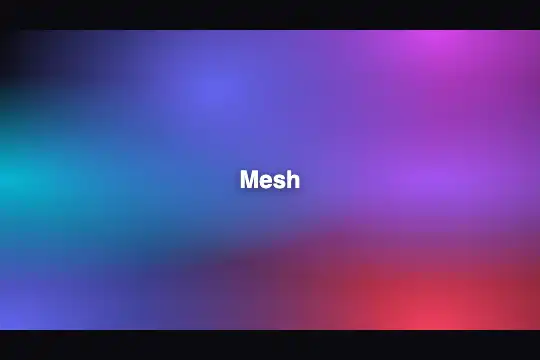
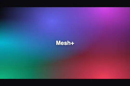
Le gradient mesh crée un effet de maillage colore fluide, très populaire dans les designs contemporains. Il utilise plusieurs radial-gradient superposes avec des positions animées.
.gradient-mesh {
  width: 100%;
  height: 100vh;
  background:
    radial-gradient(at 40% 20%, #6366f1 0px, transparent 50%),
    radial-gradient(at 80% 0%, #8b5cf6 0px, transparent 50%),
    radial-gradient(at 0% 50%, #d946ef 0px, transparent 50%),
    radial-gradient(at 80% 50%, #06b6d4 0px, transparent 50%),
    radial-gradient(at 0% 100%, #6366f1 0px, transparent 50%),
    radial-gradient(at 80% 100%, #8b5cf6 0px, transparent 50%),
    #0a0a0f;
  animation: meshMove 10s ease-in-out infinite;
}

@keyframes meshMove {
  0%, 100% {
    background-position:
      0% 0%, 100% 0%, 0% 50%,
      100% 50%, 0% 100%, 100% 100%;
  }
  25% {
    background-position:
      20% 20%, 80% 10%, 10% 60%,
      90% 40%, 10% 90%, 90% 100%;
  }
  50% {
    background-position:
      40% 10%, 60% 20%, 20% 40%,
      80% 60%, 20% 80%, 80% 90%;
  }
  75% {
    background-position:
      20% 20%, 80% 10%, 10% 60%,
      90% 40%, 10% 90%, 90% 100%;
  }
}
Comment ça fonctionne
- Plusieurs radial-gradient : Chaque gradient crée une "tâche" de couleur
- Position at X% Y% : Définit le centre de chaque gradient
- transparent 50% : Les bords des gradients se fondent doucement
- Animation background-position : Déplace les centres des gradients
2. Effet Aurora / Northern Lights
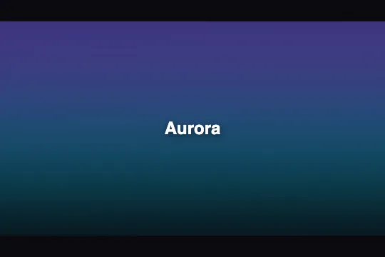
L'effet aurora reproduit les lumières boréales avec des mouvements fluides et ondulants. Il utilise des pseudo-éléments avec des gradients elliptiques animés.
.aurora-bg {
  width: 100%;
  height: 100vh;
  background: #0a0a0f;
  position: relative;
  overflow: hidden;
}

.aurora-bg::before,
.aurora-bg::after {
  content: '';
  position: absolute;
  width: 200%;
  height: 200%;
  top: -50%;
  left: -50%;
  animation: aurora 15s ease-in-out infinite;
}

.aurora-bg::before {
  background:
    radial-gradient(ellipse 80% 50% at 50% 0%,
      rgba(99, 102, 241, 0.5) 0%, transparent 70%),
    radial-gradient(ellipse 60% 40% at 30% 20%,
      rgba(139, 92, 246, 0.4) 0%, transparent 60%);
  animation-delay: 0s;
}

.aurora-bg::after {
  background:
    radial-gradient(ellipse 70% 50% at 70% 10%,
      rgba(6, 182, 212, 0.4) 0%, transparent 60%),
    radial-gradient(ellipse 50% 30% at 50% 30%,
      rgba(217, 70, 239, 0.3) 0%, transparent 50%);
  animation-delay: -7.5s;
}

@keyframes aurora {
  0%, 100% {
    transform: translateX(0) translateY(0) rotate(0deg) scale(1);
  }
  25% {
    transform: translateX(5%) translateY(-5%) rotate(5deg) scale(1.05);
  }
  50% {
    transform: translateX(-5%) translateY(5%) rotate(-5deg) scale(1.1);
  }
  75% {
    transform: translateX(3%) translateY(-3%) rotate(3deg) scale(1.05);
  }
}
Astuces pour un effet réaliste
- Ellipses horizontales : Les aurores sont naturellement étirées horizontalement
- Décalage d'animation : Les deux layers bougent en décale pour plus de fluidité
- Rotation subtile : Ajoute un mouvement ondulant naturel
- Scale variable : Simule l'intensité changeante des aurores
3. Background avec Noise/Grain
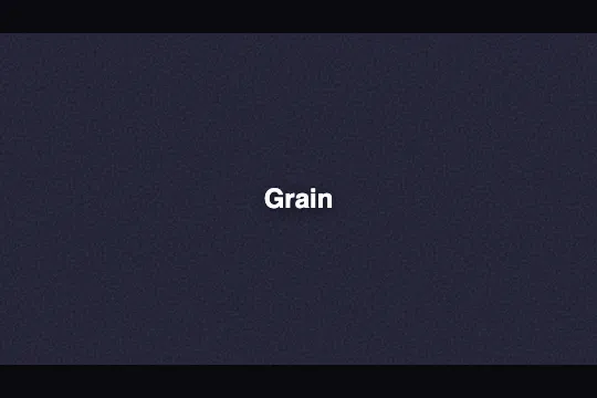
L'effet noise ajoute une texture granuleuse à vos backgrounds, leur donnant un aspect plus organique et cinématographique. Très utilisé dans les designs premium.
.noise-bg {
  width: 100%;
  height: 100vh;
  background: linear-gradient(135deg,
    #1a1a2e 0%, #0a0a0f 50%, #16213e 100%);
  position: relative;
}

.noise-bg::before {
  content: '';
  position: absolute;
  inset: 0;
  background-image: url("data:image/svg+xml,%3Csvg viewBox='0 0 256 256' xmlns='http://www.w3.org/2000/svg'%3E%3Cfilter id='noise'%3E%3CfeTurbulence type='fractalNoise' baseFrequency='0.9' numOctaves='4' stitchTiles='stitch'/%3E%3C/filter%3E%3Crect width='100%25' height='100%25' filter='url(%23noise)'/%3E%3C/svg%3E");
  opacity: 0.15;
  animation: noiseAnim 0.5s steps(10) infinite;
}

/* Vignette optionnelle */
.noise-bg::after {
  content: '';
  position: absolute;
  inset: 0;
  background: radial-gradient(ellipse at center,
    transparent 0%, rgba(10, 10, 15, 0.8) 100%);
}

@keyframes noiseAnim {
  0% { transform: translate(0, 0); }
  10% { transform: translate(-1%, -1%); }
  20% { transform: translate(1%, 1%); }
  30% { transform: translate(-1%, 1%); }
  40% { transform: translate(1%, -1%); }
  50% { transform: translate(-1%, 0); }
  60% { transform: translate(1%, 0); }
  70% { transform: translate(0, 1%); }
  80% { transform: translate(0, -1%); }
  90% { transform: translate(1%, 1%); }
  100% { transform: translate(0, 0); }
}Le noise est généré via un SVG inline encodé en data URI. Cette technique évite une requête HTTP supplémentaire et fonctionne partout.
4. Animated Gradient Orbs
Les orbs flottants créent un effet de profondeur avec des sphères de couleur floues qui se déplacent lentement. Parfait pour les hero sections.
.orbs-bg {
  width: 100%;
  height: 100vh;
  background: #0a0a0f;
  position: relative;
  overflow: hidden;
}

.orb {
  position: absolute;
  border-radius: 50%;
  filter: blur(60px);
  opacity: 0.7;
  animation: orbFloat 20s ease-in-out infinite;
}

.orb-1 {
  width: 300px;
  height: 300px;
  background: #6366f1;
  top: -100px;
  left: -50px;
  animation-delay: 0s;
}

.orb-2 {
  width: 250px;
  height: 250px;
  background: #8b5cf6;
  top: 50%;
  right: -80px;
  animation-delay: -5s;
  animation-duration: 25s;
}

.orb-3 {
  width: 200px;
  height: 200px;
  background: #d946ef;
  bottom: -50px;
  left: 30%;
  animation-delay: -10s;
  animation-duration: 22s;
}

.orb-4 {
  width: 180px;
  height: 180px;
  background: #06b6d4;
  top: 30%;
  left: 50%;
  animation-delay: -15s;
  animation-duration: 18s;
}

@keyframes orbFloat {
  0%, 100% {
    transform: translate(0, 0) scale(1);
  }
  25% {
    transform: translate(50px, -30px) scale(1.1);
  }
  50% {
    transform: translate(-30px, 50px) scale(0.9);
  }
  75% {
    transform: translate(30px, 30px) scale(1.05);
  }
}
Points clés
- filter: blur(60px) : Crée l'effet de sphère diffuse
- Tailles variées : Les orbs de différentes tailles ajoutent de la profondeur
- Animation-delay négatif : Désynchronise les mouvements
- overflow: hidden : Cache les parties qui débordent
5. Starfield / Particles CSS
Le champ d'étoiles crée un effet de ciel nocturne animé avec des étoiles scintillantes et des étoiles filantes occasionnelles, entièrement en CSS.
.starfield {
  width: 100%;
  height: 100vh;
  background: radial-gradient(ellipse at bottom,
    #1a1a2e 0%, #0a0a0f 100%);
  position: relative;
  overflow: hidden;
}

.stars {
  position: absolute;
  inset: 0;
}

.stars-1 {
  background-image:
    radial-gradient(2px 2px at 20px 30px, white, transparent),
    radial-gradient(2px 2px at 40px 70px, rgba(255,255,255,0.8), transparent),
    radial-gradient(1px 1px at 90px 40px, white, transparent),
    radial-gradient(2px 2px at 160px 120px, rgba(255,255,255,0.9), transparent),
    radial-gradient(1px 1px at 230px 80px, white, transparent),
    radial-gradient(2px 2px at 300px 150px, rgba(255,255,255,0.7), transparent);
  background-repeat: repeat;
  background-size: 500px 200px;
  animation: starMove 100s linear infinite;
}

.stars-2 {
  background-image:
    radial-gradient(1px 1px at 50px 80px, white, transparent),
    radial-gradient(2px 2px at 120px 20px, rgba(255,255,255,0.6), transparent),
    radial-gradient(1px 1px at 200px 160px, white, transparent);
  background-repeat: repeat;
  background-size: 500px 200px;
  animation: starMove 150s linear infinite;
  opacity: 0.6;
}

@keyframes starMove {
  from { transform: translateY(0); }
  to { transform: translateY(-200px); }
}

/* Etoiles filantes */
.shooting-star {
  position: absolute;
  width: 100px;
  height: 2px;
  background: linear-gradient(90deg, white, transparent);
  animation: shoot 3s ease-in-out infinite;
  opacity: 0;
}

.shooting-star:nth-child(4) {
  top: 20%;
  left: 70%;
  animation-delay: 0s;
}

.shooting-star:nth-child(5) {
  top: 40%;
  left: 30%;
  animation-delay: 1.5s;
}

@keyframes shoot {
  0% {
    transform: translateX(0) translateY(0) rotate(-45deg);
    opacity: 0;
  }
  5% { opacity: 1; }
  20% {
    transform: translateX(-200px) translateY(200px) rotate(-45deg);
    opacity: 0;
  }
  100% { opacity: 0; }
}Aperçu live, customizer, code vanilla — zéro dépendance.
Bonnes pratiques et accessibilité
Les backgrounds animés peuvent améliorer l'expérience utilisateur, mais ils doivent être utilisés avec précaution.
Performance
- Utilisez transform et opacity : Ces propriétés sont optimisées par le GPU
- Évitez d'animer background-position sur de grandes surfaces (préférez transform)
- Limitez le nombre de layers : Plus de 5-6 couches peut impacter les performances
- Testez sur mobile : Les animations peuvent drainer la batterie
Accessibilité
/* Respecter les preferences utilisateur */
@media (prefers-reduced-motion: reduce) {
  .gradient-mesh,
  .aurora-bg::before,
  .aurora-bg::after,
  .noise-bg::before,
  .orb,
  .stars,
  .shooting-star {
    animation: none !important;
  }
}

/* Alternative pour les modes d'economie d'energie */
@media (prefers-reduced-motion: reduce) {
  .animated-bg {
    /* Version statique */
    background: linear-gradient(135deg, #6366f1, #8b5cf6);
  }
}Toujours implémenter prefers-reduced-motion pour les utilisateurs sensibles aux mouvements. C'est une question d'accessibilité, pas juste de performance.
Design
- Contraste du contenu : Assurez-vous que le texte reste lisible sur fond animé
- Subtilité : Les animations lentes et douces sont moins distrayantes
- Zone d'impact : Réservez les animations aux hero sections, pas à tout le site
Conclusion
Ces 5 techniques vous permettent de créer des backgrounds animés impressionnants sans aucune dépendance JavaScript. Du gradient mesh élégant à l'effet aurora immersif, chaque technique a ses cas d'usage.
N'oubliez pas de toujours prioriser l'accessibilité et la performance. Un beau background ne vaut pas une mauvaise expérience utilisateur.
Retrouvez ces effets et bien d'autres dans notre bibliothèque d'effets, avec des variations et des templates prêts à l'emploi.