Card Expand to Full
Animates the card from its position in the layout to full screen using the FLIP technique — no manual CSS coordinate math.
Updated
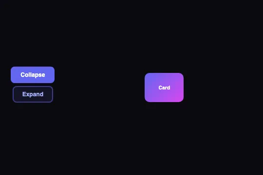
This effect is part of Effect.Labs — 840 vanilla effects, some free, some premium. Cards has 43 effects, including 6 free. Explore the category →
3 usage examples
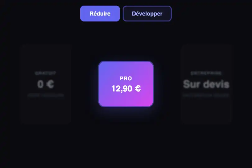
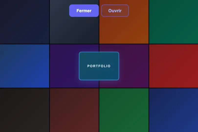
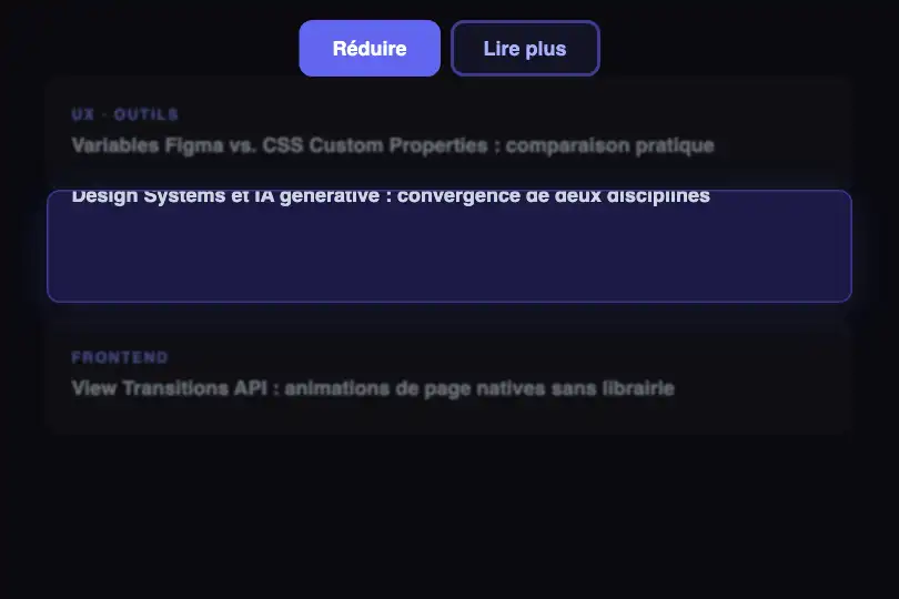
How it works
The animation uses the FLIP technique (First, Last, Invert, Play). Before any visual change, toggleCardExpand() captures the card's getBoundingClientRect() (First), applies or removes the CSS class .expanded — which instantly triggers a layout recalculation — then captures the rect again (Last).
The function computes the difference between the two states: pixel offset dx/dy and dimension ratio scaleX/scaleY. It immediately applies a transform: translate(…) scale(…) with transition: none, visually snapping the card back to its initial state without animation (Invert).
A requestAnimationFrame lets the browser commit that transform, then the function re-enables the transition all 0.6s cubic-bezier(0.4, 0, 0.2, 1) and clears the transform (Play). The browser animates naturally from the inverted state to zero — the final CSS position defined by .expanded — without any coordinate being calculated manually.
In parallel, the .expanded class drives two independent CSS animations: .card-label moves up 20 px via transform: translateY(-20px), and .card-detail fades from opacity: 0 to 1 with a 0.3 s delay — it only appears once the card has reached its final position.
Accessibility
- prefers-reduced-motion missing: the 0.6 s transition fires even when the OS signals a preference to reduce motion. In production, add
@media (prefers-reduced-motion: reduce) { .expand-card { transition: none !important; } }. - The Collapse/Expand buttons are native
<button>elements — keyboard-activatable (Space, Enter) and exposed to assistive technologies. - No
aria-expandedattribute on the buttons: the card's open/closed state is not communicated to assistive technologies. Recommended: syncaria-expanded="true/false"in the callback. - Text/background contrast: white text on an indigo–fuchsia gradient — ratio ≥ 4.5:1, WCAG AA compliant.
- No
roleoraria-labelon.card-expand-wrapper— it is purely positional, which is correct; text content remains accessible through child elements.
Browser compatibility
Requires getBoundingClientRect(), requestAnimationFrame, and CSS transitions — available in all modern browsers since 2016.
Without CSS transition or requestAnimationFrame support, the .expanded class still resizes the card — it snaps to the new dimensions instantly, without animation.
The code
HTML structure to paste into your page (the CSS + JS come with Premium):
<div class="demo-preview">
  <div class="morph-toggle-group">
    <button class="morph-toggle active" onclick="toggleCardExpand(false, this)">Collapse</button>
    <button class="morph-toggle" onclick="toggleCardExpand(true, this)">Expand</button>
  </div>
  <div class="card-expand-wrapper">
    <div class="expand-card" id="expandCard">
      <span class="card-label">Card title</span>
      <span class="card-detail">Detailed content revealed after expansion.</span>
    </div>
  </div>
</div>The full HTML + CSS + JS of Card Expand to Full, ready to paste — plus all 840 effects. Or $299 once, lifetime access.
Customize
Options passed to the API or data-* attributes:
| Option / property | Default | Effect |
|---|---|---|
| .expand-card background | linear-gradient(135deg, #6366f1, #d946ef) | Card color or background image. Swap in your brand palette or an image with background-size: cover. |
| .expand-card transition (CSS) + JS string "all 0.6s…" | 0.6s cubic-bezier(0.4, 0, 0.2, 1) | Duration and easing. Update in two places: the transition property on .expand-card in CSS, and the "all 0.6s…" string in the JS — keep them in sync. |
| .expand-card width / height (compact state) | 80px / 60px | Compact card dimensions before expansion. Scale them to match your thumbnail or card in the existing layout. |
| .expand-card top / left (compact state) | 50px / calc(50% − 40px) | Initial position inside .card-expand-wrapper. Adjust to match your source element's position in the grid. |
| .expand-card border-radius | 10px compact → 8px expanded | Corner radius in compact (.expand-card) and expanded (.expand-card.expanded) states. Update both in tandem for a consistent look. |
| .expand-card .card-detail transition-delay | 0.3s (in opacity .4s .3s) | Delay before the detail content appears. Set to 0s for immediate display; increase if the FLIP duration is longer. |
| --primary | #6366f1 | Primary color CSS variable used for toggle buttons and their focus ring. Set it at :root level or on the effect's container. |
FAQ
toggleCardExpand() targets the hardcoded id expandCard. For multiple instances, extract the logic to accept an element reference: function flipCard(el, expand, btn) { var a = el.getBoundingClientRect(); … } and wire each button with its own element.getBoundingClientRect() returns viewport-relative coordinates — scroll is already factored in and the calculation stays correct. Watch out: if a direct ancestor of .expand-card has a CSS transform, it creates a new positioning context and offsets the FLIP calculations.<body> or container at the same time: document.body.classList.toggle('card-open', expand). Drive an overlay, backdrop-filter, or background color through that class — its timing naturally aligns with the FLIP transition.


