Masonry to Grid
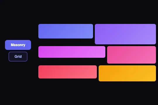
Six items smoothly transition between an organic masonry layout and a strict uniform grid using the FLIP technique — no library, just CSS flexbox and a single requestAnimationFrame.
Updated
This effect is part of Effect.Labs — 840 vanilla effects, some free, some premium. Cards has 43 effects, including 6 free. Explore the category →
3 usage examples
How it works

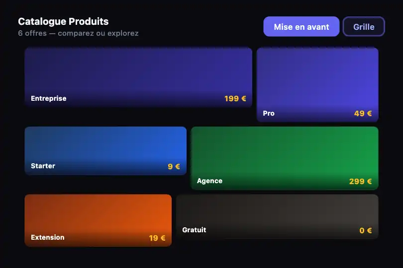
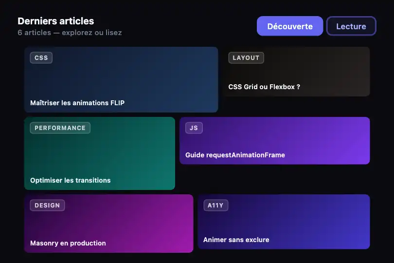
Two CSS classes — .masonry-mode and .grid-mode — define both states on the same wrapping flexbox container. In masonry mode, each item gets individual dimensions via :nth-child (widths 40–55%, heights 40–70 px). In grid mode, all items switch to calc(33.33% - 6px) width and 50 px height. Swapping the class is all it takes — the layout engine recalculates; no absolute positioning needed.
The smooth animation uses the FLIP technique (First, Last, Invert, Play). Before the class swap, setMasonryGrid() captures every item's geometry with getBoundingClientRect() (First). After the swap (Last), it computes the position and scale delta, then immediately applies transform: translate(dx, dy) scale(sx, sy) with transition: none to hold items visually at their old position (Invert).
On the next frame (requestAnimationFrame), the transition all 0.6s cubic-bezier(.4, 0, .2, 1) is restored and the forced transform is cleared (Play). The browser animates each item from its fictional position to its real CSS target. Both layouts share the exact same DOM nodes — no element creation or destruction on toggle.
The global function setMasonryGrid(btn, mode) also manages the visual state of the toggle buttons (.morph-toggle.active). The implementation is entirely vanilla: CSS for layout, a single requestAnimationFrame for animation kickoff — no Framer Motion, no GSAP, no Web Animations API.
Accessibility
- prefers-reduced-motion not implemented: the
.6stransition runs even when the OS has reduced-motion enabled. Fix before production: checkwindow.matchMedia('(prefers-reduced-motion: reduce)').matchesand applytransition: noneinstead of0.6s cubic-bezier(…). - Toggle buttons are native
<button>elements — keyboard-focusable by default. Addtype="button"to prevent accidental form submission in a parent form. - No
aria-labelorroleon the.masonry-grid-container. If items contain images, add descriptivealttext; if purely decorative, addaria-hidden="true"on the container. - Active toggle buttons (
.morph-toggle.active) usebackground: #6366f1; color: #fff— white-on-indigo-500 contrast ≈ 4.5:1, meeting WCAG AA. - No
aria-pressedstate on the toggle buttons: addaria-pressed="true/false"insidesetMasonryGridto communicate the active state to screen readers.
Browser compatibility
Requires CSS flexbox and requestAnimationFrame — supported in all modern browsers. Zero external dependencies.
Without JS, the container stays in initial masonry mode (.masonry-mode) — valid static layout, no console errors. Toggle buttons remain visible but inactive.
The code
HTML structure to paste into your page (the CSS + JS come with Premium):
<div class="morph-toggle-group">
  <button class="morph-toggle active" type="button"
          onclick="setMasonryGrid(this, 'masonry')">Masonry</button>
  <button class="morph-toggle" type="button"
          onclick="setMasonryGrid(this, 'grid')">Grid</button>
</div>

<div class="masonry-grid-container masonry-mode" id="masonryDemo">
  <!-- One .masonry-item per element — background or content via inline style -->
  <div class="masonry-item" style="background: linear-gradient(135deg, #6366f1, #818cf8);"></div>
  <div class="masonry-item" style="background: linear-gradient(135deg, #8b5cf6, #a78bfa);"></div>
  <div class="masonry-item" style="background: linear-gradient(135deg, #d946ef, #e879f9);"></div>
  <div class="masonry-item" style="background: linear-gradient(135deg, #ec4899, #f472b6);"></div>
  <div class="masonry-item" style="background: linear-gradient(135deg, #f43f5e, #fb7185);"></div>
  <div class="masonry-item" style="background: linear-gradient(135deg, #f59e0b, #fbbf24);"></div>
</div>The full HTML + CSS + JS of Masonry to Grid, ready to paste — plus all 840 effects. Or $299 once, lifetime access.
Customize
Options passed to the API or data-* attributes:
| Option / property | Default | Effect |
|---|---|---|
| transition on .masonry-item | .6s cubic-bezier(.4,0,.2,1) | Animation duration and easing. Use .4s ease-out for a snappier feel, or .9s ease-in-out for a slow editorial pace. |
| gap on .masonry-grid-container | 6px | Spacing between items in both modes. 12px for an airy gallery, 2px for a tight mosaic. |
| width / height in .masonry-mode:nth-child(n) | 45–55% / 40–70 px | Each item's dimensions in masonry mode. Adjust per :nth-child to build your own organic rhythm — large item first, smaller secondaries below. |
| width in .grid-mode .masonry-item | calc(33.33% - 6px) | Uniform width in grid mode. Change 33.33% to 25% for 4 columns, 50% for 2 columns. |
| height in .grid-mode .masonry-item | 50px | Uniform height in grid mode. Increase for taller cards or set to auto if items contain variable-height text content. |
| border-radius on .masonry-item | 6px | Corner rounding. 12px for a card look, 0 for a strict borderless mosaic. |
FAQ
.masonry-item elements in the HTML, then adjust the :nth-child rules in the CSS to set each item's width and height in masonry mode. In grid mode, the calc(33.33% - 6px) rule applies automatically to all items present — no JS changes needed.setMasonryGrid(btn, mode) expects a button element to update the .active state. If you have no visible button, pass null and guard the e.parentElement.querySelectorAll(…) line with an if (e) check. Then call setMasonryGrid(null, 'grid') on any event: scroll, timer, or data load.setMasonryGrid from a useEffect after mount or from an onClick handler. In Vue, use mounted() or a @click handler. The function only touches the DOM — no framework state, no conflicts.


