Neumorphic
Two antiparallel box-shadows — dark at bottom-right, white at top-left — simulate raking light on a uniform background and raise every component in pure-CSS Soft UI.
Updated

This effect is part of Effect.Labs — 840 vanilla effects, some free, some premium. Cards has 43 effects, including 6 free. Explore the category →
3 usage examples

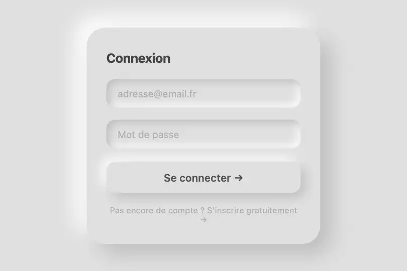
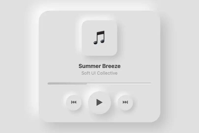
How it works
Neumorphism rests on a single rule: the element shares the exact same background color as its parent. That shared base (#e0e0e0) is what makes both shadows believable — if the colors differ, the illusion collapses immediately.
The shadow pair is declared in a single box-shadow with two values. The first (#bebebe 12px 12px 24px) casts a dark shadow to the bottom-right: where the fictional light source cannot reach. The second (#fff -12px -12px 24px) casts a bright reflection to the top-left: where the light strikes. Together they simulate raking light from an upper-left source — the defining fictional light of Soft UI.
On hover, both offsets and blur radii step from 12 px / 24 px to 16 px / 32 px, deepening the raised feel. The transition: .3s smooths the shadow change to avoid a visual jump. No JavaScript is required — the effect is handled entirely in CSS.
To create a sunken state (input field, pressed button), add the inset keyword before both shadow values: the shadows flip inward, simulating a depression. The dark color should stay roughly 8–15 % darker than the background; too large a gap breaks the material illusion, too small makes it invisible.
Accessibility
- prefers-reduced-motion: no check in the code — the
transition: .3sonbox-shadowis not disabled by the media query. Impact is minimal (no self-running animation, motion triggered by the user), but add@media (prefers-reduced-motion: reduce) { .card-neumorphic { transition: none } }if the element is interactive. - Text contrast:
#333on#e0e0e0→ ratio ≈ 9.6:1, well above WCAG AA (4.5:1) and AAA (7:1). - The demo element is a
<div>with no ARIA role or label. For interactive use (clickable card, button), addrole="button",tabindex="0", and an explicitaria-label. - No
:focus-visiblestate is declared in the code. For keyboard-interactive use, add a focus outline distinct from the neumorphic box-shadow. - The effect holds in greyscale and high-contrast mode: both shadows rely on luminance difference, not hue.
Browser compatibility
Requires multi-value box-shadow and CSS transition — available in all modern browsers since 2013.
Without box-shadow (IE8 and below), the card renders as a flat rectangle — no JS error, the layout stays intact. The transition is ignored but the static render is identical.
The code
HTML structure to paste into your page (the CSS + JS come with Premium):
<div class="demo-preview">
  <div class="card-demo card-neumorphic">
    Content
  </div>
</div>The full HTML + CSS + JS of Neumorphic, ready to paste — plus all 840 effects. Or $299 once, lifetime access.
Customize
Options passed to the API or data-* attributes:
| Option / property | Default | Effect |
|---|---|---|
| background: #e0e0e0 | #e0e0e0 | Base color of the card — must match the parent's background exactly. This is the central constraint: change it everywhere or nowhere. To adapt to other tones, derive the shadow colors from this value. |
| Dark shadow: #bebebe | #bebebe | Color of the cast shadow (1st box-shadow value). Should be 8–15 % darker than the background: for #e0e0e0, the correct range is #c8c8c8 to #b0b0b0. Beyond that, the material illusion breaks. |
| Light shadow: #fff | #ffffff | Color of the bright reflection (2nd value, negative offsets). Pure white for light backgrounds. For pastel or lightly tinted themes, shift to a slightly tinted color rather than pure white. |
| Normal offset: 12px 12px 24px | 12px 12px 24px | X + Y offset + blur radius for each shadow at rest. Reduce to 6px 6px 14px for small components (buttons, badges), increase to 20px 20px 40px for large cards. |
| Hover offset: 16px 16px 32px | 16px 16px 32px | box-shadow on hover (in .card-neumorphic:hover). A ~×1.3 ratio vs. the rest state gives convincing depth. Reduce the gap for a subtler hover. |
| border-radius: 20px | 20px | 50% for circular buttons, 12px for a squarer / professional look, 30px for a very rounded / mobile style. Keep rounding consistent across the card and its child elements. |
| transition: .3s | .3s all ease | Hover transition duration. .15s for near-instant feedback, .5s for a very gradual change. Consider restricting the property: transition: box-shadow .3s avoids accidentally transitioning other properties. |
| box-shadow: inset … | absent | Sunken variant (inputs, active/pressed state): box-shadow: inset #bebebe 4px 4px 10px, inset #fff -4px -4px 10px. The shadows flip inward — a semantically clear inversion immediately readable by the user. |
FAQ
#bebebe and #fff) are derived from #e0e0e0: if the card switches to a different tone without updating the shadows, the relief is no longer coherent. Update all three values together — parent background, card background, shadow colors — or centralise them in a CSS variable.inset keyword before both values: box-shadow: inset #bebebe 4px 4px 10px, inset #fff -4px -4px 10px. The shadows flip inward and simulate a depression. This is the foundation of active input fields and :active states in Soft UI interfaces.#2a2a3e), the dark shadow becomes even darker (#1c1c2e) and the 'light' shadow takes a blue/purple tint (#3a3a5e) rather than pure white. The logic is identical — derive both colors from the shared background — but the result is more subtle and text contrast needs a WCAG check.


