Sidebar to Overlay
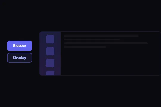
A fixed sidebar that expands into a full-screen overlay with a cubic-bezier transition, backdrop blur, and automatic content reflow — a single CSS class triggers everything.
Updated
This effect is part of Effect.Labs — 840 vanilla effects, some free, some premium. Cards has 43 effects, including 6 free. Explore the category →
3 usage examples
How it works
The effect relies on a CSS position switch from relative to absolute driven by the .overlay-mode class. In its default state, .sidebar-panel has width: 70px; position: relative; flex-shrink: 0 and occupies its slot in the display: flex container. When .overlay-mode is added, the position switches to absolute; inset: 0; width: 100%; height: 100% — the panel is pulled out of the flow and covers the entire surface. .sidebar-main, governed by flex: 1 1 0%, instantly claims all the freed width and fades out via transition: opacity .3s.
The transition .6s cubic-bezier(.4, 0, .2, 1) (Material Design easeInOut) applies only to interpolable properties: background, padding, and icon dimensions (28 → 50 px, border-radius 6 → 10 px). position and inset do not animate — they jump to the target state immediately, while colors and sizes glide, creating the impression of an organic expansion.
.overlay-mode adds backdrop-filter: blur(4px) on a rgba(99,102,241,0.15) semi-transparent background. The blur glazes the content behind without hiding it. Note: backdrop-filter creates a stacking context that isolates the overlay children's z-index values from the rest of the page.
Labels (.sidebar-label) use transition: .4s .2s — 0.4 s duration with a 0.2 s delay. They wait for the panel expansion to begin before appearing (font-size: 0; opacity: 0 → font-size: .55rem; opacity: 1), avoiding visual overlap during the resize.
Accessibility
- No prefers-reduced-motion in the code: the 0.6 s transition plays even if the OS requests reduced motion. Add:
@media (prefers-reduced-motion: reduce) { .sidebar-panel, .sidebar-panel .sidebar-icon, .sidebar-panel .sidebar-label { transition: none } }. - Toggle buttons are native
<button>elements, keyboard-focusable — but noaria-expandedis updated: the open/closed state is not announced to screen readers. - The panel and its wrapper carry no
roleoraria-label: screen readers traverse the<div class="sidebar-icon">elements with no navigation semantics. - Label contrast (
color: #a5b4fconrgba(99,102,241,0.2)background): estimated ratio ~3.2:1 — below WCAG AA (4.5:1) for normal text under 18 pt. Acceptable if labels are treated as decorative. - Keyboard navigation: both toggle buttons are in the tab order and operable without additional JS.
Browser compatibility
Requires CSS Transitions and backdrop-filter. Transitions are universal; backdrop-filter has been available in all modern browsers since 2022.
Without backdrop-filter (Firefox < 103), the overlay renders with a solid semi-transparent background — blur absent, all transitions and reflow still work. Without CSS transitions, the switch is instantaneous but the final state is identical.
The code
HTML structure to paste into your page (the CSS + JS come with Premium):
<div class="demo-preview">
  <div class="morph-toggle-group">
    <button class="morph-toggle active" onclick="setSidebarMode(this,'sidebar')">Sidebar</button>
    <button class="morph-toggle" onclick="setSidebarMode(this,'overlay')">Overlay</button>
  </div>
  <div class="sidebar-demo-wrapper">
    <div class="sidebar-panel" id="sidebarPanel">
      <div>
        <div class="sidebar-icon"></div>
        <span class="sidebar-label">Home</span>
      </div>
      <!-- Repeat for each item -->
    </div>
    <div class="sidebar-main">
      <div class="main-line"></div>
      <!-- Main content -->
    </div>
  </div>
</div>The full HTML + CSS + JS of Sidebar to Overlay, ready to paste — plus all 840 effects. Or $299 once, lifetime access.
Customize
Options passed to the API or data-* attributes:
| Option / property | Default | Effect |
|---|---|---|
| .sidebar-panel { width } | 70px | Sidebar width in compact mode. Increase to accommodate larger icons or a short always-visible label. |
| .sidebar-panel { transition } | .6s cubic-bezier(.4,0,.2,1) | Duration and easing of the expansion transition. Use .3s ease for a snappier switch, or .9s for a slower morph. |
| .sidebar-panel.overlay-mode { backdrop-filter } | blur(4px) | Glass blur intensity on the content behind the overlay. Set to blur(0) for a solid background, or blur(12px) for heavy frosted glass. |
| .sidebar-panel.overlay-mode { background } | rgba(99,102,241,0.15) | Overlay background color — adjust tint and opacity to match your brand palette. |
| .sidebar-panel .sidebar-icon { width, height } | 28px | Icon size in compact sidebar mode. The overlay value (50 px) lives in .overlay-mode .sidebar-icon — update both in sync. |
| .sidebar-panel .sidebar-label (overlay) | font-size: .55rem | Label size in overlay mode (0 in sidebar). Increase to .7rem for better readability on large screens. |
| .sidebar-main { transition } | opacity .3s | Duration of the main content fade when the overlay opens. Set to none for an instant hide. |
FAQ
setSidebarMode is hard-coded to getElementById('sidebarPanel'). For multiple instances, add a panelId parameter to the function and pass it from onclick: onclick="setSidebarMode(this,'overlay','sidebarPanel2')" — a three-line change.backdrop-filter: blur() is available in Chrome 76+, Safari 9+, Edge 79+, and Firefox 103+. On Firefox below 103, the overlay displays with the semi-transparent background but without blur — all transitions and reflow still work normally. Test with blur disabled to verify content readability behind the panel.document.getElementById('sidebarPanel').classList.add('overlay-mode') to open, .classList.remove('overlay-mode') to close. Then sync the active button state via querySelectorAll('.morph-toggle') if the UI needs to reflect the change.


