Split Screen Morph
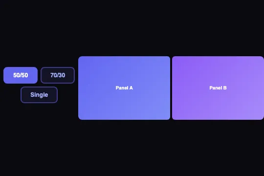
Two flex panels morph between 50/50, 70/30, and single panel — a button adds a mode class, the CSS cubic-bezier transition handles the animation without a single line of animation JS.
Updated
This effect is part of Effect.Labs — 840 vanilla effects, some free, some premium. Cards has 43 effects, including 6 free. Explore the category →
3 usage examples
How it works
The .split-screen-wrapper container is a flex row with overflow: hidden. Each panel starts at flex: 1 1 0% (50/50 by default). The .mode-70-30 class overrides the ratios to flex: 7 1 0% and flex: 3 1 0% (7 + 3 = 10, i.e. 70% and 30%). The .mode-single class collapses panel B to flex: 0 1 0% with min-width: 0; overflow: hidden; font-size: 0 — the browser shrinks it to zero width, content disappears cleanly.
All the smoothness comes from a single CSS rule: transition: .6s cubic-bezier(.4, 0, .2, 1) on .split-panel. The browser interpolates the flex-grow value between states (CSS Transitions Level 1, interpolable property). The cubic-bezier curve (Material Design's standard easing) produces an initial acceleration then a marked slow-down — the motion feels natural. No JS loop, no requestAnimationFrame — zero CPU outside the transition.
setSplitMode(btn, mode) does three things: it removes .active from all .morph-toggle buttons in the same parent (btn.parentElement.querySelectorAll), adds it to the clicked button, then strips both mode classes from the wrapper before applying a new one. The call to document.getElementById('splitDemo') is hardcoded — one instance per page as-is (see FAQ for multi-instance).
Accessibility
- prefers-reduced-motion absent: the flex transition animates regardless of system settings. For production, add
@media (prefers-reduced-motion: reduce) { .split-panel { transition: none } }. - Buttons are native
<button>elements with inlineonclick— keyboard-navigable (Tab + Enter or Space) without extra work. - No
aria-pressedon the toggles: active state is visual only (the.activeclass). Addaria-pressed="true/false"insidesetSplitModefor screen readers. - No
roleoraria-labelon.split-screen-wrapper— panels should carry their own landmarks or labels when content is meaningful. - Contrast of 'Panel A / Panel B' labels — white text on purple gradient (#6366f1 → #818cf8): ratio ≥ 4.5:1 (WCAG AA met).
Browser compatibility
Requires CSS Flexbox and CSS Transitions — natively supported in all modern browsers since 2016. Zero external dependencies.
Without CSS Transitions (IE 9 and below), panels switch width instantly — no JS errors, mode switching stays fully functional.
The code
HTML structure to paste into your page (the CSS + JS come with Premium):
<div class="demo-preview">
  <div class="morph-toggle-group">
    <button class="morph-toggle active" onclick="setSplitMode(this, '50-50')">50/50</button>
    <button class="morph-toggle" onclick="setSplitMode(this, '70-30')">70/30</button>
    <button class="morph-toggle" onclick="setSplitMode(this, 'single')">Single</button>
  </div>
  <div class="split-screen-wrapper" id="splitDemo">
    <div class="split-panel split-panel-a">Panel A</div>
    <div class="split-panel split-panel-b">Panel B</div>
  </div>
</div>The full HTML + CSS + JS of Split Screen Morph, ready to paste — plus all 840 effects. Or $299 once, lifetime access.
Customize
Options passed to the API or data-* attributes:
| Option / property | Default | Effect |
|---|---|---|
| transition on .split-panel | .6s cubic-bezier(.4, 0, .2, 1) | Animation duration and curve. Example: .35s ease for a responsive tool, .9s cubic-bezier(.34,1.56,.64,1) for an elastic bounce. |
| --primary (CSS var) | #6366f1 | Toggle button color (border, active background, active text). Swap for your project's primary color. |
| flex on .mode-70-30 .split-panel-a | 7 | Share of the large panel in asymmetric mode. 6 = 60/40, 8 = 80/20 — update .split-panel-b to match. |
| flex on .mode-70-30 .split-panel-b | 3 | Share of the small panel. Must total the same sum as .split-panel-a (e.g. 8+2, 7+3, 6+4). |
| gap on .split-screen-wrapper | 4px | Gutter between the two panels. 0 for a flush joint, 12px for an airy gap. |
| border-radius on .split-screen-wrapper | 8px | Container corner radius. 0 for full bleed, 16px for a card or modal. |
| setSplitMode(btn, mode) | — | External call from any code: trigger a mode change from a scroll event, a timer, or a keyboard shortcut without touching the built-in buttons. |
FAQ
.split-screen-wrapper.mode-30-70 .split-panel-a { flex: 3 1 0% } and .mode-30-70 .split-panel-b { flex: 7 1 0% }. Add a button with onclick="setSplitMode(this, '30-70')", then extend the condition inside setSplitMode: '30-70' === t ? o.classList.add('mode-30-70') : ….<div class="split-panel-a">Panel A</div> with any HTML. Add min-width: 0 on the panels if the content is rigid (tables, code editors) to allow shrinking below its natural size — the property is already present on .mode-single .split-panel-b as a reference.setSplitMode targets getElementById('splitDemo') by hardcoded id. For multiple instances, rename each wrapper (splitDemo2, etc.) and create a variant setSplitModeById(btn, mode, id) that takes the id as a parameter, or read it from a data-target attribute on the button (btn.dataset.target).


