Stacked to Spread
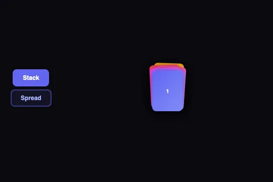
Six CSS cards shift from a slightly tilted stack to a 3×2 grid with an elastic cubic-bezier bounce — state toggle on click, zero JS animation engine.
Updated
This effect is part of Effect.Labs — 840 vanilla effects, some free, some premium. Cards has 43 effects, including 6 free. Explore the category →
3 usage examples
How it works
Six .stack-card elements are position: absolute inside a .stacked-spread-wrapper set to position: relative; height: 160px. The state logic lives entirely in two CSS classes — .stacked and .spread — applied to the wrapper. No JS animation engine is involved: all motion is produced by CSS transitions declared on the cards themselves.
In .stacked mode, each card receives via :nth-child a transform: translate(Xpx, Ypx) rotate(Ndeg) of a few pixels and degrees, simulating a casually placed stack with natural imperfections (2 px/2° to 5 px/4° depending on position). In .spread mode, the six cards fan out into three columns and two rows: translateX(−70px) · translate(0) · translateX(+70px) and translateY(−30px) / translateY(+40px).
The elastic transition is declared once on .stack-card: transition: .6s cubic-bezier(.34, 1.56, .64, 1). The y1 value of 1.56, above 1, makes cards overshoot their target before settling — the overshoot that produces the spring-like bounce. All six cards start from different positions and arrive at their targets simultaneously, creating a fan-spread effect.
The setStackMode(el, mode) function drives the toggle: it removes .stacked/.spread from the wrapper (targeted by the fixed id stackDemo), adds the new mode, and syncs the .active state on the toggle buttons. Declared globally, it can be called from any trigger — click, hover, scroll, or a business event.
Accessibility
- prefers-reduced-motion: not present in the code — no
@media (prefers-reduced-motion: reduce)rule is included. Elastic transitions play even when the user has enabled this system preference. Add@media (prefers-reduced-motion: reduce) { .stack-card { transition: none } }if your context requires it. - The Stack and Spread buttons are native
<button>elements — keyboard-focusable (Tab), activatable with Enter and Space, no extra JS needed. - No ARIA attributes are present on the wrapper or cards. If cards carry semantic content (images, links), add
role="group"andaria-labelto.stacked-spread-wrapper, and analtattribute on each image. - Text contrast inside the cards depends entirely on the content you place there — the effect itself imposes no visible text inside the cards.
- No focus trap is introduced: the toggle does not move focus and the cards remain in natural DOM order.
Browser compatibility
Requires CSS transition, transform, and :nth-child selectors — supported in all modern browsers since 2014. Zero external dependencies.
Without CSS transition support (browsers before 2014), cards jump instantly between states without animation — the layout remains correct. No JS errors are thrown.
The code
HTML structure to paste into your page (the CSS + JS come with Premium):
<div class="morph-toggle-group">
  <button class="morph-toggle active" onclick="setStackMode(this, 'stacked')">Stack</button>
  <button class="morph-toggle" onclick="setStackMode(this, 'spread')">Spread</button>
</div>
<div class="stacked-spread-wrapper stacked" id="stackDemo">
  <div class="stack-card">1</div>
  <div class="stack-card">2</div>
  <div class="stack-card">3</div>
  <div class="stack-card">4</div>
  <div class="stack-card">5</div>
  <div class="stack-card">6</div>
</div>The full HTML + CSS + JS of Stacked to Spread, ready to paste — plus all 840 effects. Or $299 once, lifetime access.
Customize
Options passed to the API or data-* attributes:
| Option / property | Default | Effect |
|---|---|---|
| .stack-card (width / height) | 60 px × 80 px | Card dimensions. Edit the CSS properties directly — stack and grid offsets are in absolute px and should be recalculated if you significantly change the size. |
| transition (.stack-card) | .6s cubic-bezier(.34, 1.56, .64, 1) | Animation duration and curve. Replace y1 (1.56) with a value ≤ 1 to remove the bounce, or raise it to 1.8–2.2 for a more pronounced overshoot. |
| Spread columns (translateX) | −70 px · 0 · +70 px | Horizontal grid spacing for the 3×2 layout. Adjust the translateX values in the .spread .stack-card:nth-child(n) rules to tighten or widen the columns. |
| Spread rows (translateY) | −30 px · +40 px | Vertical gap between the two rows. Modify the translateY in the six nth-child rules under .spread mode. |
| Stack offsets (nth-child) | 2–5 px · 2–4° | Visual imperfection of the stack. Each card has its own translate and rotate. Increase values for a messier pile, reduce them to zero for a perfectly aligned stack. |
| .stack-card:nth-child(n) background | Gradient indigo→violet→pink→red→amber | Individual card color. Replace the gradient with a solid color, a background-image, or your own brand gradient. |
| CSS var --radius-md | 0.5rem | Card border radius. Change the variable on :root to go from sharp rectangles (0) to rounder cards (1rem+). |
| setStackMode(el, mode) | — | Global function — call it from any event. To trigger without a toggle button reference, flip classes directly: document.getElementById('stackDemo').classList.replace('stacked','spread'). |
FAQ
.stack-card elements inside the wrapper. For the stack, add :nth-child rules with small offsets. For the grid, compute new translate values for the number of columns and rows you want — there is no JS logic to update, only CSS.setStackMode function targets the fixed id 'stackDemo'. For multiple instances, give each wrapper a different id and write one toggle function per instance — or factor it out: function toggleStack(el, mode, id) { var w = document.getElementById(id); w.classList.remove('stacked','spread'); w.classList.add(mode); }.const w = document.getElementById('stackDemo'); w.classList.remove('stacked'); w.classList.add('spread');. Wrap it in an IntersectionObserver, a setInterval, or your own event callback depending on the trigger.


