Tab Content Morph
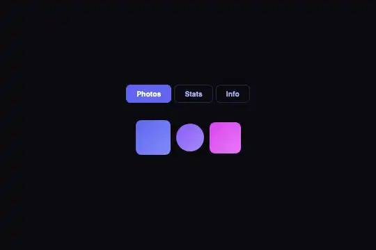



Pure CSS tab panel: panels swap with an opacity crossfade and synchronized translateY+scale slide — smooth morphing in 0.5 s, no library.
Updated
This effect is part of Effect.Labs — 840 vanilla effects, some free, some premium. Cards has 43 effects, including 6 free. Explore the category →
3 usage examples
How it works
All panels are stacked with position: absolute; inset: 0 inside a relative container. When inactive, each panel carries opacity: 0 and transform: translateY(10px) scale(.95): invisible, shifted 10 px downward, and slightly shrunk. The .active class brings it back to opacity: 1; transform: translateY(0) scale(1) — the crossfade combined with the vertical slide defines the morphing.
The transition is driven by a single CSS rule: transition: .5s cubic-bezier(.4, 0, .2, 1) (Material Design's ease-out curve). When switchTab() moves the .active class, the outgoing panel fades and slides down while the incoming panel rises and scales up simultaneously — both transitions run in parallel on the same GPU layer, with no document reflow.
The switchTab(index, btn) function is declared inside an IIFE. It strips .active from all buttons via querySelectorAll('.tab-morph-btn') and from all panels via querySelectorAll('#tabMorphContent .tab-morph-panel'), then sets the class on the clicked button and on the panel at the matching index. Inactive panels carry pointer-events: none: no accidental interaction with hidden content.
Limitation: switchTab is declared inside the IIFE and is not exposed on window; inline onclick attributes cannot reach it in global context. For multi-instance or programmatic use, redefine window.switchTab scoped to the parent .tab-morph-wrapper of the clicked button (see Customization and FAQ).
Accessibility
- prefers-reduced-motion: absent — the code contains no detection for this OS preference; the 0.5 s transition always runs, including for motion-sensitive users.
- Triggers are native
<button>elements: keyboard-focusable by default, activatable with Enter or Space. - The ARIA tabs pattern is absent: no
role="tablist", norole="tab"on buttons, norole="tabpanel"oraria-selected— screen readers do not perceive the tab/panel relationship. - Inactive panels carry
pointer-events: none: no accidental interaction with hidden content. - Contrast of inactive button text (
#a5b4fcon#0a0a0fbackground): ratio ≈ 5.1:1, WCAG AA met.
Browser compatibility
The effect relies solely on CSS transitions and querySelectorAll — available in all browsers since 2016. No external dependencies.
Without CSS transition support, panels switch instantly (no morphing) but tab navigation remains fully functional — no JS errors.
The code
HTML structure to paste into your page (the CSS + JS come with Premium):
<div class="tab-morph-wrapper">
  <div class="tab-morph-nav">
    <button class="tab-morph-btn active" onclick="switchTab(0, this)">Tab 1</button>
    <button class="tab-morph-btn" onclick="switchTab(1, this)">Tab 2</button>
    <button class="tab-morph-btn" onclick="switchTab(2, this)">Tab 3</button>
  </div>
  <div class="tab-morph-content" id="tabMorphContent">
    <div class="tab-morph-panel active"><!-- Content 1 --></div>
    <div class="tab-morph-panel"><!-- Content 2 --></div>
    <div class="tab-morph-panel"><!-- Content 3 --></div>
  </div>
</div>The full HTML + CSS + JS of Tab Content Morph, ready to paste — plus all 840 effects. Or $299 once, lifetime access.
Customize
Options passed to the API or data-* attributes:
| Option / property | Default | Effect |
|---|---|---|
| --primary | #6366f1 | Root CSS variable: accent color for the active button (background + border-color). Replace with your brand color to integrate the effect into your design system. |
| .tab-morph-panel { transition } | 0.5s cubic-bezier(.4, 0, .2, 1) | Morphing duration and curve. Try 0.3 s for a snappy feel, 0.7 s for a cinematic blend. The ease-out curve is the Material Design standard. |
| translateY(10px) in .tab-morph-panel | 10px | Vertical slide amplitude on entry. Reduce to 4 px for a near-invisible shift, raise to 20 px for a more dramatic depth effect. |
| scale(.95) in .tab-morph-panel | 0.95 | Scale factor of the inactive panel. Go down to 0.90 to emphasize the zoom-in on entry, set to 1 to remove the scale effect entirely. |
| .tab-morph-content { min-height } | 80px | Minimum height of the panel container. Set it to the height of the tallest panel to prevent layout jumps when panels have very different content sizes. |
| .tab-morph-btn { padding } | 6px 14px | Button click area size. Increase padding to meet the 44 × 44 px minimum touch target recommended by WCAG 2.5.5. |
| window.switchTab(index, btn) | — | Redefine this function to make it globally accessible and instance-scoped (btn.closest('.tab-morph-wrapper')) — required for multiple instances on the same page or to trigger a tab switch programmatically. |
FAQ
switchTab queries querySelectorAll('.tab-morph-btn') without scope — multiple instances interfere with each other. To use several, redefine window.switchTab scoped to the parent wrapper: var w = btn.closest('.tab-morph-wrapper'); w.querySelectorAll('.tab-morph-btn').forEach(…). Each instance then operates independently.<button class="tab-morph-btn" onclick="switchTab(3, this)">Tab 4</button> in .tab-morph-nav and <div class="tab-morph-panel">…</div> in .tab-morph-content. The index passed to switchTab must match the panel's zero-based position. No CSS changes required — the transition applies automatically to any .tab-morph-panel element.@media (prefers-reduced-motion: reduce) { .tab-morph-panel { transition: none; } }. Panels will then switch instantly without animation — still fully functional and respectful of motion-sensitive users.


