Dots Navigation
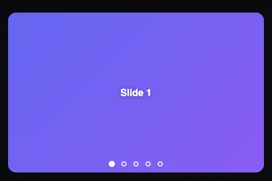
Carousel without arrows: a row of dots laid over the bottom of the image, one per slide; clicking a dot slides the track straight to that image.
Updated
This effect is part of Effect.Labs — 840 vanilla effects, some free, some premium. Gallery has 44 effects, including 6 free. Explore the category →
3 usage examples
How it works
Navigation goes through dots, not arrows: that is what sets this effect apart from the Vertical Slider in the same category, which keeps arrows and moves up or down. The script counts the .dtnv-slide elements and creates one button per slide inside .dtnv-dots. Clicking the fourth dot brings the fourth image directly, without stepping through the previous ones: the horizontal .dtnv-track gets translateX(-300%) and slides in 0.5 s.
The dot of the visible image fills in and grows slightly (is-active, scale(1.2)); the others stay 10 px white rings. Each dot is a 24 × 24 px button, big enough for a thumb, even though the drawn ring is small.
Two gestures complete the dots: the ← and → keys (focus then follows the active dot) and a horizontal drag of more than 50 px by finger or mouse, handled with Pointer Events. Those two move one step and start over from the first image after the last. No animation starts without someone acting.
Adding or removing an image needs no change to the dots: they are rebuilt from the number of slides on load. A photo goes in as an <img> inside the slide (full coverage with object-fit: cover). Each .dtnv-carousel has its own instance; nothing is exposed on window.
Accessibility
- Reachable dots: real
<button type="button">elements in the Tab order, named "Slide 1", "Slide 2"…; the one for the visible image carriesaria-current="true". - Carousel described:
role="region"+aria-roledescription="carousel"on the frame, and for each image a "slide" group named "2 of 5". - Nothing hidden is reachable:
inertandaria-hiddenon images outside the frame. - Change announced: invisible
aria-live="polite"area ("slide 4 of 5"), silent on load. - Reduced motion: no sliding under
prefers-reduced-motion: reduce; the clicked dot still shows the right image.
Browser compatibility
A little over 4 KB of standalone JavaScript. Checked on 08/11/2026 with Playwright (Chromium, Firefox, WebKit): dots reached with Tab and activated with Enter, → key from a dot, two independent carousels, script run twice without duplicate dots, finger swipe at 390 px (Chromium) and mouse drag, reduced motion, no errors. Minimum versions from @mdn/browser-compat-data 8.1.8; the most demanding is inert.
Before inert, the carousel works but a link in a hidden image can still be reached by keyboard. Without aspect-ratio (Safari 14), set --dtnv-height. Without JavaScript, no dot is created and only the first image shows. In Safari on Mac, Tab only stops on buttons when the "Press Tab to highlight each item" option is on (a system setting, not the effect).
The code
HTML structure to paste into your page (the CSS + JS come with your purchase):
<div class="fx-0164-root">
  <div class="dtnv-carousel" role="region" aria-roledescription="carousel" aria-label="Slideshow" data-slide="slide" data-of="of">
    <div class="dtnv-track">
      <div class="dtnv-slide"><span class="dtnv-caption">Slide 1</span></div>
      <div class="dtnv-slide"><span class="dtnv-caption">Slide 2</span></div>
      <!-- … as many div.dtnv-slide as images -->
    </div>
    <div class="dtnv-dots"></div>  <!-- the dot buttons are created here by the script -->
  </div>
</div>One-time payment, no subscription — the code is yours forever
Customize
Options passed to the API or data-* attributes:
| Option / property | Default | Effect |
|---|---|---|
Dot colour (CSS — --dtnv-dot-color on .fx-0164-root) |
#fff | Ring, fill of the active dot and focus outline. On a light background, use a dark colour. |
Maximum width and format (CSS — --dtnv-width, --dtnv-ratio) |
640px · 16 / 10 | The frame follows the available width up to this limit; the height comes from the format. |
Fixed height (CSS — --dtnv-height) |
auto | For a tile or a screen: 190px, 100%… |
Slide speed (CSS — --dtnv-duration) |
0.5s | The cubic-bezier(.25,.46,.45,.94) curve is kept; jumping from the 1st to the 5th image takes the same time as one step. |
Corners (CSS — --dtnv-radius) |
1rem | 0 for a full screen. |
Demo background (CSS — --dtnv-stage-bg, --dtnv-stage-padding, --dtnv-stage-min-height) |
#0a0a0f · 25px 16px · 300px | To neutralise in your page (transparent, 0, 0). |
Labels (HTML — data-slide, data-of, aria-label) |
slide · of · Slideshow | data-slide also names the dots ("Slide 3"); change it for another language. |
FAQ
.dtnv-dot class and draws the ring with ::before. For numbers, add dot.textContent = i + 1; where the script creates the button and remove the .dtnv-dot::before rule; the accessible name "Slide N" set by aria-label stays.