Custom Circle Cursor

A circle substituted for the native cursor inside a delimited zone: `mouseenter` shows it and erases the system pointer, `mousemove` teleports it to the exact pointer coordinate — zero interpolation, zero lag — and checks on every event whether the hovered element carries the `data-hover` attribute to switch the circle's visual state.
Updated
This effect is part of Effect.Labs — 840 vanilla effects, some free, some premium. Cursors has 26 effects, including 1 free. Explore the category →
3 usage examples

How it works
Three listeners are attached to the #zone-circle container, never to the circle itself. mouseenter fires two actions at once: it adds the cursor-active class to the zone — which activates the CSS rule cursor: none and hides the system pointer — and switches the circle from display: none to display: block. mouseleave reverses all of it: removes cursor-active, resets the circle to display: none and strips hover for a clean state on the next entry.

On every mousemove, the circle receives two values: style.left = e.clientX + 'px' and style.top = e.clientY + 'px'. These are viewport coordinates written directly, with no coefficient, no requestAnimationFrame, no lerp. The circle does not follow the cursor with a delay or a trail — it occupies the exact same position at every instant. Centering at the contact point is handled by transform: translate(-50%, -50%) in CSS. The mix-blend-mode property on the circle blends it visually with the content underneath (inversion, subtraction, multiplication) — no extra JS.
Still inside mousemove, after repositioning, the code inspects e.target: if that element has the data-hover attribute, the hover class is added to the circle; otherwise it is removed. This check runs on every event, with no cache and no delay — the switch is instantaneous. The JS has no knowledge of the circle's appearance: it supplies a binary state that CSS interprets visually. The data-hover attribute is your semantic selector — you designate active elements inside the zone without touching the JS.
Accessibility
- Hiding the native cursor is a heavy accessibility decision — not just an animation. If the custom circle fails to load (blocked JS, rendering error),
cursor: noneremoves the user's pointing reference without substituting anything. Verify that#cursorCircleis present in the DOM before attaching listeners. - On keyboard,
mousemovenever fires: the user never sees the circle, and ifcursor: noneapplies through another rule, the visual reference disappears without a substitute. Make sure every clickable element inside the zone has an explicit:focus-visiblestate — a focus ring, a shadow — independent of any cursor effect. - On touch screens, no
mouse*events flow: the circle stays atdisplay: none, the zone keeps its native cursor. Clean fallback, no extra code. To block emulatedmousemoveon tap, gate the listeners behindmatchMedia('(hover: hover) and (pointer: fine)'). - The circle is a purely visual ornament. Make sure it carries
pointer-events: nonein CSS — otherwise it intercepts mouse events at its own position and breaksdata-hoverdetection on the elements underneath. Never carry information through the circle or itshoverstate alone — part of your audience will never see either.
Browser compatibility
All APIs used are ES5-compatible: getElementById, classList, addEventListener, style.left/top/display, hasAttribute. The only floor is syntactic: arrow functions (ES2015) halt IE 11. On the CSS side, mix-blend-mode is the limiting factor — absent from IE and pre-Chromium Edge, where the circle renders without blending.
Without JavaScript, the circle is never made visible and cursor-active is never added: the native pointer stays intact. Without mix-blend-mode (Edge 18 and earlier), the circle renders as a solid flat shape — a functional fallback if you assign it a readable background color. No fallback code to write in either case.
The code
HTML structure to paste into your page (the CSS + JS come with Premium):
<div class="cursor-zone" id="zone-circle">
  <div class="cursor-circle" id="cursorCircle"></div>
  <button class="morph-btn" data-hover="true">Hover me</button>
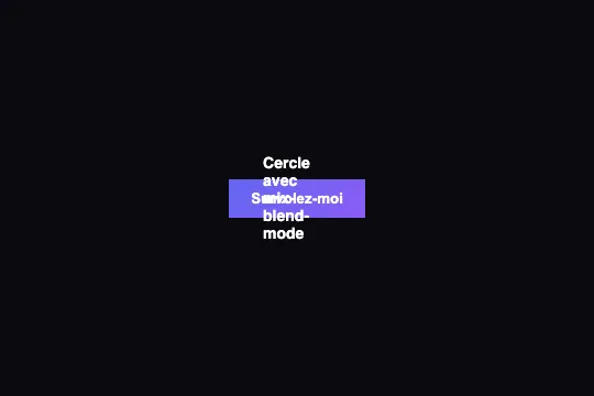
  <span class="info-text">Circle with mix-blend-mode</span>
</div>The full HTML + CSS + JS of Custom Circle Cursor, ready to paste — plus all 840 effects. Or $299 once, lifetime access.
Customize
Options passed to the API or data-* attributes:
| Option / property | Default | Effect |
|---|---|---|
| Activation zone (#zone-circle) | the 300 px tall container in the demo | All three listeners (mouseenter, mouseleave, mousemove) are attached to this element. Replace the id with any container or document.body for a full-page cursor. |
| Circle size (CSS width/height on #cursorCircle) | defined in CSS, not hard-coded in the JS | The JavaScript only writes left and top — it has no knowledge of the circle's size. Change width and height freely in CSS, centering remains handled by transform: translate(-50%, -50%). |
| mix-blend-mode (CSS on #cursorCircle) | defined in CSS — 'difference' in the demo | difference inverts colors under the circle. exclusion gives a softer similar result. multiply darkens (light backgrounds). screen lightens (dark backgrounds). normal disables blending for a solid flat shape — preferable in work interfaces. |
| The data-hover attribute | present on the demo button (data-hover="true") | On every mousemove, the code tests e.target.hasAttribute('data-hover') — presence only, value ignored. Place it on any HTML element (link, image, SVG, button) to trigger hover on the circle. |
| The .hover class on #cursorCircle (CSS) | toggled by data-hover — appearance entirely defined in CSS | The JS adds or removes .hover; all visual rendering depends on the CSS you write for that selector. Examples: scale(1.6) to enlarge the circle over active elements; a different mix-blend-mode value per state; reduced opacity for a fade-out effect. |
| The .cursor-active class (CSS on #zone-circle) | added by mouseenter, removed by mouseleave | This class must carry cursor: none in your CSS — the JS never touches the cursor property directly. To hide the pointer outside the zone as well, move cursor: none to the body. |
FAQ
cursor-active to the #zone-circle container as soon as the pointer enters it. A CSS rule on that selector declares cursor: none — the JS never touches the property directly. On mouseleave, the class is removed and the native cursor immediately resumes. Without JavaScript, cursor-active is never added and the native pointer stays visible.style.left = e.clientX + 'px' and style.top = e.clientY + 'px' directly on every mousemove, with no coefficient and no interpolation. The circle occupies the exact same position as the pointer at every instant — a geometric substitution, not a follower with friction. For a trail, a per-frame lerp or a CSS transition on left/top — that is a different effect.mouseenter and mousemove do not fire: the circle stays at display: none, cursor-active is never added and the native cursor is never hidden. No disable code to write. To block emulated mousemove events some browsers fire on tap, gate the listeners behind matchMedia('(hover: hover) and (pointer: fine)').