Custom Cursor States




A 32 px ring in position: fixed, appended to the body and moved on every mousemove; the zone hides the native pointer on enter and restores it on leave, and the data-cursor-type attribute of the hovered element picks the shape — a 48 px circle, a 24 px pink diamond or a green dashed circle — with a 200 ms transition on everything, position included.
Updated
This effect is part of Effect.Labs — 840 vanilla effects, some free, some premium. Cursors has 26 effects, including 1 free. Explore the category →
3 usage examples
How it works
For each [data-cursor-states] zone, the script creates a div.alchemy-custom-cursor and appends it to document.body — outside the zone and out of the flow. Its CSS: position: fixed, z-index: 9999, 32 × 32 px, border: 2px solid #a78bfa, border-radius: 50%, transform: translate(−50%, −50%) to center the box on the point, pointer-events: none so it never intercepts a click, display: none at rest, and transition: all .2s cubic-bezier(.23, 1, .32, 1). That rule and its three states were missing from the sold code until September 5, 2026: the div existed, invisible.
Enter and leave are handled on the zone: mouseenter shows the ring (display: block) and writes zone.style.cursor = 'none' inline; mouseleave hides it, sets cursor back to empty and resets the class to alchemy-custom-cursor. The native pointer is therefore hidden only while hovering the zone, and everything is restored on exit — measured: display: none, style.cursor = '', base class.
On every mousemove, left/top receive clientX/clientY — viewport coordinates, consistent with position: fixed, so page scrolling introduces no offset. Then the class is reset to its base and e.target.closest('[data-cursor-type]') looks for the nearest typed element under the pointer: state-link gives a 48 px circle, #6366f1 border, rgba(99,102,241,.1) fill; state-action a 24 px square with border-radius: 4px rotated 45° — a diamond — #ec4899 border; state-drag a 40 px circle in border-style: dashed, #10b981 border. Outside any typed element, the 32 px violet ring remains.
Since the transition targets all, it also animates left/top: the ring catches up with the pointer instead of tracking it pixel by pixel. Measured after a 496 px jump: 50% of the way at 24 ms, 97% at 124 ms, arrival around 170 ms — a soft follow during fast gestures, exact at rest. The same delay smooths the size, color and rotation changes between states. Two integration facts: the .cursor-states-zone is a three-column grid at height: 100% backed by a min-height: 300px — the latter is what gives it its height, since the percentage resolves to auto inside the sold wrapper (min-height: 300px with no height): without it, the grid dropped to 92 px tall, its content's height, and above and below the native pointer took over; and the CSS contains a .custom-cursor rule (fixed, hidden) that belongs to Cursor Trail: no element carries it here.
Accessibility
- prefers-reduced-motion not handled: the 200 ms lag and the morphs between shapes play regardless of the preference. Add
@media (prefers-reduced-motion: reduce) { .alchemy-custom-cursor { transition: none } }— the ring then sticks to the pointer and changes shape instantly, which is the expected behavior under reduced motion. - cursor: none removes the native pointer inside the zone: the custom cursor is the only position cue. It is never
display: blockwithout hover, so for keyboard users it doesn't exist and nothing signals focus. The three[data-cursor-type]areas are non-focusabledivs: make them realaandbuttonelements with an explicit:focus-visiblestyle — the cursor does not reflect focus. - Contrast: the
rgba(255,255,255,.4)labels at 11.2 px measure 3.8:1 on#0a0a0f, below the 4.5:1 AA threshold — switch torgba(255,255,255,.6)(7.3:1). The rings are graphical indicators (3:1 threshold): on a dark background they all pass (#6366f14.4:1, the others ≥ 5.6:1). On a light page they don't:#a78bfa2.7:1 and#10b9812.5:1 on white — use#7c3aed(5.7:1) and#047857(5.5:1). - Touch: no
mousemove, so no ring and the native pointer is never hidden — the effect is harmlessly inert. Screen readers: the div is empty and outside the zone; setaria-hidden="true"at creation (t.setAttribute('aria-hidden', 'true')) so it never shows up in the tree. Itsz-index: 9999puts it above everything, dialogs included. - Integration: a
position: fixedelement is positioned against the viewport unless an ancestor hastransform,filterorwill-change: transform— since the div is appended tobody, only a transformedbodywould shift it. The zone gets its height from itsmin-height: 300px(itsheight: 100%resolves toautowithout a sized parent: 92 px measured without the min-height) — keep an explicit height when integrating; the reset on leave is properly done by the code (native cursor restored, class and display cleared).
Browser compatibility
ES5 code (var, function) requiring Element.closest, classList, position: fixed and CSS transitions. closest rules out Internet Explorer and Edge before 15. Zero dependencies.
Without JavaScript, no div is created and the zone keeps the native pointer: three columns with icon and label, nothing missing. Without Element.closest (Edge 12-14, IE), the script throws on the first mousemove after having already hidden the native pointer on enter — the user loses their cursor inside the zone. Add a closest polyfill or test for it before attaching the listeners.
The code
HTML structure to paste into your page (the CSS + JS come with Premium):
<div class="cursor-states-zone" data-cursor-states>
  <div class="cursor-state-area" data-cursor-type="link">
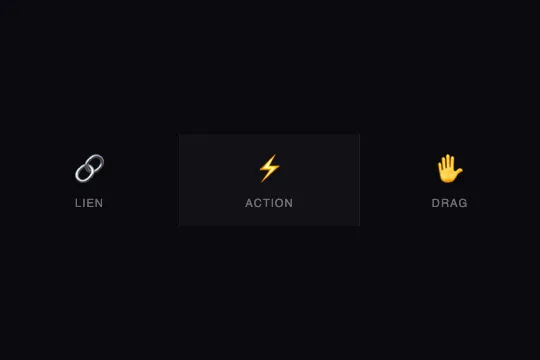
    <div class="state-icon">🔗</div>
    <div class="state-label">Link</div>
  </div>
  <div class="cursor-state-area" data-cursor-type="action">
    <div class="state-icon">⚡</div>
    <div class="state-label">Action</div>
  </div>
  <!-- … 3 in total, one per cursor state … -->
</div>The full HTML + CSS + JS of Custom Cursor States, ready to paste — plus all 840 effects. Or $299 once, lifetime access.
Customize
Options passed to the API or data-* attributes:
| Option / property | Default | Effect |
|---|---|---|
Base size (CSS — .alchemy-custom-cursor) |
32 × 32 px, 2 px #a78bfa border | Ring shown outside any typed element. The translate(−50%, −50%) keeps it centered whatever the size; the border is the indicator, thicken it (3px) on busy backgrounds. |
transition (CSS — all .2s cubic-bezier(.23, 1, .32, 1)) |
.2s on every property | Sets both the morph between states and the position lag (measured: 97% of the way in 124 ms). For an exact follow without losing the morph, list the properties: width .2s, height .2s, border-color .2s, background .2s, transform .2s, border-radius .2s. |
Link state (CSS — .state-link) |
48 px, #6366f1 border, rgba(99,102,241,.1) fill | The only state with a fill: it slightly lightens what it hovers. Lower the fill to .05 over visuals, or remove it for a pure ring. |
Action state (CSS — .state-action) |
24 px, 4 px radius, rotate(45deg), #ec4899 border | The diamond comes from rotating a rounded square; remove rotate(45deg) for a square, or set border-radius: 50% and keep the small size for a dot. The rotation is interpolated by the transition: the circle “twists” into a diamond over 200 ms. |
Drag state (CSS — .state-drag) |
40 px, dashes, #10b981 border | border-style: dashed is the only stroke difference. dotted gives dots; a slow rotation animation on this state alone suggests movement. |
| data-cursor-type values (HTML + CSS) | link, action, drag | The JS adds state- + value, whatever it is: a data-cursor-type="text" works as soon as a .alchemy-custom-cursor.state-text rule exists (say a 2 × 28 px vertical bar). closest walks up the ancestors: put the attribute on a container to type all of its content. |
z-index (CSS — 9999) |
9999 | The ring sits above everything. Lower it below your dialogs' z-index if they must cover it, or hide it when they open (the native pointer stays hidden as long as you are inside the zone). |
FAQ
transition: all .2s also animates left and top, rewritten on every mousemove. Each new position starts a 200 ms transition from the current one: measured, the ring covers 50% of a jump in 24 ms and 97% in 124 ms, then settles around 170 ms. That is what gives the “soft” follow; at rest, the measured gap is 0 px. For a pixel-exact follow, exclude the position from the transition by listing the properties to animate (size, color, transform, border-radius) — the morph between states remains, the lag disappears.data-cursor-type="text" on the element or on its container — the JS uses closest, so descendants inherit the type. In the CSS, a rule .alchemy-custom-cursor.state-text { width: 2px; height: 28px; border-radius: 1px; border-color: #e2e8f0 }. The class is rebuilt on every move (className = 'alchemy-custom-cursor' then classList.add): states are exclusive and there is nothing to remove. If typed elements are nested, the one closest to the pointer wins.min-height: 300px. .cursor-states-zone also declares height: 100%, but its .demo-preview container only has a min-height: 300px — not a height — and a percentage against a parent with no definite height resolves to auto: without the min-height, the grid took its content height, 92 px (icon, label, twice 16 px of padding), centered inside the 300 px, with no ring and no cursor: none above or below (measured). For another height, change the zone's min-height or give its container a height in px. Incidentally, the .custom-cursor rule in the CSS comes from another effect (Cursor Trail) and can be deleted.