Magnetic Cursor
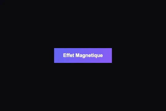
A button that leans toward your cursor for as long as you hover it: the JS measures the offset from center, writes it into two CSS variables, and :hover decides when the translation applies.
Updated
This effect is part of Effect.Labs — 840 vanilla effects, some free, some premium. Cursors has 26 effects, including 1 free. Explore the category →
3 usage examples

How it works
The effect relies on a strict separation of roles. The button is wrapped in a .magnetic-area container, and that container — not the button — is what moves. On the CSS side, the key rule fits on one line: .magnetic-area:hover receives transform: translate(var(--magnetic-x, 0), var(--magnetic-y, 0)). The translation is driven by two CSS variables with a fallback of 0, and it is only declared under :hover: outside hover, no transform exists. A transition: transform .3s on the container smooths both the pursuit and the return to rest.
On the JavaScript side, the mousemove listener sits on the container itself, not on the zone around it. On every move, getBoundingClientRect() returns the element's actual position; the script derives the pointer's offset from its center (clientX - rect.left - rect.width / 2, same for Y), multiplies it by 0.3 and writes the result into --magnetic-x and --magnetic-y through style.setProperty(). The JS never touches transform: it supplies numbers, the CSS decides how to apply them. A second listener, mouseleave, resets both variables to 0px. The whole thing fits in about fifteen lines, with no requestAnimationFrame and no library.
This architecture produces an emergent behavior: since getBoundingClientRect() measures the already-transformed position, each mousemove computes the offset from where the element currently sits. The pull is self-damping: the element converges under the pointer instead of oscillating, and settles around 23% of the initial offset (0.3 / 1.3), not the coefficient's 30%. Another consequence: without JavaScript, the variables are never written, the 0 fallback kicks in and the button remains fully functional — the effect is progressive enhancement, not a dependency.
Accessibility
- prefers-reduced-motion: absent from the code. Add
@media (prefers-reduced-motion: reduce) { .magnetic-area:hover { transform: none; } }— a single rule neutralizes the effect, since the entire translation goes through that selector. - The effect is 100% mouse-driven:
mousemovefires neither from the keyboard nor from touch. The native<button>stays focusable and activatable with Enter/Space, but no:focus-visiblestyle is defined — add one, keyboard users will never see the magnetic lean. - On coarse pointers (touch), no
mousemoveflows in normal use: the effect is inert, the button behaves normally. To block the emulatedmousemovesome browsers fire on tap, gate the listener behindmatchMedia('(hover: hover) and (pointer: fine)'). - For screen readers nothing changes: the movement is purely visual, and the
<button>keeps its accessible name and its place in the accessibility tree. Never carry information through the movement itself — it is invisible to part of your users.
Browser compatibility
Relies on CSS variables (var() written through setProperty()), transitions and getBoundingClientRect(). The limiting factor is custom property support — universal today, absent from IE 11.
Degradation is natural: without CSS variables (IE 11), translate(var(…)) is invalid, the browser drops the declaration and the button renders static but fully clickable. Without JavaScript, the variables are never written and the 0 fallback in var(--magnetic-x, 0) guarantees a zero translation. No fallback code to write.
The code
HTML structure to paste into your page (the CSS + JS come with Premium):
<div class="cursor-zone" id="zone-magnetic-v2">
  <div class="magnetic-area" id="magneticAreaBtn">
    <button class="magnetic-btn">Magnetic effect</button>
  </div>
</div>The full HTML + CSS + JS of Magnetic Cursor, ready to paste — plus all 840 effects. Or $299 once, lifetime access.
Customize
Options passed to the API or data-* attributes:
| Option / property | Default | Effect |
|---|---|---|
| Attraction coefficient (x * 0.3 / y * 0.3 in the JS) | 0.3 | The two multiplications set the amplitude: the value written into the variables equals 30% of the offset from center. 0.1 = a barely perceptible quiver; 0.5 = pronounced pursuit. Edit both occurrences together to keep the movement isotropic. |
| transition: transform .3s (on .magnetic-area) | .3s | Smooths every new variable value and animates the return to rest after mouseleave. 0.15 s = snappy response, glued to the cursor; 0.5 s = visible lag, the button feels heavy. It is the effect's only speed control. |
| Return curve (timing-function) | ease (implicit) | The shorthand keeps the default ease curve. Switch to cubic-bezier(0.34, 1.56, 0.64, 1) for an elastic return that slightly overshoots the rest position — the 'magnet release' feel typical of this kind of interaction. |
| The :hover gate (.magnetic-area:hover) | translation applied on hover only | Declaring the transform under :hover is a safety net: outside hover, no translation can persist. Move the declaration onto .magnetic-area alone if you drive the variables some other way — the return to rest will then depend solely on the JS mouseleave. |
| Asymmetric X / Y coefficients | 0.3 on both axes | Nothing forces the same factor on both axes: y * 0.15 with x * 0.3 constrains the vertical and produces a lateral glide — relevant for a wide, short button, where the horizontal offset largely dominates the vertical one. |
| The wrapper's content (.magnetic-btn) | a gradient-styled <button> | .magnetic-area carries the listener, the transition and the translation — the button is just a passenger. Swap it for a link, an SVG icon or an entire card: as long as the element sits inside the wrapper, the mechanics work without touching the JavaScript. |
FAQ
:hover. One attracts from afar, the other accompanies on contact. And in the code: the former writes the transform inline from JS; here the JS only writes two variables, the CSS stays in charge.getElementById — one instance only. To equip several, switch to the class: iterate over document.querySelectorAll('.magnetic-area') and attach the mousemove/mouseleave pair to each element in the loop. Since the variables are written on each wrapper's inline style, instances are independent.mousemove flows, the variables stay at their 0 fallback and the button behaves normally. No need to disable anything. To tell stylus or trackpad apart, the (hover: hover) and (pointer: fine) media query remains the right criterion.