Retro Desktop UI
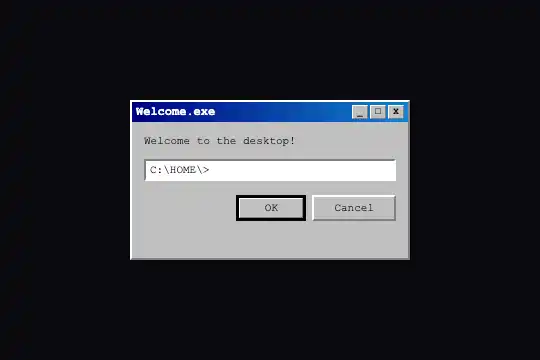
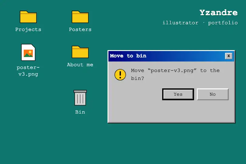
A small style kit in a 90s desktop look: bevelled grey window, blue gradient title bar, buttons that press in on click and a sunken input field.
Updated
This effect is part of Effect.Labs — 840 vanilla effects, some free, some premium. Distortion has 31 effects, including 5 free. Explore the category →
3 usage examples
How it works
Everything rests on two-colour borders. A "raised" surface has white top and left edges and grey bottom and right edges (border-color: #fff gray gray #fff); a "sunken" surface reverses the order. The .rdk-window (280 px, silver grey) is raised; the .rdk-input field is sunken; the .rdk-titlebar goes from navy to #1084d0.
The .rdk-btn buttons and the small .rdk-titlebar-btn title-bar buttons are raised. While pressed (:active), their borders flip; on .rdk-btn, the text also shifts one pixel down and right: the button seems to sink. The main .rdk-primary button has a 3 px black frame and an inner rim.
With the keyboard, focus shows as a black dotted line inside the button, as on desktops of the time (the old version removed every focus outline). It is a style kit without JavaScript: the buttons have no action of their own, it is up to you to wire them to your code. Combine window, buttons and field freely.
Accessibility
- Real controls: real
<button type="button">elements and a real<input>, reachable with Tab; Enter or Space activates them, and the pressed look also shows while Space is held. - Visible focus: black dotted line inside the buttons (
:focus-visible) and around the field (:focus). - Accessible names: the "_", "□", "X" buttons have an
aria-label(Minimize, Maximize, Close) and their symbol is hidden; the field hasaria-label="Command". Adapt those labels to your use. - No animation: nothing moves apart from pressing; the reduced-motion setting has nothing to remove.
Browser compatibility
CSS only, no dependency. The most recent feature is gap in a flex box (Chrome 84, Firefox 63, Safari 14.1 according to MDN data); the buttons' dotted focus uses :focus-visible (Chrome 86, Firefox 85, Safari 15.4). Measured in Chromium 151, Firefox 153 and WebKit 26.5: Tab reaches the buttons and the field with a dotted outline, two independent copies, fluid width up to 100 %.
Without :focus-visible, the buttons keep the browser's default focus outline instead of the dotted line. In Safari for Mac, Tab only stops on buttons when the "Press Tab to highlight each item" option is on (a browser setting).
The code
HTML structure to paste into your page (the CSS + JS come with your purchase):
<div class="fx-0279-root">
<div class="rdk-window">
<div class="rdk-titlebar">
<span>Welcome.exe</span>
<div class="rdk-titlebar-buttons">
<button type="button" class="rdk-titlebar-btn" aria-label="Minimize"><span aria-hidden="true">_</span></button>
<button type="button" class="rdk-titlebar-btn" aria-label="Maximize"><span aria-hidden="true">□</span></button>
<button type="button" class="rdk-titlebar-btn" aria-label="Close"><span aria-hidden="true">X</span></button>
</div>
</div>
<div class="rdk-body">
<p>Welcome to the desktop!</p>
<input class="rdk-input" type="text" value="C:\HOME\>" aria-label="Command">
<div class="rdk-btn-row">
<button type="button" class="rdk-btn rdk-primary">OK</button>
<button type="button" class="rdk-btn">Cancel</button>
</div>
</div>
</div>
</div>One-time payment, no subscription — the code is yours forever
Customize
Options passed to the API or data-* attributes:
| Option / property | Default | Effect |
|---|---|---|
Window width (CSS — --rdk-w) |
280 px | 100% fills the parent; add height: 100% on .rdk-window for a full-size window. |
Surface grey (CSS — --rdk-face) |
silver |
A warmer grey (#d4d0c8) recalls other desktops of the same era; window and buttons follow. |
Title bar (CSS — --rdk-title-a, --rdk-title-b) |
navy → #1084d0 |
Two brand colours; keep white text readable on the start colour. |
Font (CSS — --rdk-font) |
"Courier New", monospace |
A sans-serif font (sans-serif) looks closer to the original desktops. |
Elements (HTML — .rdk-titlebar-btn, .rdk-btn, .rdk-primary, .rdk-input) |
3 title buttons, OK, Cancel, one field | Remove what you do not need, duplicate the rest: each class keeps its style outside the window, as long as it stays inside .fx-0279-root. |
Accessible labels (HTML — aria-label) |
Minimize, Maximize, Close, Command | Replace them with what your buttons and field actually do. |
Demo frame (CSS — --rdk-page, --rdk-root-h) |
#0a0a0f, at least 300 px tall |
transparent and 0 drop the kit into your page. |
FAQ
closeBtn.addEventListener('click', () => win.hidden = true).<dialog> element opened with showModal(): the browser handles focus, the Escape key and the inert background. Give the <dialog> an aria-labelledby pointing to the title-bar text.