Radio Ripple
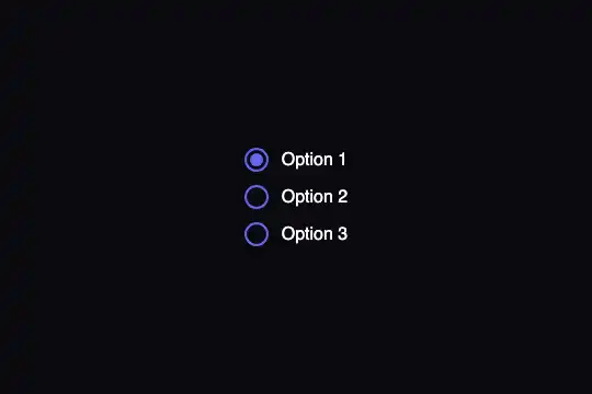
CSS-only radio buttons: the chosen option's dot pops in with a bounce and a light ripple spreads and fades around the circle, on real native radios.
Updated
This effect is part of Effect.Labs — 840 vanilla effects, some free, some premium. Forms has 20 effects, including 2 free. Explore the category →
3 usage examples
How it works
The group is a <fieldset class="rrp-group"> whose <legend> names the question (hidden from sight, read by screen readers). Each option is a <label class="rrp-option"> holding the real <input type="radio">, the drawn circle .rrp-circle (22 px, 2 px #6366f1 border) and its text. The radio is transparent and sits under the circle: it keeps the click, the focus, the arrow keys and form submission.
Two pseudo-elements make the animation. ::before is the centre dot: at scale(0) at rest, it goes to scale(1) when the radio is checked, in 0.3 s on a cubic-bezier(.68,-.55,.265,1.55) curve that makes it overshoot then settle. ::after is a 20% indigo disc reaching 8 px beyond the circle; on selection, the rrp-ripple animation (0.4 s) grows it from 0 to 1.5 times while fading it out: that is the ripple.
No JavaScript. The radios of one group share a name (here option): it is what allows a single choice, and what your server receives. The option checked in the HTML (checked) also plays its ripple on load.
Accessibility
- Real radios: Tab enters the group on the checked option, up / down arrows change the choice, a screen reader announces "Choose an option, group, Option 1, radio button, checked, 1 of 3".
- Group name: the fieldset's legend is read before the first option; write the real question in it ("Pick-up time slot").
- Visible focus: from the keyboard, an
#a5b4fcring surrounds the active option's circle (input:focus-visible + .rrp-circle). - Reduced motion: under
prefers-reduced-motion: reduce, the dot appears with no bounce and the ripple is not played. - Hit area: the whole row (circle and text) is clickable.
Browser compatibility
CSS only: :checked, pseudo-elements, @keyframes, inset (Chrome 87, Firefox 66, Safari 14.1). Measured in Chromium 151, Firefox 153 and WebKit 26.5 (Playwright): click, Tab then arrow down, touch at 390 px, reduced motion. The focus ring needs :focus-visible (Chrome 86, Firefox 85, Safari 15.4).
Without inset (browsers from 2020 and earlier), the dot and ripple are not drawn but the radios remain usable. Without :focus-visible, no ring from the keyboard.
The code
HTML structure to paste into your page (the CSS + JS come with your purchase):
<div class="fx-0296-root">
  <fieldset class="rrp-group">
    <legend class="rrp-legend">Choose an option</legend>
    <div class="rrp-list">
      <label class="rrp-option">
        <input type="radio" name="option" value="1" checked>
        <span class="rrp-circle" aria-hidden="true"></span>
        <span>Option 1</span>
      </label>
      <!-- Option 2, Option 3: same structure -->
    </div>
  </fieldset>
</div>One-time payment, no subscription — the code is yours forever
Customize
Options passed to the API or data-* attributes:
| Option / property | Default | Effect |
|---|---|---|
Colour (CSS — border-color of .rrp-circle, background of ::before and ::after) |
#6366f1, ripple rgba(99,102,241,.2) | Change all three together; keep the ripple very transparent (20 to 25%). |
Dot bounce (CSS — transition of .rrp-circle::before) |
.3s cubic-bezier(.68,-.55,.265,1.55) | ease-out for a dot that appears without overshooting. |
Ripple (CSS — @keyframes rrp-ripple and inset of ::after) |
0.4 s, from 0 to 1.5 times, 8 px overflow | Set inset to -14px and the duration to .6s for a wider, slower ripple. |
Circle size (CSS — .rrp-circle and the input) |
22px | Give the invisible input the same size to keep the hit area under the circle. |
Group name (HTML — name and <legend>) |
option · "Choose an option" | A different name per question; the legend can stay visible by removing the rrp-legend class. |
Demo frame (CSS — .fx-0296-root) |
min-height 300px, #0a0a0f background | Remove it in a real form: the text then takes the page's colour. |
FAQ
name, so the browser treats them as one group: only one radio can be checked across the page. Give each question its own name ("slot", "delivery"…); it is also what tells the answers apart on the server.checked. Then add required to one of the radios if an answer is mandatory: the browser will block the send..rrp-list to flex-direction: row with a gap; the left / right arrow keys work too.