Icon Bounce
An icon bounces in 5 steps (translateY: 0 → -12 → -4 → -8 → 0) over 0.5s on hover — text stays still, pure CSS @keyframes.
Updated
This effect is part of Effect.Labs — 840 vanilla effects, some free, some premium. Hover has 48 effects, including 5 free. Explore the category →
3 usage examples
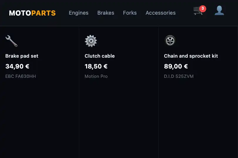
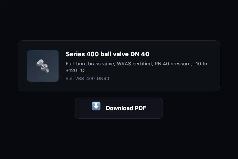
How it works
The .fx-0348-root wrapper centres a 200 px button in column layout (flex-direction: column). The icon (.ibc-icon) and label are two separate <span>s. At rest the icon is still. On hover, the ibc-bounce animation runs on the icon alone: 0.5 s, one iteration. Its five translateY steps (0 → -12 px → -4 px → -8 px → 0) produce a natural bounce — quick rise, partial rebound, second small hop, return. The text label stays fixed, unaffected.
The animation triggers on hover of the whole button, not just the icon, covering the natural hit area without depending on the cursor's exact position. :focus-visible triggers the same animation. Under reduced motion, the animation is explicitly suppressed — the icon stays still and the focus outline provides state feedback.
Accessibility
- Reduced motion: under
prefers-reduced-motion: reduce, theibc-bounceanimation is explicitly removed on hover and focus. The icon stays still. Focus state is communicated by the focus outline. - Keyboard: the element is a natively focusable
<button>.:focus-visibletriggers the icon bounce and adds a 2 px outline. - Icon role: the icon (
aria-hidden="true") is decorative; the text label carries the semantics. Screen readers do not announce the motion. - Touch: on touchscreens, a tap may not trigger the
:hoveranimation on all browsers. Functional interaction (click) does not depend on it.
Browser compatibility
Pure CSS. Properties: @keyframes, animation (1 iteration triggered on hover), :focus-visible. Verified in Chromium and Firefox: bounce visible, two independent copies, 0 errors. On browsers before 2021, :focus-visible is unavailable.
Without :focus-visible (before 2021), keyboard focus does not trigger the bounce.
The code
HTML structure to paste into your page (the CSS + JS come with your purchase):
<div class="fx-0348-root">
  <button class="ibc-box" type="button">
    <span class="ibc-icon" aria-hidden="true">🚀</span>
    <span>Your text</span>
  </button>
</div>One-time payment, no subscription — the code is yours forever
Customize
Options passed to the API or data-* attributes:
| Option / property | Default | Effect |
|---|---|---|
Icon (HTML — .ibc-icon) |
🚀 (emoji) | Replace with any emoji, inline SVG, or icon font (Font Awesome, Heroicons…). Size is controlled via font-size. |
Bounce height (CSS — -12px at peak) |
-12 px | -20px for a bigger bounce; -6px for a subtle nudge. Adjust all three values consistently: 40%, 70%, 85%. |
Duration (CSS — 0.5s) |
0.5 s | 0.3 s is snappier; 0.8 s gives a heavier, slower bounce. |
Layout (CSS — flex-direction: column) |
icon above label | Switch to flex-direction: row (icon to the left) and replace margin-bottom with margin-right on the icon. |
Iteration count (CSS — animation: ... 1) |
once on hover | Set to infinite for continuous bouncing (not recommended; mind reduced motion). |
FAQ
el.addEventListener('click', () => { el.classList.remove('ibc-clicked'); void el.offsetWidth; el.classList.add('ibc-clicked'); }) and bind the animation to .ibc-clicked .ibc-icon instead of :hover.animationend listener on the icon that resets the animation with animation: none followed by requestAnimationFrame..ibc-icon class to each icon. The animation applies to all elements carrying this class inside the button on hover. For staggered delays, add animation-delay to each icon individually.
