Morph on Click
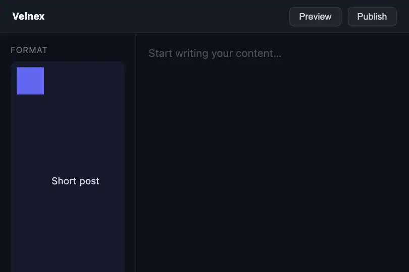
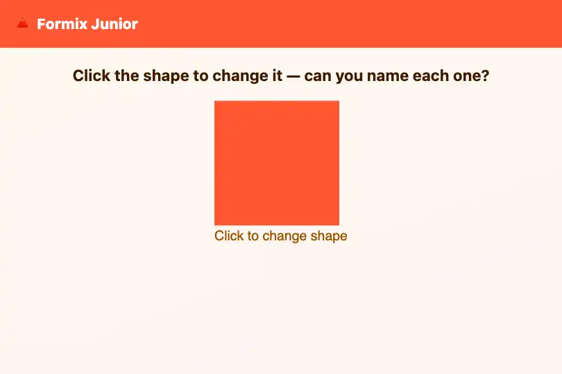
A div morphs its shape on each click via CSS clip-path transition: circle, diamond, rounded rect, triangle, back to circle — 5 shapes, infinite loop.
Updated
This effect is part of Effect.Labs — 840 vanilla effects, some free, some premium. Hover has 48 effects, including 5 free. Explore the category →
3 usage examples
How it works
The .fx-0376-root frame holds a .mph-shape element with tabindex="0" role="button" and a descriptive label. The script keeps a current index per instance (JavaScript closure — two instances on the same page are independent). On load, the index is 0 (circle) and the shape's clip-path is set to the circle value.
On click (or keydown Enter/Space), the index is incremented modulo 5 and clip-path is updated. The 5 shapes are defined as CSS clip-path values: circle (circle(50%)), diamond (polygon(50% 0%, 100% 50%, 50% 100%, 0% 50%)), rounded rectangle (inset + radius), triangle (polygon(50% 0%, 100% 100%, 0% 100%)). The CSS transition (clip-path 0.5s ease) interpolates the polygons: all shapes having the same number of points, the morphing is smooth.
Under prefers-reduced-motion: reduce, the transition is suppressed (transition: none !important): shapes change instantly on click. The functional effect (shape change) is preserved; only the animation is disabled.
Accessibility
- Keyboard: the element is focusable by Tab (
tabindex="0") and announced as a button (role="button"). Enter and Space trigger the shape change. - Reduced motion: under
prefers-reduced-motion: reduce, the shape change is instant — no transition. The functional behaviour is preserved. - Shape label: the element carries a static
aria-label("Shape — click to transform"). To inform assistive technologies of the active shape, add a dynamicaria-labelupdated on each click: "Circle — click to change shape". - No information encoded visually: if the active shape carries meaning (circle = type A, diamond = type B…), that information must also be conveyed through visible text or an updated
aria-label— shape alone is not enough for screen reader or keyboard navigation users.
Browser compatibility
CSS clip-path + 1 KB of JavaScript, no dependency. clip-path: polygon() available since Chrome 55, Firefox 54 and Safari 10. CSS transition on clip-path available since Chrome 55, Firefox 72 and Safari 13.1 — on Firefox 54-71, shape change is instant (no animated morphing). Measured in Chromium 151, Firefox 153 and WebKit 26: all transitions smooth in all three.
Without JavaScript, the element shows the initial shape (circle) without changing on click. On Firefox 54-71 (outside current scope), clip-path works but the transition is not animated: shapes change instantly.
The code
HTML structure to paste into your page (the CSS + JS come with your purchase):
<div class="fx-0376-root">
  <div class="mph-shape" tabindex="0" role="button" aria-label="Shape — click to transform">CLICK ME</div>
  <span class="mph-label" aria-hidden="true">Click to transform</span>
</div>One-time payment, no subscription — the code is yours forever
Customize
Options passed to the API or data-* attributes:
| Option / property | Default | Effect |
|---|---|---|
Shapes (CSS — clip-path arrays in JS) |
circle, diamond, rounded rectangle, triangle, (back to circle) — 5 shapes | Add or remove shapes in the JS array. For smooth morphing, all shapes must have the same number of polygon points; convert the circle and rounded rectangle to N-point polygons (where N is the point count of your most complex shapes). |
Transition duration (CSS — transition: clip-path 0.5s ease) |
0.5 s | Lower to 0.2 s for a snappy change; raise to 1 s for a slow transformation. |
Shape colour (CSS — background-color of .mph-shape) |
violet (#7c3aed) |
Add a transition on background-color and change the colour in JS per index to give each shape its own tint. |
Shape size (CSS — width and height of .mph-shape) |
120×120 px | Adjust freely. For a non-square aspect (elongated diamond, wide triangle), adapt the clip-path values accordingly. |
| Trigger (JS — events) | click + keyboard Enter/Space | To trigger on hover instead of click, replace click with mouseenter. For automatic cycling, use setInterval. |
FAQ
clip-path values to the JS array. For smooth morphing, each shape must have the same number of points; convert the circle and rounded rectangle to N-point polygons (where N is the point count of your most complex shapes).clip-path: circle(50%) and clip-path: polygon(...) are different value types; the browser cannot interpolate them directly. To animate between a circle and a polygon, express the circle as an N-point polygon uniformly distributed on a circle (clip-path: polygon(50% 0%, 60% 10%, ...)).localStorage: localStorage.setItem('mph-idx', idx) on each click, and read parseInt(localStorage.getItem('mph-idx') || '0') on load. Wrap accesses in try/catch since localStorage can be blocked in private browsing.
