Star Rating
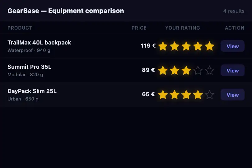
Five rating stars with dynamic hover preview: stars fill up to the cursor before the click is confirmed. Each clicked star pops with an elastic bounce. Full keyboard accessibility.
Updated
This effect is part of Effect.Labs — 840 vanilla effects, some free, some premium. Hover has 48 effects, including 5 free. Explore the category →
3 usage examples
How it works
The .fx-0367-root root (250 px tall, rgb(26, 26, 36) background) centers the star group in a .mi-star-group div with role="radiogroup" and aria-label="Rating out of 5". Each star is a div with role="radio", aria-checked="false", and a data-value attribute (1 to 5). Each star’s SVG (5-pointed polygon) starts as a grey outline (stroke visible, fill transparent).
On hover, the script adds the .hover class to all stars with a value less than or equal to the hovered star’s value: visually, all stars up to the cursor turn yellow. This is preview only; on mouse leave, stars return to the rated state (or all go grey if no rating has been given). On click, the script calls setRating(value): it removes .selected from all stars, adds it to stars with a value ≤ the clicked value, updates aria-checked (true on rated stars, false on others), and updates the summary label.
The click animation (@keyframes miStarPop) scales the star to 1.4× then returns to 1 with a cubic-bezier(0.17, 0.89, 0.32, 1.49) that gives the bounce. It applies only to the clicked star (not the whole row). Keyboard navigation uses the roving tabindex: only the active star has tabindex="0", others have tabindex="-1". Left/right arrows move focus and give the rating; Enter/Space confirm the rating on the focused star.
Accessibility
- Radiogroup role: the star group uses
role="radiogroup"and each star hasrole="radio"witharia-checked. A screen reader announces the row as a group of radio buttons and reports each star’s selected state. - Keyboard: Tab reaches the active star, left/right arrows navigate between stars updating focus (roving tabindex). Enter or Space confirms the rating on the focused star. No mouse is needed to rate.
- Reduced motion: under
prefers-reduced-motion: reduce, the pop animation (@keyframes miStarPop) is disabled. Color transitions on stars remain active: hover and rated states remain visually clear. - Summary label: an adjacent
spandisplays the chosen rating as text (e.g. 4 stars out of 5). This text is read by screen readers and allows color-blind users to confirm their rating.
Browser compatibility
CSS (animations, SVG transitions) + 0.8 KB of JavaScript (querySelectorAll, addEventListener, roving tabindex, matchMedia), no dependency. Verified in Chromium 151: hover preview, click rating, arrow keyboard navigation, aria-checked updated, pop only on the clicked star, two independent copies, reduced-motion without pop, 0 errors.
Without JavaScript, stars are static. Without CSS transitions, stars change color instantly with no animation. On mobile touchscreens, there is no hover; a tap gives the rating directly.
The code
HTML structure to paste into your page (the CSS + JS come with your purchase):
<div class="fx-0367-root">
  <div class="mi-star-scene">
    <div class="mi-star-group" role="radiogroup" aria-label="Rating out of 5">
      <div class="mi-star" role="radio" aria-checked="false" tabindex="0" data-value="1">
        <svg viewBox="0 0 24 24"><polygon points="12 2 15.09 8.26 22 9.27 17 14.14 18.18 21.02 12 17.77 5.82 21.02 7 14.14 2 9.27 8.91 8.26 12 2"></polygon></svg>
      </div>
      <!-- repeat for stars 2–5 with tabindex="-1" -->
    </div>
    <span class="mi-star-label">No rating</span>
  </div>
</div>One-time payment, no subscription — the code is yours forever
Customize
Options passed to the API or data-* attributes:
| Option / property | Default | Effect |
|---|---|---|
Rated stars color (CSS — fill and stroke on .mi-star.selected svg and .mi-star.hover svg) |
Yellow #fbbf24 |
Switch to orange (#f97316) for a warmer feel, or violet (#8b5cf6) for a specific brand. Hover preview and rated colors should match. |
Number of stars (HTML — number of .mi-star divs in the group) |
5 stars | Switch to 10 for finer granularity, or 3 for a simple rating. Update the data-value attributes (1, 2, 3…) and the group’s aria-label (Rating out of 10). |
Star size (CSS — width / height of .mi-star) |
32 px | Reduce to 24 px for a compact row in a table; enlarge to 48 px for a prominent standalone use. |
Summary label (HTML — span.mi-star-label) |
No rating | The script updates this text via label.textContent. Adapt the base message and rating format (e.g. 3.5 / 5). |
FAQ
click event). The preview is a desktop-only feature. On mobile, the rating is given in one tap, which remains usable.setRating(0) (no stars selected). The script then removes all .selected classes and sets all aria-checked to false.
