Switch with Icons
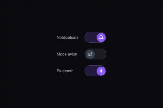
Toggle switches with an SVG icon inside the knob: the icon changes on toggle (sun/moon, sound/mute, on/off). The knob slides with an elastic overshoot. Keyboard and screen-reader accessible.
Updated
This effect is part of Effect.Labs — 840 vanilla effects, some free, some premium. Hover has 48 effects, including 5 free. Explore the category →
3 usage examples
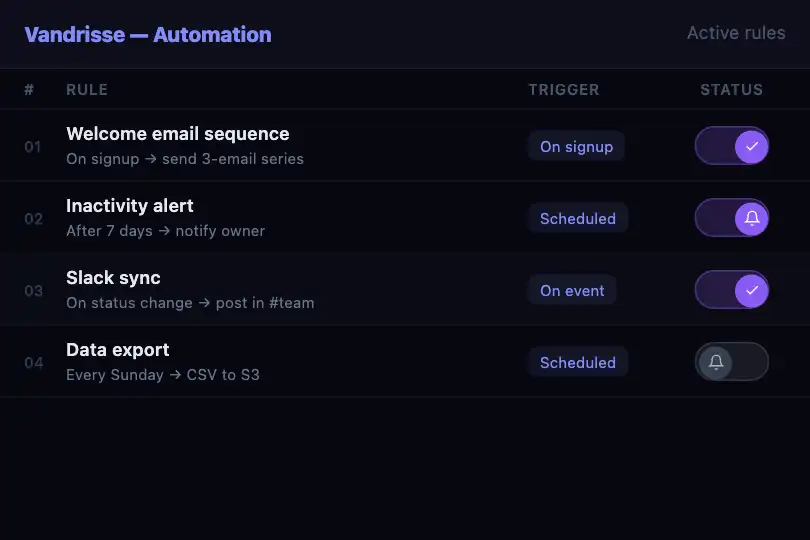
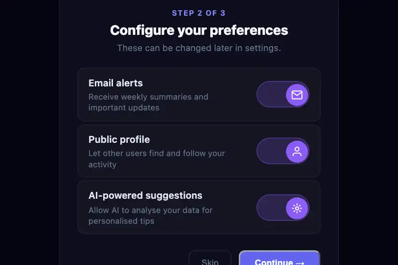
How it works
The .fx-0368-root root (250 px tall, rgb(26, 26, 36) background) centers three settings rows in .mi-switch-scene. Each row is made up of a span.mi-switch-label and a div.mi-switch toggle. The switch (80×40 px, rounded corners) holds a div.mi-switch-knob (32×32 px) containing an icon SVG. The knob moves from 4 px (off state) to 44 px (on state) via the CSS left property. The transition (cubic-bezier(0.34, 1.56, 0.64, 1), 0.3 s) gives a slight rightward overshoot before settling, creating a rubber-band feel.
Each switch has role="switch", aria-checked (true or false), and tabindex="0". The script reads the neighboring label’s text to dynamically build the switch’s aria-label: a switch preceded by the label Notifications receives aria-label="Notifications". This avoids static IDs that would duplicate when two copies of the component are on the same page. On click or Space/Enter keypress, the script toggles the .on class and updates aria-checked.
Each icon SVG has two CSS states: the off-state icon is visible when .on is absent, and vice versa. The icon change happens via a 0.2 s opacity transition. Both icons are in the DOM simultaneously; their swap is handled entirely in CSS via the .mi-switch:not(.on) and .mi-switch.on selectors. No DOM manipulation is needed for the icon change.
Accessibility
- Switch role: each toggle has
role="switch"andaria-checked. Screen readers announce it as a switch and report its state (on / off). - Keyboard: Tab reaches each switch (roving tabindex between rows), Space or Enter toggles it. The focus outline (
:focus-visible) is visible on keyboard navigation. - Dynamic label: the
aria-labelis built from the neighboringspan.mi-switch-labeltext by JavaScript. This approach works with two copies of the component on the same page without duplicate IDs. - Reduced motion: under
prefers-reduced-motion: reduce, knob movement is instant (thelefttransition is removed); background color and icon transitions stay active over 0.15 s.
Browser compatibility
CSS (transitions on left, background-color, opacity) + 0.4 KB of JavaScript (classList, setAttribute, keydown), no dependency. Verified in Chromium 151: three independent switches, aria-checked updated, aria-label built from neighboring label, two independent component copies, reduced-motion without sliding, 0 errors.
Without JavaScript, switches are visually correct but do not toggle on click. Without CSS transitions, the knob moves and the icon changes instantly.
The code
HTML structure to paste into your page (the CSS + JS come with your purchase):
<div class="fx-0368-root">
  <div class="mi-switch-scene">
    <div class="mi-switch-row">
      <span class="mi-switch-label">Notifications</span>
      <div class="mi-switch on" role="switch" aria-checked="true" tabindex="0">
        <div class="mi-switch-knob">
          <!-- SVG icon for on state -->
        </div>
      </div>
    </div>
  </div>
</div>One-time payment, no subscription — the code is yours forever
Customize
Options passed to the API or data-* attributes:
| Option / property | Default | Effect |
|---|---|---|
Icons in the knobs (HTML — SVG inside .mi-switch-knob) |
Sun/moon, sound/mute, check/cross | Replace the SVGs with any pair of 16 px icons. Keep both SVGs in the knob (one per state); CSS handles their display via .mi-switch:not(.on) and .mi-switch.on. |
Active background color (CSS — background on .mi-switch.on) |
Violet #6366f1 |
Switch to green (#10b981) for an activation toggle, or red (#ef4444) for a critical disableable function. The knob color at rest (.mi-switch-knob) can stay white regardless of the background color. |
Knob bounce (CSS — cubic-bezier of the left transition) |
cubic-bezier(0.34, 1.56, 0.64, 1) |
ease-out gives a smooth slide with no bounce. Raise the second parameter above 1.5 for a more pronounced rebound. |
Initial state (HTML — .on class on .mi-switch) |
Notifications ON, Dark mode OFF, Sound ON | Add or remove the .on class in the HTML to set each switch’s initial state. The JS reads the initial state and sets aria-checked accordingly. |
FAQ
sw.classList.contains('on') and call your logic (e.g. document.body.classList.toggle('dark-theme')). The current script only toggles the visual and ARIA state..disabled class to the .mi-switch div and check for it at the start of the handler to ignore the click. Also add aria-disabled="true" and remove tabindex so screen readers announce it as unavailable..mi-switch-knob. Background and knob transitions work identically. Without an icon, the adjacent text label (span.mi-switch-label) becomes even more important to indicate what the switch controls.
