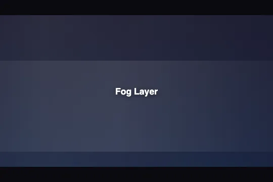
Fog Layer
Two CSS pseudo-elements drift in opposite directions over a 200% track to simulate seamlessly looping semi-transparent fog — pure CSS, zero JavaScript.
Updated
This effect is part of Effect.Labs — 840 vanilla effects, some free, some premium. Atmosphere has 58 effects, including 10 free. Explore the category →
3 usage examples


How it works
.fog-container::before and ::after produce two independent fog layers. Each layer is a virtual rectangle 200% wide positioned at left: -50% of its parent — an offset of exactly one container width. The @keyframes fogDrift animation applies translateX(-25%) → translateX(25%), moving the element by 50% of its own width — one full container width side to side. Paired with a symmetric horizontal gradient (transparent at both edges), the loop is invisible to the eye.
The horizontal gradient on each layer simulates fog density: transparent at the edges, peaking at the center with white opacity (rgba(255,255,255,.08) for ::before, .10 for ::after). Values are kept deliberately close to full transparency — the look is misty, not opaque.
Depth comes from two differences between the layers: ::before covers 100% of the height and moves at 8s linear infinite; ::after covers only 60% of the height starting at top: 30% (a denser fog bank concentrated in the mid section), runs at 12s linear infinite reverse with a -4s delay. The opposite direction and different speed produce a crossing drift that gives the illusion of three-dimensional volume.
Accessibility
- prefers-reduced-motion not implemented: the effect does not read the system motion preference — animations run continuously regardless of OS settings. For accessible contexts, add your own override:
@media (prefers-reduced-motion: reduce) { .fog-container::before, .fog-container::after { animation: none; } }. - The
.fog-containercarries no ARIA role in the delivered code — for purely decorative use, addaria-hidden="true"on the element so screen readers skip the animated pseudo-elements. - The overlay content (
.fog-content) isposition: relative; z-index: 3and stays in the normal flow — screen readers reach it without obstruction. - Contrast: the fog layers are very faint (max 10% opacity) on a dark background — they neither improve nor degrade text contrast; verify your text/background ratio independently of the effect.
- No keyboard or pointer interaction is handled — no focus trap, no event listeners, zero impact on page navigation.
Browser compatibility
Requires CSS animation, linear-gradient, and pseudo-elements — supported in all modern browsers since 2012. Zero external dependencies.
On a very old browser without animation support, .fog-container remains visible with its static background gradient — no JS errors (there is no JS), overlay content is intact.
The code
HTML structure to paste into your page (the CSS + JS come with Premium):
<div class="demo-preview">
  <div class="fog-container">
    <!-- ::before and ::after pseudo-elements handled entirely by CSS -->
  </div>
  <!-- overlay content (optional) -->
  <span class="fog-content">Your text</span>
</div>The full HTML + CSS + JS of Fog Layer, ready to paste — plus all 840 effects. Or $299 once, lifetime access.
Customize
Options passed to the API or data-* attributes:
| Option / property | Default | Effect |
|---|---|---|
| animation-duration on ::before | 8s | Speed of the first fog layer. 5s = agitated mist; 20s = very slow, calming drift. |
| animation-duration on ::after | 12s | Speed of the second (lower) layer. Keep the ratio ≠ 1 with the first to avoid synchronization that breaks the depth illusion. |
| animation-delay on ::after | -4s | Phase offset for the second layer. A negative value starts it mid-cycle immediately — change it to shift the fog's visible position at load time. |
| rgba opacity in ::before gradient | 0.03 / 0.08 / 0.05 / 0.02 | Density of the first fog layer. Raise all values evenly (e.g. 0.06/0.16/0.10/0.04) for thick fog; lower them for near-invisible haze. |
| height and top on ::after | 60% / top 30% | Height and vertical position of the second layer. Use top: 50%; height: 50% to concentrate dense fog in the lower half, or top: 0; height: 100% for two full-height layers. |
| background on .fog-container | linear-gradient(#1a1a2e → #16213e) | Scene background color. Replace with your brand gradient — the white fog layers work over any tint. |
| animation-direction on ::after | reverse | Remove reverse to make both layers drift in the same direction — creates a wind or current effect rather than a crossing swirl. |
FAQ
left: -50%. The animation moves each layer translateX(-25%) to +25% of its own width — exactly one container width side to side. Because the horizontal gradient is symmetric (transparent at both edges), the wrap from end to start of the cycle is completely seamless.rgba(255,255,255,…) with rgba(R,G,B,…) in the gradients of both pseudo-elements — e.g. rgba(100,160,255,0.10) for an icy blue fog. Also update the background of .fog-container so the background tint is consistent with the fog color.


