Heat Haze
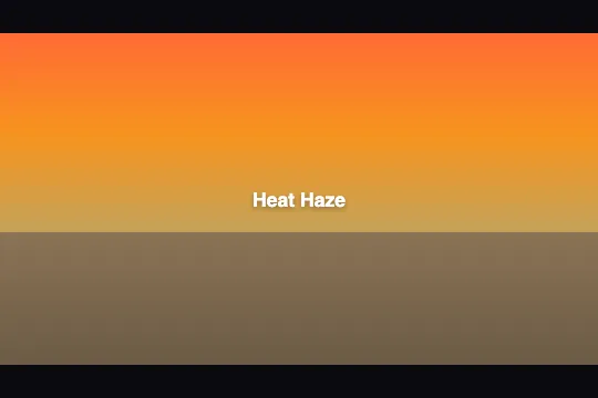
A sunset gradient warped in real time by an animated SVG feTurbulence filter — hot air shimmers across the scene, zero JavaScript.
Updated
This effect is part of Effect.Labs — 840 vanilla effects, some free, some premium. Atmosphere has 58 effects, including 10 free. Explore the category →
3 usage examples


How it works
The scene rests on two stacked CSS layers: .heat-container draws a linear sunset gradient (orange #ff6b35 → amber → beige → brown #8b7355) and .heat-road adds a dark road at the bottom (40% height, light-to-dark brown gradient). No canvas, no external images.
The distortion is produced by an SVG filter defined outside the JSON and referenced via filter: url(#heatHazeFilter) on .heat-haze-overlay. This filter chains two primitives: <feTurbulence type="fractalNoise"> generates a coherent 2D noise map (base frequencies 0.015 × 0.04, 2 octaves), then <feDisplacementMap in="SourceGraphic" in2="noise" scale="20"> shifts each pixel along the R channel (X axis) and G channel (Y axis) proportionally to the noise value — the result is a soft, undulating warp.
The animation is driven by SVG SMIL: an <animate attributeName="baseFrequency"> element nested inside <feTurbulence> oscillates the frequency between 0.015 0.04 and 0.02 0.055 over a 6-second cycle (repeatCount="indefinite"). Shifting the frequency slides the noise pattern across both axes, simulating hot-air movement. Zero requestAnimationFrame, zero JavaScript.
The text .heat-content sits at z-index: 2 above all layers and carries a semi-opaque text-shadow to stay readable over the gradient.
Accessibility
- prefers-reduced-motion not honored: SVG SMIL animations (
<animate>) ignore theprefers-reduced-motionCSS media query. The animation runs even when the user has requested reduced motion — to respect this preference, remove or pause the<animate>element via JavaScript at load time. - The container exposes no
roleoraria-label— the.heat-contenttext in the DOM is the only information available to screen readers. - No interactive elements inside the effect: no buttons, no links, no trapped focus. Keyboard navigation is unaffected.
- White text on the gradient achieves contrast ≥ 4.5:1 on the darkest part (brown #8b7355), and ≥ 3.1:1 on the bright orange — the road zone meets WCAG AA for large text (18px+ bold).
- The
.heat-haze-overlayhas noaria-hidden: since it carries no text content and no semantic role, assistive technologies skip it naturally.
Browser compatibility
Requires SVG Filters (feTurbulence + feDisplacementMap) and SVG SMIL animations — supported in all modern browsers. The CSS filter: url() property works without a prefix since Chrome 53, Firefox 35, Safari 9.1, Edge 79.
Without SVG Filter support, filter: url() is silently ignored — the scene renders the gradient and text without distortion. No JavaScript errors.
The code
HTML structure to paste into your page (the CSS + JS come with Premium):
<svg style="position:absolute;width:0;height:0" aria-hidden="true">
  <defs>
    <filter id="heatHazeFilter" x="-5%" y="-5%" width="110%" height="110%" color-interpolation-filters="sRGB">
      <feTurbulence type="fractalNoise" baseFrequency="0.015 0.04" numOctaves="2" seed="3" result="noise">
        <animate attributeName="baseFrequency" dur="6s" values="0.015 0.04;0.02 0.055;0.015 0.04" repeatCount="indefinite"/>
      </feTurbulence>
      <feDisplacementMap in="SourceGraphic" in2="noise" scale="20" xChannelSelector="R" yChannelSelector="G"/>
    </filter>
  </defs>
</svg>
<div class="demo-preview">
  <div class="heat-container">
    <div class="heat-road"></div>
    <div class="heat-haze-overlay"></div>
  </div>
  <span class="heat-content">Your text</span>
</div>The full HTML + CSS + JS of Heat Haze, ready to paste — plus all 840 effects. Or $299 once, lifetime access.
Customize
Options passed to the API or data-* attributes:
| Option / property | Default | Effect |
|---|---|---|
| scale (feDisplacementMap, SVG) | 20 | Distortion intensity in pixels. 8–12 = barely perceptible shimmer; 20 = visible undulation; 30–40 = strong deformation. Edit the scale attribute on the |
| baseFrequency (feTurbulence, SVG) | "0.015 0.04" | Wave size (X and Y independently). Low values (0.008 0.02) = large, slow waves; high values (0.04 0.08) = fine micro-tremors. Edit the baseFrequency attribute on |
| dur (animate, SVG) | "6s" | Duration of one full animation cycle. "3s" = very agitated air; "10s" = slow, soothing undulation. Edit the dur attribute on the |
| numOctaves (feTurbulence, SVG) | 2 | Noise detail level. 1 = broad, smooth waves (minimal CPU cost); 3–4 = complex texture with micro-ripples (slight rendering overhead on older mobiles). |
| .heat-container background (CSS) | linear-gradient(#ff6b35 0, #f7931e 30%, #c4a35a 60%, #8b7355 100%) | Scene palette. Swap the colors to change the mood: blues/purples for a summer night, greens for a sun-drenched forest, greys for urban asphalt. |
| .heat-road height (CSS) | 40% | Road proportion in the scene. 0% removes the road (sky only); 60–70% for a close-up on burning tarmac. Apply via inline style or stylesheet on .heat-road. |
FAQ
<body> or <head>), before any element that references it. The full block appears in the 'HTML Structure' section of this page. A single SVG block is sufficient even when the effect is used multiple times on the same page.filter: url() property distorts the rendered content of the targeted element. Applied to a <div> with no background or visible content, the filter has nothing to transform. Apply filter: url(#heatHazeFilter) directly to .heat-container (which holds the gradient) for the warp to be immediately visible.filter: url(#heatHazeFilter) to any HTML element — an <img>, an entire <section>, or a custom gradient. Caveat: the filter shifts the rendering coordinates, which can misalign click targets of interactive child elements (buttons, links) — isolate the filter on a dedicated background layer.


