Liquid Button
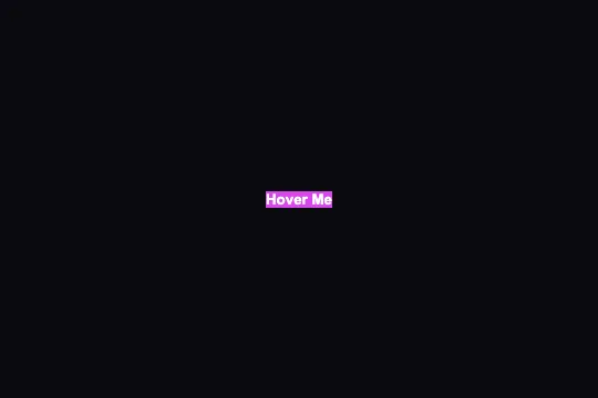
Pure-CSS liquid fill: a circular pseudo-element expands from center on hover, turning the button's color into a fluid wave — zero JavaScript.
Updated
This effect is part of Effect.Labs — 840 vanilla effects, some free, some premium. Atmosphere has 58 effects, including 10 free. Explore the category →
3 usage examples

How it works
The effect relies entirely on a ::before pseudo-element positioned absolutely at the button's center (top:50%; left:50%; transform:translate(-50%,-50%)). At rest it measures 0×0 px and is invisible. On :hover, it grows to 300×300 px with border-radius:50%: the circle expands from the center, and its overflow is clipped by overflow:hidden on the parent button — creating the illusion of a liquid fill rising inside.
Two independent CSS transitions overlap: transition:.3s on .liquid-btn covers property changes on the button itself, while transition:.5s on the ::before controls the circle's expansion. The label text lives in a <span> with position:relative; z-index:1 to stay above the fill throughout the animation.
The effect writes nothing to the DOM, starts no requestAnimationFrame, and exposes no JavaScript API — it is pure declarative CSS. Modern browsers GPU-accelerate width/height transitions via compositing, keeping the animation smooth at negligible CPU cost. Padding and border-radius use custom properties (--space-4, --space-8, --radius-lg) defined on :root.
Accessibility
- No prefers-reduced-motion in the code: the fill animation always plays on hover regardless of the OS motion setting. For sensitive users, add
@media (prefers-reduced-motion:reduce) { .liquid-btn::before { transition:none } }. - The native
<button>element is keyboard-focusable (Tab) and activatable with Enter or Space — no additional configuration needed. - No
:focus-visiblering is defined in the code; the browser applies its default outline (may be barely visible on some OS/themes). Recommended: add.liquid-btn:focus-visible { outline:2px solid #818cf8; outline-offset:2px }. - White text on
#6366f1(indigo) contrast ratio ≈ 3.9:1 — passes WCAG AA for large text (≥ 18 pt) but fails for body-size text (< 18 pt). Adjust the background color or font weight if needed. overflow:hiddenon the button clips the pseudo-element precisely to the border radius — no visual leakage regardless of button size.
Browser compatibility
Requires only ::before, transition, border-radius, and overflow:hidden — available from CSS2/3 in all modern browsers.
Without pseudo-element support (very old browsers), the button displays normally with its indigo background — no errors, no JavaScript involved.
The code
HTML structure to paste into your page (the CSS + JS come with Premium):
<button class="liquid-btn">
  <span>Button label</span>
</button>The full HTML + CSS + JS of Liquid Button, ready to paste — plus all 840 effects. Or $299 once, lifetime access.
Customize
Options passed to the API or data-* attributes:
| Option / property | Default | Effect |
|---|---|---|
| background on .liquid-btn | #6366f1 | Initial button color. Replace with your brand color — the fill color should contrast with it. |
| background on .liquid-btn::before | #d946ef | Color of the liquid circle on hover. Choose a complementary or analogous color for a harmonious effect. |
| --radius-lg (CSS var on :root) | 0.75rem | Button border-radius. Set to 100px for a pill shape, 0 for a sharp rectangle. |
| --space-4 / --space-8 (CSS vars on :root) | 1rem / 2rem | Vertical / horizontal button padding. Increase for a hero CTA, reduce for a compact context. |
| transition on .liquid-btn::before | .5s | Fill expansion duration. .3s = snappy response, .8s = slow and dramatic reveal. |
| width / height on .liquid-btn:hover::before | 300px | Maximum diameter of the liquid circle. Increase to 400px or more if your button exceeds 250 px width — otherwise corners remain unfilled. |
| z-index on .liquid-btn span | 1 | Keeps the label above the fill. Do not go below 1 or the text will disappear during the animation. |
FAQ
::before pseudo-element, a transition on width and height, and overflow:hidden for clipping. No script is loaded, no npm dependency. Drop the CSS into any framework (React, Vue, Svelte) — it just works.prefers-reduced-motion clause natively. Add this CSS block after the effect: @media (prefers-reduced-motion:reduce) { .liquid-btn::before { transition:none; width:100%; height:100%; border-radius:0; opacity:.15; } }. This disables the animation and shows a subtle static tint instead.width and height on .liquid-btn:hover::before are fixed at 300 px. If your button is wider (e.g. full-width), the circle won't cover the corners. Calculate the button's diagonal (Math.sqrt(w²+h²)) and use that value as the diameter. Alternatively, replace the width/height expansion with a transform approach: transform:translate(-50%,-50%) scale(4) on hover is more robust for variable-size buttons.


