Particle Explosion
30 particles burst in a full circle from a button's center on click — Web Animations API, cubic-bezier easing, 7 vivid colors, no canvas.
Updated
This effect is part of Effect.Labs — 840 vanilla effects, some free, some premium. Atmosphere has 58 effects, including 10 free. Explore the category →
3 usage examples

How it works
On click, the code computes the button's center in the container's coordinate space via getBoundingClientRect(), then creates 30 <div> elements positioned at that origin. Each particle receives a start angle evenly distributed over 360° ((Math.PI × 2 / 30) × i) — the symmetry is mathematical, not random: particles form a perfect ring.
Motion is handled by the Web Animations API (element.animate()) with no canvas or manual RAF. Translation vector: (cos(angle) × velocity, sin(angle) × velocity) where velocity = 80 + Math.random() × 80 px (range 80–160 px). Opacity drops from 1 to 0 and the scale transform from 1 to 0 simultaneously — particles shrink and fade as they fly outward.
The cubic-bezier(0, 0.5, 0.5, 1) easing produces a sharp initial burst followed by gradual deceleration: high gradient at the start simulates kinetic energy, then slows toward the end. Duration varies from 600 to 1 000 ms per particle (randomised with Math.random()), creating a natural trailing spread between the fastest and slowest particles.
Each particle is removed from the DOM via onfinish at the end of its animation — zero memory accumulation. The 7 colors (#6366f1, #8b5cf6, #d946ef, #f43f5e, #f59e0b, #22c55e, #06b6d4) are picked at random per particle. The effect is burst-safe: each click creates 30 new independent elements regardless of ongoing animations.
Accessibility
- No prefers-reduced-motion check: the effect does not query the system preference — the explosion always fires on click. Implement manually (skip the
forloop or reduce to 5 slow particles) if your audience includes motion-sensitive users. - The trigger is a native
<button>: keyboard-focusable (Tab), activatable with Space or Enter, exposed to screen readers without extra ARIA. - The particle container has no
aria-hiddenorrole: ephemeral<div>s may generate noise in the accessibility tree on the most verbose screen readers. Addaria-hidden="true"to the container if particles should not be announced. - Shipped button text contrast: white over the
#f43f5e → #f59e0bgradient, ratio ~3.2:1 — below WCAG AA (4.5:1) for normal-weight body text. Fix for production: use a darker background or ≥ 18 pt text. - The effect is fully DOM-based (no canvas, no WebGL): no opaque graphical surface hides underlying text content.
Browser compatibility
Uses the Web Animations API (element.animate()) and getBoundingClientRect() — no canvas, no WebGL, no manual RAF.
Without Web Animations API support (IE 11, Safari < 13.1), particles are created but stay in place — no fatal JS error. The onfinish callback does not fire, so divs accumulate in the DOM. Add setTimeout(el.remove.bind(el), 1200) on each particle for cleanup if IE support is required.
The code
HTML structure to paste into your page (the CSS + JS come with Premium):
<div class="demo-preview">
  <div class="explosion-container" id="explosionContainer">
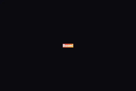
    <button class="explosion-btn" id="explosionBtn">Boom!</button>
  </div>
</div>The full HTML + CSS + JS of Particle Explosion, ready to paste — plus all 840 effects. Or $299 once, lifetime access.
Customize
Options passed to the API or data-* attributes:
| Option / property | Default | Effect |
|---|---|---|
| colors (array, JS line 2) | ['#6366f1','#8b5cf6','#d946ef','#f43f5e','#f59e0b','#22c55e','#06b6d4'] | Replace the 7 hex values with your palette. Each particle randomly picks one color from this array at creation time. |
| Particle count (for loop, i < 30) | 30 | Increase to 50–80 for a denser, more spectacular burst; drop to 10–15 for a subtle effect. DOM load is proportional to the count. |
| velocity (80 + Math.random() * 80) | 80–160 px | First term = minimum radius (80 px), second = random amplitude (+80 px max). Widen the range (e.g. 60 + random * 160) for a more explosive and irregular spread. |
| duration (600 + Math.random() * 400) | 600–1 000 ms | Each particle's lifetime. Reduce to 300–500 ms for a snappy burst; increase to 900–1 400 ms for a slower, floatier effect. |
| easing (cubic-bezier(0, 0.5, 0.5, 1)) | cubic-bezier(0, 0.5, 0.5, 1) | Deceleration curve per particle. ease-out gives a similar result; linear removes deceleration for a mechanical, uniform look. |
| .explosion-particle (CSS to add) | Not defined in the shipped CSS | Define particle size and shape. Circle: border-radius:50%. Square: border-radius:0. Diamond: add transform:rotate(45deg) to the start keyframe. Recommended size: 6–12 px. |
FAQ
.explosion-particle (no size, no position: absolute). Add at minimum: .explosion-particle { position: absolute; width: 8px; height: 8px; border-radius: 50%; pointer-events: none; } and ensure the parent container has position: relative or absolute.onfinish removes them after the animation ends. There is no lock-out: multiple explosions can stack in quick succession. Edge case: very rapid clicking (100+ times) briefly creates 3 000 simultaneous elements — add a 300 ms debounce if needed.rect / containerRect calculation with your desired coordinates in the container's space: e.g. e.clientX - containerRect.left to follow the cursor, or fixed values to centre the burst. The particle creation logic is position-agnostic — only startX and startY change.


