Ripple Effect


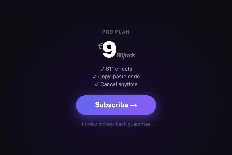
Material Design circular wave from the click point — zero rAF, relative positioning, pure CSS scale+opacity animation, auto-cleanup on animationend.
Updated

This effect is part of Effect.Labs — 840 vanilla effects, some free, some premium. Atmosphere has 58 effects, including 10 free. Explore the category →
3 usage examples
How it works
On click, getBoundingClientRect() converts screen coordinates (clientX/Y) into container-local coordinates. Subtracting clientX - rect.left gives the exact position even when the container has CSS transforms or the page is scrolled.
A <div class="ripple"> is created and inserted at those coordinates. Its size is set to 100 × 100 px directly in JS; it is centered on the click point via marginLeft: -50px; marginTop: -50px. The container carries overflow: hidden — the wave is clipped to its edges, creating the illusion that it emerges from inside the component.
The entire animation is driven by a CSS keyframe (scale(0) → scale(N) + opacity 0.4 → 0): no requestAnimationFrame runs, no JS loop is launched. The main thread is not blocked. Multiple rapid clicks create multiple independent .ripple elements in the DOM simultaneously.
The animationend listener removes the element from the DOM as soon as the keyframe ends — no timer, no manual cleanup. Note: the .ripple class and its keyframe are not defined in the provided CSS (they lived on the host page); add them to your stylesheet. .ripple elements also need pointer-events: none to avoid capturing subsequent clicks.
Accessibility
- prefers-reduced-motion absent: the code does not check the system preference — the animation always runs. Add
@media (prefers-reduced-motion: reduce) { .ripple { animation-duration: 0.01ms !important; } }soanimationendfires near-instantly without leaving the element stuck in the DOM. - The
.ripple-containerhascursor: pointerbut neithertabindex="0"norrole="button"— not keyboard-activatable as provided. Add both attributes and akeydownlistener for Enter/Space if the element is interactive. - No
aria-labelon the container in the original code. If the inner text does not describe the action clearly, add an explicit ARIA label. - Injected
.rippleelements do not carrypointer-events: nonein the provided CSS — add it to prevent in-flight waves from capturing subsequent clicks. - The default
#12121abackground with white text exceeds WCAG AA (ratio > 10:1) — no contrast issue on the default configuration.
Browser compatibility
Uses getBoundingClientRect(), addEventListener('animationend'), and DOM manipulation — universally supported since Chrome 43 / Firefox 43 / Safari 9.
If CSS animations are unsupported, animationend never fires and .ripple elements stay in the DOM. Add a fallback setTimeout at 1 s to remove them.
The code
HTML structure to paste into your page (the CSS + JS come with Premium):
<div class="ripple-container" id="rippleContainer">
  <!-- Component content (text, icon, label) -->
  Click here
  <!-- <div class="ripple"> elements are injected by JS on click and removed on animationend -->
</div>The full HTML + CSS + JS of Ripple Effect, ready to paste — plus all 840 effects. Or $299 once, lifetime access.
Customize
Options passed to the API or data-* attributes:
| Option / property | Default | Effect |
|---|---|---|
| background (CSS .ripple) | rgba(255,255,255,0.4) | Wave color and opacity. Use your brand color with opacity 0.2–0.5 depending on background contrast. |
| animation-duration (CSS .ripple) | ~0.6s | Expansion duration. 0.4s = snappy (CTA button), 0.8–1s = organic (hero, large surfaces). |
| to { transform: scale(N) } (CSS @keyframes) | 4 | Final expansion factor. Calibrate to container size: N ≈ (2 × container diagonal) ÷ 100 to have the wave cover the entire surface. |
| ripple.style.width / height (JS lines 7–8) | 100px | Initial disc size. Larger values soften the wave start; smaller values make it more pinpoint. Always keep marginLeft = marginTop = -(size / 2). |
| animation-timing-function (CSS .ripple) | ease-out | Expansion easing. ease-out = fast start, gentle end (Material Design). cubic-bezier(0.4,0,0.2,1) = Material standard curve. |
| border-radius (CSS .ripple) | 50% | Wave shape. 50% = perfect circle. Lower values produce a rounded diamond; 0 = square geometric wave. |
FAQ
.ripple element in the container. Multiple rapid clicks generate overlapping waves — each self-removes on its own animationend.@media (prefers-reduced-motion: reduce) { .ripple { animation-duration: 0.01ms !important; } }. The wave ends near-instantly, animationend still fires and cleans up the DOM. No JS changes needed.position: relative; overflow: hidden to the <button> — native behavior (focus, keyboard, submit) is preserved since the effect only inserts a child element and does not manipulate events.


