Gradient Mask Fade
A block whose centre stays sharp while its edges dissolve into the page, through a radial mask: grid, image or interface, no animation.
Updated

This effect is part of Effect.Labs — 840 vanilla effects, some free, some premium. SVG has 30 effects, including 3 free. Explore the category →
3 usage examples


How it works
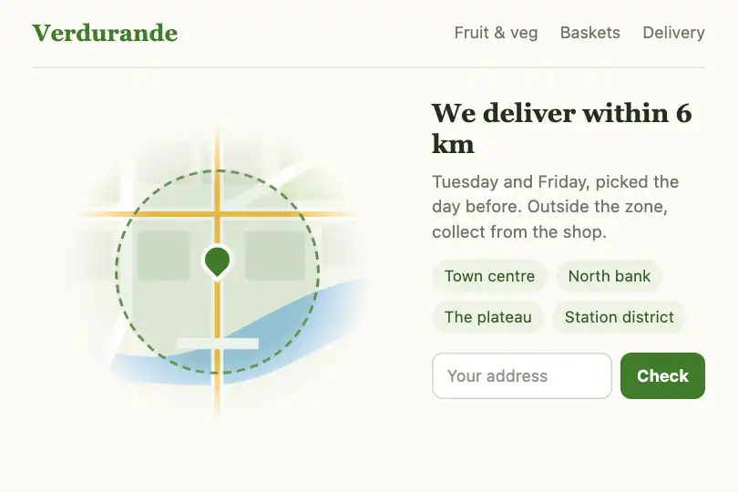
The .gmf-fade block (280 × 180 px by default) carries a radial-gradient mask-image: an ellipse of 80% × 60% of the box, opaque up to 40% of its radius, then increasingly transparent up to 70%. Where the mask is opaque the content shows; where it is transparent you see what lies behind. The block has no edge: it melts into the page, whatever its colour.
The content is up to you. By default, an indigo grid on a near-black background (a small repeated SVG data URI) with the word “FADE” in the middle. Replace the background with --gmf-fill, or put an <img> in the block: it fills it (object-fit:cover). Any HTML placed inside fades the same way, an interface mock-up included.
The effect is static: no animation, no pointer reaction, no JavaScript. The fade shape is set with four variables (--gmf-rx, --gmf-ry, --gmf-solid, --gmf-end), written once and used by both mask-image and -webkit-mask-image.
Accessibility
- Nothing moves: no animation or flashing, so the reduced-motion setting has nothing to stop.
- Real text: the label is a real
<span>. Keep important text in the sharp area: on the edges it loses contrast. - Images: a screenshot or map placed in the block keeps its
alt. If the image only illustrates nearby text, leavealt="". - Pointer: the block reacts to nothing and keeps the normal cursor: it does not promise a click.
Browser compatibility
Radial-gradient mask-image, with -webkit-mask-image for Chrome and Edge before 120 and Safari before 15.4; CSS variables inside the gradient. Measured in Chromium, Firefox and WebKit (Playwright): faded edges (removing the mask changes 1.6% of the demo image), two copies, 390 px, white and dark backgrounds.
Without masking the block shows whole, with sharp edges: nothing disappears.
The code
HTML structure to paste into your page (the CSS + JS come with your purchase):
<div class="fx-0624-root">
  <div class="gmf-fade">
    <span class="gmf-label">FADE</span>
  </div>
</div>One-time payment, no subscription — the code is yours forever
Customize
Options passed to the API or data-* attributes:
| Option / property | Default | Effect |
|---|---|---|
Size (CSS — --gmf-width, --gmf-height) |
280px / 180px | 100% to follow a parent that has a height, for instance as a section background. |
Content (CSS — --gmf-fill) |
indigo grid on #111 | Any background value. Or an <img> inside the block, which covers it. |
Ellipse width and height (CSS — --gmf-rx, --gmf-ry) |
80% / 60% | Radii of the fade area, as a percentage of the box. Equal values on a square block give a circle. |
Sharp area (CSS — --gmf-solid) |
40% | How far from the centre the content stays fully visible. |
End of fade (CSS — --gmf-end) |
70% | Where everything is transparent. The wider the gap with --gmf-solid, the softer the fade. |
Block background and height (CSS — --gmf-page, --gmf-min-h) |
#0a0a0f / 300px | transparent and 0px: the block then melts straight into your page. |
FAQ
--gmf-solid or --gmf-end in your own CSS; declare those variables with @property (type <percentage>) so they interpolate.<span class="gmf-label"> with <img src="screenshot.png" alt="…">: it covers the block. Set --gmf-width and --gmf-height to the image's proportions, and tighten --gmf-solid if only one area of the screen should stay sharp.