3D Extrude Text
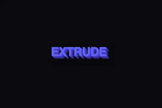
A stack of 12 graduated text-shadow layers and a hover translate create the illusion of an extruded block — 3D relief in pure CSS, zero JavaScript.
Updated
This effect is part of Effect.Labs — 840 vanilla effects, some free, some premium. Text has 56 effects, including 4 free. Explore the category →
3 usage examples

How it works
The effect relies on a stack of text-shadow layers. At rest, 4 shadows each offset by 1 px (from blue-indigo #4f46e5 to deep violet #312e81) sketch a minimal volume. On hover, 12 layers take over: each shadow advances 1 px further — apparent depth reaches 12 px — and colors slide progressively toward near-black (#0f0d24), simulating the front face and lateral sides of a solid extruded block.
Half the illusion comes from the transform: translate(-8px, -8px) applied on hover: the text shifts up and left, uncovering the stacked shadows that were hidden behind it. The eye reads this offset as a physical lift. The final layer — rgba(0,0,0,.5) 13px 13px 20px with a large blur radius — acts as a cast shadow that anchors the block in space.
Everything animates via a single transition: .3s on the base selector: the browser interpolates transform and text-shadow simultaneously without JavaScript or requestAnimationFrame. The element must be rendered as display: inline-block — applied here via .demo-text span — for transform to take effect on inline text.
Accessibility
- prefers-reduced-motion: no handling in the code —
transitionandtranslatealways play. Add manually if needed:@media (prefers-reduced-motion: reduce) { .text-3d-extrude { transition: none } }. - Face contrast: #6366f1 (indigo-500) on #0a0a0f gives a ratio of ~4.3:1 — valid WCAG AA for large text (≥ 3:1) but slightly under the 4.5:1 threshold for body text. Switching to #818cf8 (indigo-400) raises the ratio to ~5.9:1.
- The
<span>withcursor: pointeris not keyboard-focusable: no:focus-visibleis defined. If the extrusion should respond to keyboard navigation, convert to<button>or addtabindex="0"and a:focus-visiblestate. - No
ariaattributes in the base code — visible text is directly accessible to screen readers, which is correct for a purely decorative effect on static text. Noaria-hiddenneeded.
Browser compatibility
Requires text-shadow (IE10+) and transform — supported in all modern browsers and most older ones. Zero external dependencies.
Without hover (mobile, touch), the text stays in its rest state — 4 subtle shadows, no translate. No visual breakage; the text remains readable and the effect is silent.
The code
HTML structure to paste into your page (the CSS + JS come with Premium):
<div class="demo-preview">
  <!-- Replace with your content -->
  <span class="demo-text text-3d-extrude">EXTRUDE</span>
</div>The full HTML + CSS + JS of 3D Extrude Text, ready to paste — plus all 840 effects. Or $299 once, lifetime access.
Customize
Options passed to the API or data-* attributes:
| Option / property | Default | Effect |
|---|---|---|
| color on .text-3d-extrude | #6366f1 | Front face color of the text. Also update the text-shadow hues accordingly (they are darker variants of this color). |
| text-shadow (hover state, layers 1–12) | 12 layers, 1 px each | Layer count = depth in px. 6 layers = subtle relief, 18 = thick wall. If you reduce, also reduce the translate offset (e.g. 6px instead of 8px). |
| transform: translate(-8px, -8px) in :hover | -8px up, -8px left | Lift distance. Increase to accentuate the lift. Flip signs (+8px, +8px) to extrude toward the bottom-right. |
| transition on .text-3d-extrude | .3s | Animation duration. .15s = snappy and sharp. .5s = cinematic. Replace with transition: none to respect prefers-reduced-motion. |
| font-size on .demo-text | 2.5rem | Below 1.8rem, the 12 one-pixel layers blend together visually. Recommended: ≥ 2rem for readable relief. |
| font-weight on .demo-text | 800 | High weights (700–900) maximize the visible extrusion surface. Below 600, the lateral shadow sides are too thin to distinguish. |
| text-shadow (rest state, layers 1–4) | 4 layers, 1 px each | Volume at rest before hover. Reduce to 1–2 layers for a near-flat look, or increase to 6 for permanent depth even without interaction. |
FAQ
translate(-8px, -8px) shifts the whole block at once and shadows stay aligned — the relief is consistent. However, shadows at the end of the first line may overlap the start of the second. For the cleanest result, apply the class to individual line spans or use white-space: nowrap.transform: translate(8px, 8px) and all text-shadow offsets positive (1px 1px 0, 2px 2px 0, …). For a vertical-only extrusion: translate(0, 8px) with offsets 0 1px 0, 0 2px 0, ….font-family on the parent element. Variable fonts even let you animate font-weight in parallel via transition: .3s font-weight and :hover { font-weight: 900 }, visually amplifying the extrusion by thickening the front face.


