3D Shadow Depth
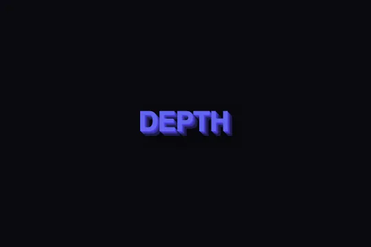
Pure-CSS multi-layer 3D shadow — seven stacked text-shadow levels create the illusion that text rises on hover.
Updated
This effect is part of Effect.Labs — 840 vanilla effects, some free, some premium. Text has 56 effects, including 4 free. Explore the category →
3 usage examples


How it works
At rest, four text-shadow layers build the 3D depth: each layer shifts 1 px further bottom-right (1px 1px → 4px 4px) and uses a progressively darker indigo shade (#4f46e5 → #4338ca → #3730a3 → #312e81). A fifth semi-transparent black blur (rgba(0,0,0,.5) 5px 5px 10px) adds the ambient cast shadow. The stack simulates a glyph extruded from a flat surface.
On hover, text-shadow extends to seven layers (up to 7px 7px) with three extra levels in the deepest shade (#1e1b4b), and the cast shadow deepens to rgba(0,0,0,.6) 8px 8px 15px. Simultaneously, transform: translate(-3px, -3px) shifts the text toward the top-left — this inverse offset reveals the additional layers and creates the illusion that the glyph rises from the surface.
The transition: .3s property animates interpolation between both states. The CSS engine interpolates text-shadow layer by layer (1:1 matching between the two lists) and transform in parallel — no JavaScript is needed. For transform to apply to an inline <span>, the element must be a flex item (direct child of a flex container) or declared display: inline-block.
Accessibility
- prefers-reduced-motion not implemented: the code contains no
@media (prefers-reduced-motion: reduce)rule — the hover transition plays regardless of system preferences. Add@media (prefers-reduced-motion: reduce) { .text-3d-shadow { transition: none; } }if the audience includes motion-sensitive users. - The text remains native DOM content — screen readers read it directly, no ARIA attributes are needed.
- The effect is purely decorative: with CSS disabled, text is fully readable. No information is conveyed exclusively through the shadow.
- Contrast:
#6366f1on#0a0a0f≈ 4.9:1 — WCAG AA compliant for large text (≥ 24 px bold). Insufficient for standard body text — adapt the color for smaller sizes. - The hover state (7 layers + translate) is pointer-only. Keyboard users will not see it. If this state is meaningful, add
:focusalongside:hoverin the selectors.
Browser compatibility
Requires only text-shadow, transform, and transition — supported in all browsers since 2013. Zero external dependencies.
Without these CSS properties (very old browsers), text renders without shadow or animation — no errors, no JS involved.
The code
HTML structure to paste into your page (the CSS + JS come with Premium):
<div class="demo-preview">
  <!-- Apply text-3d-shadow to any text element -->
  <span class="demo-text text-3d-shadow">Your text</span>
</div>

<!-- Or directly on a semantic heading -->
<!-- (display:inline-block required if element is not a flex item) -->
<h1 class="text-3d-shadow"
    style="font-size:4rem;font-weight:800;display:inline-block">
  Your title
</h1>The full HTML + CSS + JS of 3D Shadow Depth, ready to paste — plus all 840 effects. Or $299 once, lifetime access.
Customize
Options passed to the API or data-* attributes:
| Option / property | Default | Effect |
|---|---|---|
| color (in .text-3d-shadow) | #6366f1 | Main text color. Shadow layer shades should be progressively darker versions of this color to maintain 3D extrusion coherence. |
| text-shadow (rest — .text-3d-shadow) | #4f46e5 1px 1px 0, #4338ca 2px 2px 0, #3730a3 3px 3px 0, #312e81 4px 4px 0, rgba(0,0,0,.5) 5px 5px 10px | Rest-state depth (4 layers + cast shadow). Each layer adds 1 px more offset — increase the step (2px, 3px…) for a stronger effect or reduce layer count for subtle relief. |
| text-shadow (hover — .text-3d-shadow:hover) | … #1e1b4b 5px 5px 0, #1e1b4b 6px 6px 0, #1e1b4b 7px 7px 0, rgba(0,0,0,.6) 8px 8px 15px | Maximum depth on hover (7 layers). The 3 extra layers in #1e1b4b create the space that produces the lift illusion. Adjust their color if the background is not near-black. |
| transform (in .text-3d-shadow:hover) | translate(-3px, -3px) | Text shift on hover. Set values to roughly half the total shadow depth (here 7 px → 3–4 px). Too high = visible slide; too low = weakened illusion. |
| transition (in .text-3d-shadow) | .3s | Hover transition duration. 0.2s = responsive, 0.5s = dramatic. Can include easing: transition: .3s ease-out. |
| font-size (in .demo-text) | 2.5rem | Effect is legible from ≈ 2rem and optimal above 3rem. Below 1.2rem, layers overlap and the illusion disappears. |
| font-weight (in .demo-text) | 800 | Heavy weight widens glyphs and amplifies the visible surface of each shadow layer. Weight 700 works well; weight 400 (normal) significantly reduces the effect. |
FAQ
.text-3d-shadow and .text-3d-shadow:hover) are all you need — no JS file to load, no initialization. It works in static pages, CSS-capable HTML emails, and any front-end framework (React, Vue, Svelte) without configuration.#3b82f6 → #2563eb → #1d4ed8 → #1e40af → #1e3a8a. The deepest layer can approach black to simulate the cast shadow.class="text-3d-shadow" to as many elements as needed. Each instance is fully autonomous thanks to pure CSS — no selector conflicts, no JavaScript coordination.


