Blur to Sharp

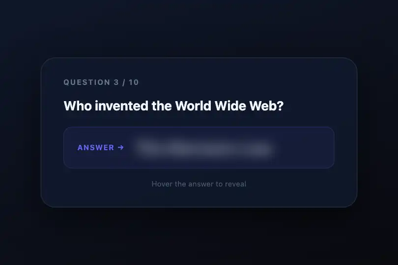
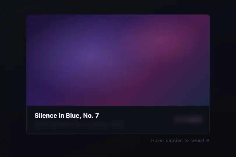
Text that starts blurred and semi-transparent, resolving to full sharpness on hover — two CSS properties, zero JavaScript.
Updated

This effect is part of Effect.Labs — 840 vanilla effects, some free, some premium. Text has 56 effects, including 4 free. Explore the category →
3 usage examples
How it works
The resting state combines filter: blur(8px) and opacity: 0.5 on the text element: the word is rendered illegible and airy at the same time. The :hover pseudo-class resets both to their natural values (blur(0), opacity: 1). The transition: .4s shorthand interpolates both in parallel over 400 ms — a single declaration drives the entire animation.
filter and opacity are promoted to a GPU compositing layer by modern browsers: the transition triggers neither reflow nor repaint on surrounding elements; it runs entirely on the compositor thread and stays smooth at 60 fps even on heavy pages.
The effect JS is empty — no JavaScript logic whatsoever. The effect is triggered solely by the browser's :hover pseudo-class in the stylesheet. Zero dependencies, zero framework: copy the HTML and CSS, it works in any stack.
Accessibility
- prefers-reduced-motion: absent from the code — the transition runs regardless, even if the OS signals a preference to reduce motion. Recommended fix:
@media (prefers-reduced-motion: reduce) { .text-blur-sharp { transition: none; } } - Resting state contrast is not WCAG compliant:
opacity: 0.5combined withfilter: blurintentionally makes the text illegible — that is the point of the effect. The hover state (opacity: 1,blur(0)) must deliver a ratio ≥ 4.5:1 between text color and background to meet WCAG AA. - Keyboard and mobile not covered: the effect is strictly triggered by
:hover. Add:focus-withinto the hover rule for keyboard navigation. On touch screens: add@media (hover: none) { .text-blur-sharp { filter: none; opacity: 1; } }to display text sharp by default. - Text stays in the DOM flow: no
aria-hiddenis applied. Screen readers read the content normally, regardless of its blurred visual state.
Browser compatibility
Requires CSS filter on HTML elements — supported in all modern browsers. JS is empty, zero external dependency.
On Safari 9.1–15.3 or iOS 9.3–15.3: add -webkit-filter: blur(8px) to the resting rule for identical behavior. Browsers without filter support: text displays at full opacity — no JS errors, content remains accessible.
The code
HTML structure to paste into your page (the CSS + JS come with Premium):
<div class="demo-preview">
  <span class="demo-text text-blur-sharp">TEXT</span>
</div>The full HTML + CSS + JS of Blur to Sharp, ready to paste — plus all 840 effects. Or $299 once, lifetime access.
Customize
Options passed to the API or data-* attributes:
| Option / property | Default | Effect |
|---|---|---|
| filter: blur(8px) | 8px | Initial blur intensity in .text-blur-sharp. From 3 px (subtle, still legible) to 14 px (fully illegible). The hover value is always blur(0). |
| opacity: .5 | 0.5 | Initial transparency in .text-blur-sharp. Lower to 0.2–0.3 for stronger concealment; raise to 0.7 for a visible blur with less transparent text. |
| transition: .4s | 0.4s | Duration and easing of the transition in .text-blur-sharp. Examples: 0.25s ease-out (snappy reveal), 0.7s cubic-bezier(0,0,0,1) (cinematic progressive unblur). |
| font-size: 2.5rem | 2.5rem | Text size in .demo-text. The larger the type, the more dramatic the blur — a blur(8px) on 4rem stays recognizable as a silhouette, while at 1rem it disappears entirely. |
| font-weight: 800 | 800 | Font weight in .demo-text. Heavy weights (700–900) preserve their blurred silhouette — preferred for hero headlines where the word shape should remain visible at rest. |
| letter-spacing: -.02em | -.02em | Letter spacing in .demo-text. A strongly negative tracking (-0.05em) tightens glyphs and amplifies the typographic impact at reveal. |
| transition-delay on :hover | 0s | Delay before the reveal. Declare in .text-blur-sharp:hover { transition-delay: 0.1s; } to add a slight hesitation before the focus snaps in. |
FAQ
:hover is not triggered on touch screens. To display text sharp by default on mobile, add @media (hover: none) { .text-blur-sharp { filter: none; opacity: 1; } }. For a touch-interactive variant, replace :hover with a JavaScript class toggle on tap.<span class="text-blur-sharp">. Transitions are independent per element: each word resolves only when the mouse passes over it. Example: <h1><span class="text-blur-sharp">Word1</span> and <span class="text-blur-sharp">Word2</span></h1>..text-blur-sharp (rest state) set transition: 0.8s — that is the blur-return duration; in .text-blur-sharp:hover add transition-duration: 0.25s — that is the reveal duration. The browser picks the duration from the block it is transitioning into.


