Bounce In Letters

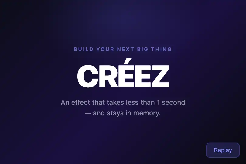

Each letter drops in from above with an elastic bounce — pure CSS animation cascaded at 80 ms intervals, zero dependencies, for memorable headlines.
Updated
This effect is part of Effect.Labs — 840 vanilla effects, some free, some premium. Text has 56 effects, including 4 free. Explore the category →
3 usage examples
How it works
The animation is driven by a single CSS @keyframes rule — bounceInLetter — that moves each letter from opacity:0, translateY(-50px) scale(.5) to opacity:1, translateY(0) scale(1) over 600 ms. The cubic-bezier(.68, -.55, .265, 1.55) easing produces an elastic overshoot: the 4th parameter exceeds 1, pushing the letter slightly past its final position before it snaps back — the characteristic bounce.
The splitText(el, text, delayStep) utility wraps each character in an individual span and applies an increasing animation-delay (0 s, 0.08 s, 0.16 s…) to each one. That staggered delay produces a cascade entrance rather than a simultaneous one. The animation-fill-mode: forwards mode ensures each letter stays visible after its animation ends, even while later letters are still in flight.
The Replay button calls replayBounceIn(): it clears the container's innerHTML then calls splitText again after a 50 ms delay — that gap gives the browser time to force a style recalculation before re-injecting the spans, guaranteeing a clean CSS animation restart.
Important caveat: the CSS does not include a @media (prefers-reduced-motion) rule. Since spans start at opacity:0, if CSS animations are disabled (system preference or old browser) the text stays invisible — add the fallback described in the A11y section.
Accessibility
- prefers-reduced-motion not in the code: no @media rule is included. Add
@media (prefers-reduced-motion: reduce) { .text-bounce-in span { animation: none; opacity: 1; transform: none; } }for motion-sensitive users. - Text is structured in inline
<span>elements — screen readers read the full word in DOM order, unaffected by the per-letter split. - The Replay button is a native
<button>, keyboard-focusable and reachable via Tab — no additional ARIA role needed. - Text contrast: white (
#ffffff) on dark (#0a0a0f) background, ratio > 15:1 — well above WCAG AA (4.5:1) and AAA (7:1). - Without CSS animation support (very old browsers), letters stay at
opacity:0and text is invisible. Recommended fallback:@supports not (animation-name: a) { .text-bounce-in span { opacity:1; transform:none; } }.
Browser compatibility
Relies on CSS animations, cubic-bezier, and animation-fill-mode — supported in all modern browsers since 2015. Zero external dependencies.
Without CSS animation support, letters remain at opacity:0 (text invisible). Safe fallback: @supports not (animation-name: a) { .text-bounce-in span { opacity:1; transform:none; } }.
The code
HTML structure to paste into your page (the CSS + JS come with Premium):
<div class="demo-preview">
  <span class="demo-text text-bounce-in" id="bounceInText">
    <!-- spans generated by splitText(el, 'WORD', 0.08) -->
    <span style="animation-delay: 0s">W</span>
    <span style="animation-delay: 0.08s">O</span>
    <span style="animation-delay: 0.16s">R</span>
    <span style="animation-delay: 0.24s">D</span>
  </span>
  <button class="replay-btn" onclick="replayBounceIn()">Replay</button>
</div>The full HTML + CSS + JS of Bounce In Letters, ready to paste — plus all 840 effects. Or $299 once, lifetime access.
Customize
Options passed to the API or data-* attributes:
| Option / property | Default | Effect |
|---|---|---|
| 0.08 (3rd arg of splitText) | 0.08 s | Delay between each letter. Lower to 0.05 s for a short snappy word, raise to 0.12 s for a longer word to keep the cascade visible. |
| animation: .6s … | 0.6 s | Animation duration per letter (CSS, .text-bounce-in span line). Increase to 0.9 s for a slower, more cinematic feel. |
| cubic-bezier(.68, -.55, .265, 1.55) | 1.55 (4th param.) | Elastic overshoot amount. Raise to 1.8 for a pronounced bounce, lower to 1.1 for a softer entry. |
| translateY(-50px) | -50px | Initial fall distance in CSS. -80px for a more dramatic top entrance, -20px for a subtle slide. |
| scale(.5) | 0.5 | Starting scale of each letter in CSS. 0.8 for a light zoom, 0.1 for an appearance from near-zero. |
| font-size: 2.5rem | 2.5rem | Text size in CSS (.demo-text class). Works from 1rem to 8rem — adjust freely for your context. |
| 'BOUNCE' (2nd arg of splitText) | "BOUNCE" | Text to animate. Change the string in the JS call to match your content — the effect works with any Unicode string. |
FAQ
splitText(el, text, delay) function takes an element as its first argument — call it on as many elements as you need with different id values. Each container must carry the text-bounce-in class to inherit the CSS animation rule.IntersectionObserver: observe the container, and in the callback call splitText(el, text, delay) as soon as isIntersecting becomes true. Call observer.unobserve(el) afterwards to trigger only once.<span> elements with their individual animation-delay values. Without JS, you can pre-render the spans server-side or directly in the HTML source — that is exactly the structure provided in the example, which animates on load without any extra JS call.


