Flip Characters
Each character flips around its horizontal axis on hover — the cascade ripples letter by letter through a staggered CSS delay calculated by the JS at init.
Updated

This effect is part of Effect.Labs — 840 vanilla effects, some free, some premium. Text has 56 effects, including 4 free. Explore the category →
3 usage examples

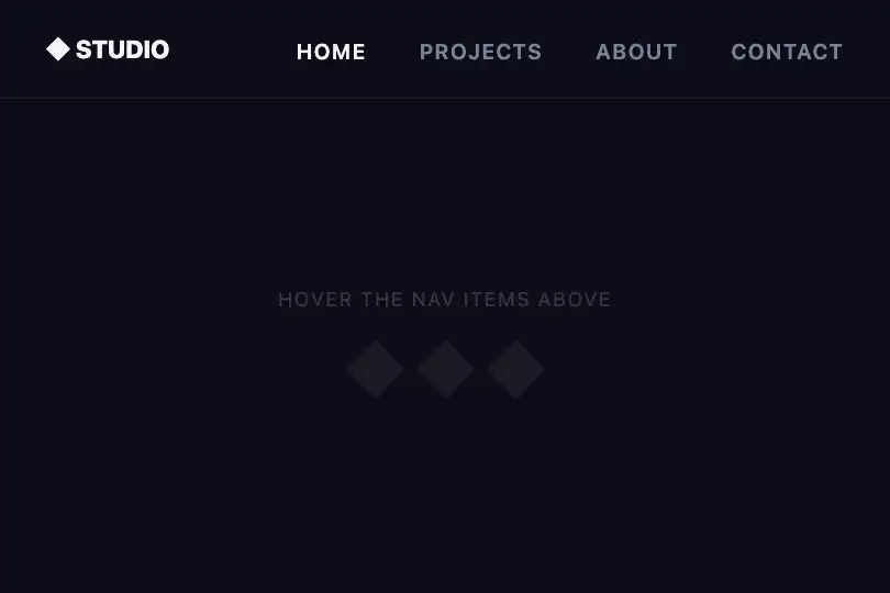

How it works
On load, the script targets the element with id="flipText", reads its text content, and reinjects each character into an individual <span> via innerHTML. Each span receives a style="animation-delay: Ns" computed at 0.05 s × index — that is the sole responsibility of the JS; everything else is pure CSS.
The flipChar keyframe rotates the span around the X axis (rotateX): 0° → 90° → 0°. At 90° the character is seen edge-on and nearly disappears, then returns flat — the eye reads it as a flip. The display: inline-block on each span is mandatory: without it, transform has no effect on inline elements.
The trigger is .text-flip:hover span: hovering the parent container fires the animation on all spans at once, but the staggered delays produce the letter-by-letter cascade. Total cascade duration is approximately (n − 1) × 0.05 s + 0.6 s, where n is the character count.
The transition: transform 0.3 s on each span handles the return to rest when the mouse leaves the container — letters snap back smoothly without replaying the full keyframe.
Accessibility
- prefers-reduced-motion absent: the code contains no
prefers-reduced-motionmedia query. TheflipCharanimation fires even when the user has enabled reduced motion in the OS — add manually if needed:@media (prefers-reduced-motion: reduce) { .text-flip:hover span { animation: none; } }. - The text remains native DOM text wrapped in spans — screen readers read the original content without disruption, unlike a canvas or an image.
- Keyboard only: the effect is triggered by
:hover, not:focus-within. Keyboard-only users (Tab navigation) do not see the animation. Add.text-flip:focus-within spanto the animation rule to fix this. - Contrast: the effect defines no colors — the contrast ratio depends entirely on the implementation. Verify WCAG AA (≥ 4.5:1) against the chosen background.
- The animation lasts 0.6 s and does not loop (
iteration-count: 1,fill-mode: forwards) — it does not constitute auto-playing animated content under WCAG 2.2.2 (no looping without interaction).
Browser compatibility
Requires CSS 3D transforms and CSS animations — supported since Chrome 36, Firefox 16, Safari 9. Zero external dependencies.
Without rotateX support, letters stay flat — the text is perfectly readable. On mobile (no hover), characters display normally with no animation.
The code
HTML structure to paste into your page (the CSS + JS come with Premium):
<div class="demo-preview">
  <!-- JS splits textContent into spans with animation-delay on load -->
  <span class="demo-text text-flip" id="flipText">YOUR TEXT</span>
  <!-- After JS init, becomes: -->
  <!-- <span class="demo-text text-flip" id="flipText">
    <span style="animation-delay: 0s">Y</span>
    <span style="animation-delay: 0.05s">O</span>
    ...
  </span> -->
</div>The full HTML + CSS + JS of Flip Characters, ready to paste — plus all 840 effects. Or $299 once, lifetime access.
Customize
Options passed to the API or data-* attributes:
| Option / property | Default | Effect |
|---|---|---|
| font-size on .demo-text | 2.5 rem | Character size — increase to 4–7 rem for a hero heading, reduce to 1 rem for navigation. |
| font-weight on .demo-text | 800 | Text weight. 900 accentuates the flip (wider character); 400 gives a thinner, subtler flip. |
| animation-delay: ${0.05 × t}s in JS (calc line) | 0.05 s/char | Stagger increment between each letter. Reduce to 0.03 s for a fast cascade on long words; increase to 0.08 s for a slow, dramatic effect. |
| duration in .text-flip:hover span (animation: .6s) | 0.6 s | Duration of a single character flip. 0.3 s = snappy; 1 s = slow and cinematic. |
| transition in .text-flip span (transition: transform .3s) | 0.3 s | Return-to-rest speed when the mouse leaves. Reduce to 0.1 s for an immediate snap. |
| rotateX in @keyframes flipChar at 50% | rotateX(90deg) | Flip axis. Replace with rotateY(90deg) for a lateral (left–right) flip instead of vertical. |
| perspective on .text-flip (to add) | none | Adding perspective: 300px on the parent .text-flip adds a pronounced 3D depth to the flip. |
| letter-spacing on .demo-text | -0.02 em | Letter spacing. Increasing to 0.1–0.2 em spaces out the cascade and makes each individual flip more distinct. |
FAQ
getElementById('flipText') — one element per page. For multiple instances, replace the lookup with querySelectorAll('.text-flip') and iterate: document.querySelectorAll('.text-flip').forEach(el => { el.innerHTML = el.textContent.split('').map((c, i) => `<span style="animation-delay:${i*.05}s">${c}</span>`).join(''); }).:hover trigger does not fire on touch devices without a pointer. For touch interaction, add a touchstart listener that toggles a .flipping class on the element and trigger the animation through that class instead of :hover.@media (prefers-reduced-motion: reduce) { .text-flip:hover span { animation: none; } }. The text remains readable and interactive without the flip animation.


