Highlight Marker
A CSS gradient anchored at the text bottom expands on hover like a marker stroke — pure CSS, zero dependencies.
Updated

This effect is part of Effect.Labs — 840 vanilla effects, some free, some premium. Text has 56 effects, including 4 free. Explore the category →
3 usage examples
How it works
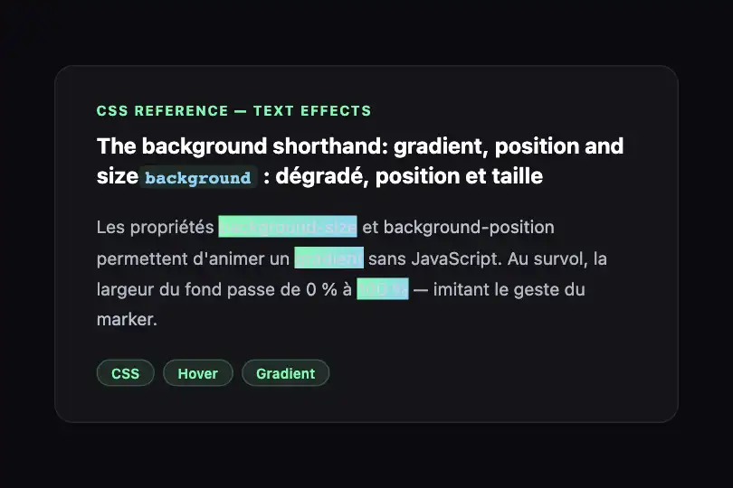
The background shorthand packs gradient, position, and initial size into one declaration: linear-gradient(120deg, #84fab0 0, #8fd3f4 100%) 0 100%/0 100% no-repeat. The 0 100% before the slash anchors the fill to the element's bottom-left; the 0 100% after the slash sets the starting size to zero width, full height — the gradient exists in the DOM but is invisible.

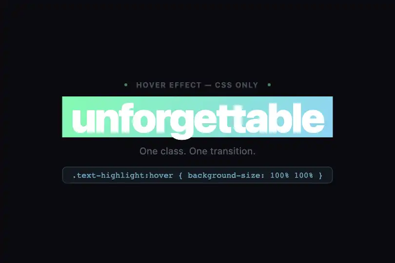
On hover, background-size: 100% 100% expands the width to 100% of the element. The transition: background-size .3s rule animates that dimension change: the fill grows left to right, reproducing a marker stroke. The 120° gradient (mint green → sky blue) adds a slight diagonal that enhances the material feel.
The effect contains zero JavaScript: one CSS class added to any inline or block element. No library, no JS event. Compatible with every framework (React, Vue, Svelte, Angular) — copy both CSS rules and apply the class.
Accessibility
- prefers-reduced-motion not in code: the transition runs for all users, including those with OS-level motion reduction enabled. To respect that preference, add:
@media (prefers-reduced-motion: reduce) { .text-highlight { transition: none } }. - The effect is hover-only (
:hover) — no:focusor:focus-visiblerule is defined. Keyboard users will not see the effect. Recommended fix:.text-highlight:focus-visible { background-size: 100% 100% }. - The gradient is purely decorative — no
aria-*attribute is needed. Ensure overlaid text remains readable against the colored fill (WCAG AA ratio ≥ 4.5:1, verify for your chosen colors). - On mobile (no hover), the element renders without effect: it stays readable but the marker never appears on a touchscreen without additional JS.
Browser compatibility
Requires only CSS3 background-size and transitions — universally supported since 2013.
Without background-size support (IE ≤ 8), the fill stays absent — text is still readable, no JS is broken. On mobile (no hover), the element renders without the effect.
The code
HTML structure to paste into your page (the CSS + JS come with Premium):
<span class="text-highlight">Highlighted term</span>

<!-- In running text -->
<p>
  A sentence with an
  <span class="text-highlight">important word</span>
  highlighted on hover.
</p>

<!-- In a heading -->
<h2>
  Build interfaces that are
  <span class="text-highlight">memorable</span>
</h2>The full HTML + CSS + JS of Highlight Marker, ready to paste — plus all 840 effects. Or $299 once, lifetime access.
Customize
Options passed to the API or data-* attributes:
| Option / property | Default | Effect |
|---|---|---|
| Start color (#84fab0) | #84fab0 | First gradient color (left side). Edit it in the .text-highlight rule, background property. |
| End color (#8fd3f4) | #8fd3f4 | Second gradient color (right side). Same property, second stop. |
| Angle (120deg) | 120deg | Gradient tilt. 90deg = perfectly horizontal, 120deg = slight diagonal, 180deg = top to bottom. |
| Duration (.3s in transition) | 0.3s | Speed of the marker fill. 0.2s = snappy, 0.5s = slow and analogue. |
| Marker height (2nd value in hover background-size) | 100% | Second background-size parameter in :hover. 100% = full text cover, 50% = thick marker, 15% = thin underline. |
| Vertical position (0 100% before slash) | 0 100% | Vertical anchor of the fill. 0 100% = bottom (underline style), 0 50% = text center, 0 0% = top. |
| :focus-visible (not present) | — | Add .text-highlight:focus-visible { background-size: 100% 100% } to show the marker on keyboard focus as well. |
FAQ
<span class="text-highlight">. Because the effect relies on background-size at the individual element level, each span highlights independently on hover. No collision between instances.<span> that wraps to a new line, background is calculated on the total bounding box — the fill covers a single rectangle, not each line separately. For correct multiline rendering, split the text into separate spans, or use -webkit-box-decoration-break: clone; box-decoration-break: clone (partial support in Chrome and Firefox)..text-highlight:hover { background-size: 100% 100% } with a @keyframes rule animating background-size from 0 100% to 100% 100%, applied directly to .text-highlight. Add animation-fill-mode: forwards to hold the final state, and animation-delay to stagger successive spans.


