Letter Rotate In

Each letter flips 90° on the Y axis to reveal itself face-on — a 3D cascade powered by CSS alone.
Updated
This effect is part of Effect.Labs — 840 vanilla effects, some free, some premium. Text has 56 effects, including 4 free. Explore the category →
3 usage examples

How it works
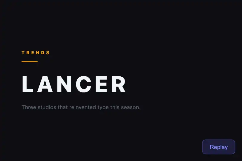

The effect relies on a @keyframes rotateInLetter that animates each letter from rotateY(90deg) opacity:0 to rotateY(0deg) opacity:1. Letters start edge-on — invisible from the front, like a tile seen from the side — and rotate toward the viewer. animation-fill-mode: forwards holds the final state: no JS manages opacity afterwards.
The perspective: 500px on the .text-rotate-in container establishes a shared 3D vanishing point for all letters. Lowering this value (200px) exaggerates the perspective distortion; raising it (1000px) makes the rotation nearly flat and more subtle.
The cascade is achieved via an increasing animation-delay injected as inline style on each <span> (step × index). The splitText(el, text, step) function rebuilds these spans on the fly for the Replay button — but the initial animation can be served entirely as static pre-generated HTML with no runtime JS needed.
Accessibility
- prefers-reduced-motion absent: no
@media (prefers-reduced-motion: reduce)rule in the CSS — letters always animate. Recommended fix:.text-rotate-in span { animation: none; opacity: 1; transform: none; }inside that media query. - Text lives in native
<span>elements withoutaria-hidden— screen readers read the letters as the full word. Content remains accessible without extra markup. - The Replay button is a native
<button>, keyboard-reachable (Tab + Enter/Space). - Text contrast in the demo: white on
#0a0a0f, ratio ≈ 21:1 — exceeds WCAG AAA (≥ 7:1). - Fallback without animation support: letters stay at
opacity:0(initial state). Guard with@supports not (animation-name: none) { .text-rotate-in span { opacity: 1; transform: none; } }.
Browser compatibility
Requires CSS 3D transforms (rotateY) and animation-fill-mode: forwards — supported since Chrome 36, Firefox 16, Safari 9, Edge 12. Zero external dependencies.
Without CSS 3D transform support, letters remain at opacity:0 (the animation's initial state). Guard with @supports not (transform: rotateY(0)) { .text-rotate-in span { opacity:1; transform:none; } }.
The code
HTML structure to paste into your page (the CSS + JS come with Premium):
<div class="demo-preview">
  <span class="demo-text text-rotate-in" id="rotateInText">
    <!-- one <span> per letter with animation-delay = step × index -->
    <span style="animation-delay: 0s">W</span>
    <span style="animation-delay: 0.08s">O</span>
    <span style="animation-delay: 0.16s">R</span>
    <span style="animation-delay: 0.24s">D</span>
  </span>
  <button class="replay-btn" onclick="replayRotateIn()">Replay</button>
</div>The full HTML + CSS + JS of Letter Rotate In, ready to paste — plus all 840 effects. Or $299 once, lifetime access.
Customize
Options passed to the API or data-* attributes:
| Option / property | Default | Effect |
|---|---|---|
| perspective on .text-rotate-in | 500px | 3D depth: 200px = sharp, expressive flip; 1000px = near-flat rotation. Lower to dramatize the effect. |
| animation-duration in .text-rotate-in span | .5s | Per-letter animation duration. .3s = snappy reveal, 1s = dramatic slow entry. |
| animation-timing-function in .text-rotate-in span | ease | Easing curve. ease-out = gradual landing, cubic-bezier(0.34,1.56,0.64,1) = slight spring on arrival. |
| rotateY(90deg) in .text-rotate-in span | 90deg | Starting angle. rotateY(-90deg) = flip from the other side, rotateX(90deg) = vertical rotation (falling tile effect). |
| step in splitText(el, text, step) | 0.08 | Delay gap in seconds between each letter. 0.04 = fast cascade, 0.15 = theatrical slow cascade. |
| font-size on .demo-text | 2.5rem | Text size. The effect reads best at 4–8rem where the 3D depth is clearly perceptible. |
| letter-spacing on .demo-text | -.02em | Letter spacing. Positive values (0.1em) spread the tiles for a more pronounced visual offset. |
FAQ
@keyframes, 3D transform, and animation. JS is only used for the Replay button. The <span> list with animation-delay can be generated server-side or statically, with no runtime JS needed.animation-play-state: paused, then switch to running via a class added by an IntersectionObserver. Example: el.classList.add('lri-visible') combined with .lri-visible .text-rotate-in span { animation-play-state: running; }.@keyframes rotateOutLetter (from rotateY(0deg), opacity:1 to rotateY(-90deg), opacity:0) and apply it via an exit class. Chaining entrance and exit creates a reusable typographic ticker.


