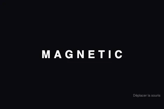
Magnetic Cursor Text


Each character acts as a magnet: it follows the cursor within a configurable radius and snaps back with an elastic CSS transition.
Updated
This effect is part of Effect.Labs — 840 vanilla effects, some free, some premium. Text has 56 effects, including 4 free. Explore the category →
3 usage examples

How it works
The splitChars(el) function reads the data-text attribute of the target element and replaces its raw text content with a series of <span class="char"> — one per glyph. Spaces are converted to non-breaking spaces to prevent inline collapse. Each span is display: inline-block, making each letter independently translatable without triggering a reflow on the rest of the text.
The CSS rule .kt-magnetic .char { transition: transform .3s cubic-bezier(.25, .46, .45, .94) } delegates animation entirely to the browser. The chosen curve produces a slight overshoot on return — the characteristic "elastic snap-back" — without any requestAnimationFrame loop. JS only writes the final style; the browser handles all interpolation.
On each mousemove event, the Euclidean distance between the cursor and the bounding-box center of each .char is computed. If it falls below the magnetic radius (JS constant, ~120 px by default), the letter receives style.transform = translate(dx·f, dy·f) where f = (1 − dist/radius) × strength — a factor that decays linearly to zero at the field boundary, simulating magnetic flux falloff.
When the cursor exits the radius or the container, transforms are reset to an empty string. The CSS transition then springs each character back to its natural position — no cleanup state required on the JS side. The data-text attribute stores the original string and lets splitChars() rebuild spans if the content changes dynamically.
Accessibility
- prefers-reduced-motion absent: the shipped code does not disable the transition. Add in production:
@media (prefers-reduced-motion: reduce) { .kt-magnetic .char { transition: none } }to stop letter displacement for motion-sensitive users. - The
<span class="char">elements may be read letter by letter by some screen readers. Wrap the.kt-textin an element witharia-label="YOUR TEXT"and addaria-hidden="true"to each.charso the word is announced as a single block. - Contrast: the default
#fffcolor on#0a0a0fbackground achieves ~20:1 ratio (WCAG AAA). Verify after any palette change. - The effect is triggered by
mousemoveonly — no keyboard or touch alternative. For a purely decorative heading this is not an accessibility blocker; text stays readable and correctly positioned without interaction. - No
roleoraria-labelis present on the container in the shipped code: as the text is semantic HTML, no additional role is required if the heading hierarchy is respected.
Browser compatibility
Uses only CSS transform + transition and the mousemove event — no canvas, WebGL, or requestAnimationFrame dependency.
Without mouse events (touch devices, legacy browsers), characters stay at their natural position. Text is fully readable and layout does not break.
The code
HTML structure to paste into your page (the CSS + JS come with Premium):
<div class="demo-preview">
  <div class="kt-text kt-magnetic" id="magnetic1" data-text="YOUR TEXT">
    <!-- Generated by splitChars() or written manually -->
    <span class="char" data-char="Y">Y</span>
    <span class="char" data-char="O">O</span>
    <span class="char" data-char="U">U</span>
    <span class="char" data-char="R">R</span>
  </div>
</div>The full HTML + CSS + JS of Magnetic Cursor Text, ready to paste — plus all 840 effects. Or $299 once, lifetime access.
Customize
Options passed to the API or data-* attributes:
| Option / property | Default | Effect |
|---|---|---|
| font-size on .kt-text | 2.2rem | Character size. 4–6 rem for a hero, 1.4–2 rem for navigation. |
| font-weight on .kt-text | 800 | Font weight. 900 for maximum impact, 400–600 for a softer editorial style. |
| color on .kt-text | #fff | Character color. Accepts any CSS value: hex, oklch, or a gradient via background-clip: text. |
| letter-spacing on .kt-text | .02em | Letter spacing. Widen to 0.06–0.12 em on large sizes for a monumental effect. |
| transition-duration on .kt-magnetic .char | 0.3s | Elastic return duration. 0.15 s = crisp, dry response; 0.5 s = slow, organic magnetism. |
| transition-timing-function on .kt-magnetic .char | cubic-bezier(.25,.46,.45,.94) | Return curve. Try cubic-bezier(.34,1.56,.64,1) for a more pronounced bounce. |
| data-text on .kt-text | MAGNETIC | Source text used by splitChars() to generate spans. Change the word without touching the HTML. |
| Magnetic radius (JS constant) | 120 | Pixel distance below which a character is attracted. Increase for a wider attraction field. |
| Attraction strength (JS constant) | 0.38 | Maximum displacement factor. 0 = no movement, 0.6 = very pronounced displacement. |
FAQ
splitChars() handles every character including spaces. For multi-word phrases, one .kt-text.kt-magnetic per word is preferred — transforms can otherwise create visual overlaps between letters if displacement exceeds the word's natural footprint.e.clientX / e.clientY to the per-.char distance calculation. The magnetic field then activates as soon as the cursor enters the parent zone, well before it hovers over the letters.transform: translate() is handled by the browser's compositor thread — no layout reflow, no repaint. CSS transitions run independently of the JS main thread, guaranteeing 60 fps even on a complex document.


