Neon Flicker
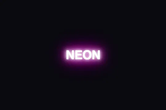
Pure-CSS neon text: five white and colored text-shadow layers flicker at irregular intervals to mimic the glow and instability of a real neon tube.
Updated
This effect is part of Effect.Labs — 840 vanilla effects, some free, some premium. Text has 56 effects, including 4 free. Explore the category →
3 usage examples

How it works
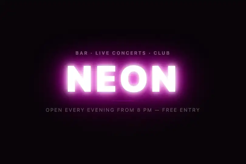
The effect relies on five stacked text-shadow layers, all centered (0, 0 offset) but with increasing blur radii. The first two (10 px, 20 px) use white #fff to form the luminous core of the tube; the next three (30 px, 40 px, 70 px) apply magenta #ff00de for the colored outer bloom. The accumulation creates the light saturation characteristic of real illuminated fluorescent glass.
The flicker is produced by @keyframes neonFlicker: text-shadow is cut to none only at the 20%, 24%, and 55% stops. Each blackout spans exactly 1% of the animation duration — long enough to register as a flicker, short enough not to read as a fault. The total 1.5 s duration produces roughly 40 flickers per minute, consistent with an aging real gas tube.
The alternate animation direction replays each cycle in reverse. Blackouts that fell at 20%, 24%, and 55% on the forward pass now land at 45%, 76%, and 80% on the return, doubling the pattern variety without adding a single keyframe. The result is a flicker that never repeats at exactly the same perceived cadence.

The effect is fully declarative: zero JavaScript, zero dependencies. The text-neon-flicker class applies to any HTML text element — h1, span, p, button — without modifying the markup or loading additional files.
Accessibility
- prefers-reduced-motion not handled: the code contains no
@media (prefers-reduced-motion: reduce)block. The animation runs on all devices, including those configured to reduce motion. For accessible projects, add:@media (prefers-reduced-motion: reduce) { .text-neon-flicker { animation: none; } } - Text remains readable when the glow disappears:
color: #fffis maintained at all times, independent oftext-shadow. Against a dark background (#0a0a0f), the white/background contrast ratio is ≥ 7:1 — WCAG AAA without the effect. - The animation is
infiniteand starts automatically, with no pause button in the default markup. WCAG 2.2.2 recommends a pause mechanism for any auto-started animation lasting over 5 seconds; add a button togglinganimation-play-state: pausedif the text is a primary foreground element. - No ARIA attributes are defined in the base markup. If the text element serves as a logo or graphic heading, add
role="img"andaria-labelfor screen readers. - Keyboard navigation: the default markup contains no interactive elements. If you wrap the neon text in a link or button, verify the
:focus-visiblecontrast ratio against the dark background.
Browser compatibility
Uses only CSS text-shadow and @keyframes — natively supported in all modern browsers without vendor prefixes.
Without CSS animation support, the text is displayed in white (color: #fff) with the glow frozen at the initial state defined in .text-neon-flicker. No errors, no readability regression.
The code
HTML structure to paste into your page (the CSS + JS come with Premium):
<div class="demo-preview">
  <!-- Apply text-neon-flicker to any text element -->
  <span class="demo-text text-neon-flicker">NEON</span>
</div>The full HTML + CSS + JS of Neon Flicker, ready to paste — plus all 840 effects. Or $299 once, lifetime access.
Customize
Options passed to the API or data-* attributes:
| Option / property | Default | Effect |
|---|---|---|
| #ff00de (neon color) | Magenta #ff00de | Replace this value at all 3 occurrences: in both active blocks of @keyframes neonFlicker and in the text-shadow property of .text-neon-flicker. Try cyan #00e5ff, green #39ff14, or orange #ff6600. |
| #fff (inner glow) | White #fff | The first two text-shadow layers (10 px, 20 px) form the luminous core. Switch to pale yellow (#fffde0) for a warm tube, or light cyan (#cffafe) for a cold one. |
| animation-duration (1.5s) | 1.5s | Duration of one full cycle. 1 s = fast, tense flicker; 2–3 s = slow, atmospheric rhythm. Modify in the animation property of .text-neon-flicker. |
| text-shadow spreads (10px 20px 30px 40px 70px) | 10 20 30 40 70 px | The five blur radii control halo intensity. Reduce (5 10 15 20 40) for a subtle neon; increase (15 30 50 70 120) for a fully saturated full-screen glow. |
| Flicker stops in @keyframes (20%, 24%, 55%) | 20% 24% 55% | The only three points where text-shadow is set to none. Move or multiply these stops to vary flicker cadence — a single stop at 50% gives one flash per half-cycle. |
| font-size on .demo-text (2.5rem) | 2.5rem | Adjust to context: 1.5 rem for a compact badge, 6–10 rem for a full-screen sign. The text-shadow effect scales automatically with font size. |
| animation-play-state (running) | running | Set to paused via JavaScript (el.style.animationPlayState = 'paused') to freeze the animation on its last displayed state — useful for an accessible pause button. |
FAQ
#ff00de at three locations: in both active keyframe blocks inside @keyframes neonFlicker and in the text-shadow property of .text-neon-flicker. The two white inner layers (#fff at 10 px and 20 px) can stay as-is or be lightly tinted to warm or cool the overall atmosphere.prefers-reduced-motion block. To fix this, add to the bottom of your stylesheet: @media (prefers-reduced-motion: reduce) { .text-neon-flicker { animation: none; } }. Text stays visible in white with a frozen glow — no readability regression.h1, h2, p, button, a… The text-shadow property applies regardless of the tag. One constraint: the background behind the element must be dark for the luminous halo to be perceptible — against a white background the effect is invisible.


