Optical Size
Fraunces' opsz axis adapts typographic details by size — serifs, contrast, letter-spacing — from 9 to 144, in pure CSS.
Updated
This effect is part of Effect.Labs — 840 vanilla effects, some free, some premium. Text has 56 effects, including 4 free. Explore the category →
3 usage examples
How it works
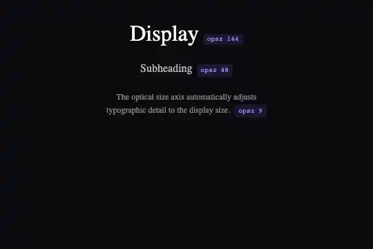
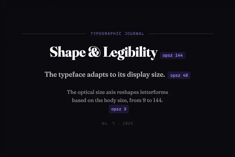
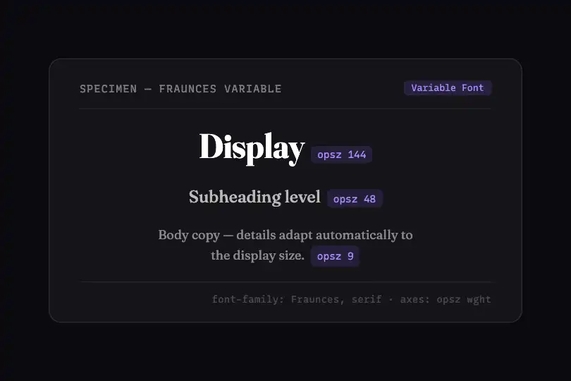
The effect relies on the CSS property font-variation-settings, which exposes variable font axes. The standardised "opsz" axis (optical size) produces two distinct designs: a low value generates a text cut (open strokes, wide serifs, reduced contrast); a high value generates a display cut (sharp serifs, high stroke contrast, tighter letter-spacing). No JavaScript, no images — one CSS rule per size level is enough.
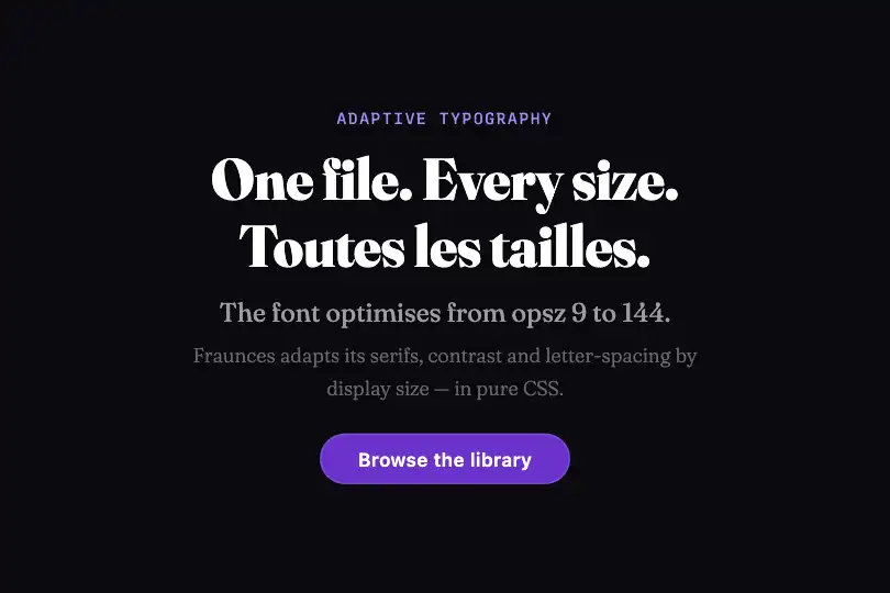
Fraunces is a variable serif font with an opsz axis from 9 to 144 and a wght axis from 100 to 900. At opsz 144 / wght 700, serifs are fine and high-contrast, designed for display headlines. At opsz 9 / wght 400, strokes open up and serifs widen to stay legible at small sizes. opsz 48 is a natural intermediate level for subheadings.
Three CSS classes each apply a specific pair of values. .vf-opsz-large sets font-variation-settings: "opsz" 144, "wght" 700 at 2rem. .vf-opsz-medium sets "opsz" 48, "wght" 500 at 1rem. .vf-opsz-small sets "opsz" 9, "wght" 400 at 0.75rem. All three are stacked in .vf-opsz-scene (flex-column, gap: 20px, horizontally centred). Side by side, they reveal that the opsz axis is an adaptive redesign of letterforms, not a simple zoom.
The .vf-opsz-tag labels use Recursive with font-variation-settings: "MONO" 1 — the font switches to a monospace render without changing family. They display the active opsz value for each tier and carry a semi-transparent violet badge (rgba(139,92,246,.15)) to stay subtle while informative.
Accessibility
- No animation: the effect is entirely static (pure CSS, zero
requestAnimationFrame).prefers-reduced-motionis not applicable — there is no motion to reduce. - Main text contrast: white (#ffffff) on black (#0a0a0f) — ratio ≥ 7:1, WCAG AAA. The
.vf-opsz-smalltext atrgba(255,255,255,.5)reaches ~4.6:1 AA at the rendered size (≥ 12px). - The
<span class="vf-opsz-tag">elements are read by screen readers (e.g. "opsz 144"). If purely decorative, addaria-hidden="true"to each span. - No interactive elements in the base structure — no tab focus required. No focus trap introduced if a parent component is clickable.
- Typographic fallback:
font-family: Fraunces, serif— if the variable font is not loaded, text stays readable in the system serif with no JS error or visual crash.
Browser compatibility
Requires CSS font-variation-settings (variable fonts) — supported in all modern browsers since 2018. Zero JS dependencies.
If Fraunces is not loaded, the browser falls back to the system serif — text stays readable but the opsz axis demonstration is lost. Loading Fraunces from Google Fonts (opsz,wght@9..144,100..900) guarantees the expected render.
The code
HTML structure to paste into your page (the CSS + JS come with Premium):
<div class="vf-opsz-scene">
  <div class="vf-opsz-row">
    <div class="vf-opsz-large">Display headline
      <span class="vf-opsz-tag">opsz 144</span>
    </div>
  </div>
  <div class="vf-opsz-row">
    <div class="vf-opsz-medium">Subheading
      <span class="vf-opsz-tag">opsz 48</span>
    </div>
  </div>
  <div class="vf-opsz-row">
    <div class="vf-opsz-small">Body copy — adapted for comfortable reading
      <span class="vf-opsz-tag">opsz 9</span>
    </div>
  </div>
</div>The full HTML + CSS + JS of Optical Size, ready to paste — plus all 840 effects. Or $299 once, lifetime access.
Customize
Options passed to the API or data-* attributes:
| Option / property | Default | Effect |
|---|---|---|
| font-variation-settings: "opsz" 144 | 144 | Display value in .vf-opsz-large — valid Fraunces range: 9–144. Lower to 72 for a softer display. |
| font-variation-settings: "opsz" 48 | 48 | Mid-level value in .vf-opsz-medium — lower to 24–30 for an h3 or a caption. |
| font-variation-settings: "opsz" 9 | 9 | Body value in .vf-opsz-small — optimised for ≈ 12px. Raise to 14 for 16–18px body copy. |
| font-variation-settings: "wght" (per level) | 700 / 500 / 400 | Independent weight per tier, freely adjustable without affecting opsz. E.g. wght 900 for a very bold display. |
| font-size (.vf-opsz-large) | 2rem | CSS size of the display tier — increase to 3–4rem for a full-screen hero. Fraunces scales to very large sizes without quality loss. |
| font-family: Fraunces, serif | Fraunces | Replace with any variable font exposing an opsz axis (Literata, Newsreader, Source Serif 4…). The axis range varies by font. |
| gap (.vf-opsz-scene) | 20px | Vertical spacing between the 3 typographic tiers in the flex-column container. |
FAQ
opsz axis (9–144) and a wght axis (100–900). Load it via: <link href="https://fonts.googleapis.com/css2?family=Fraunces:opsz,wght@9..144,100..900&display=swap" rel="stylesheet">. The labels use Recursive (MONO axis) — omit them if you don't need the badges.opsz axis changes the actual glyph coordinates: at opsz 9, serifs widen, thin strokes open up, and contrast decreases to compensate for the optical effect of small sizes. At opsz 144, serifs sharpen and contrast increases for display impact. This is not a CSS scale transform — the letterforms genuinely change.font-variation-settings is animatable in CSS (transition: font-variation-settings 0.4s ease) and JavaScript (el.style.fontVariationSettings = '"opsz" 72, "wght" 600'). The browser interpolates axis values frame by frame — useful for a hover that slides a heading from opsz 48 to opsz 144.


