Outline to Fill
Outline text that fills with color on hover — pure CSS, zero JavaScript.
Updated
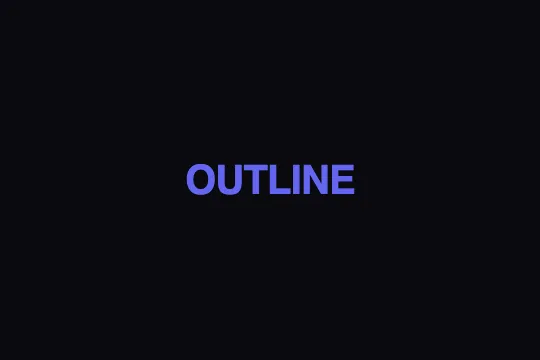
This effect is part of Effect.Labs — 840 vanilla effects, some free, some premium. Text has 56 effects, including 4 free. Explore the category →
3 usage examples



How it works
The resting state relies on two combined properties: -webkit-text-stroke draws the glyph outline with a chosen width and color, and color: transparent hides the inner fill. The text is only visible as a hollow silhouette.
On hover (:hover), color switches to the fill color (#6366f1) and -webkit-text-stroke is reset to zero. The transition: .4s applied at rest animates both properties simultaneously: the outline fades out as the fill appears.
-webkit-text-stroke is prefixed but natively supported across all modern rendering engines — Chrome, Firefox, Safari, Edge — without polyfills. Unlike text-shadow, it operates on the vector path of the glyph, preserving sharp edges at any size and font-weight.
The effect is entirely stateless: no JS, no extra DOM. Apply the text-outline-fill class to any text element and add the CSS — done.
Accessibility
- No prefers-reduced-motion: the transition (.4s) runs regardless of the system setting. Add
@media (prefers-reduced-motion: reduce) { .text-outline-fill { transition: none } }for motion-sensitive users. - The effect is triggered by
:hoveronly — not keyboard-accessible. Add.text-outline-fill:focus-visible { -webkit-text-stroke: 0 transparent; color: #6366f1 }to fire on focus as well. - Text content is native HTML (
<span>): screen readers read it normally, independently of the visual style — noariaattributes are required on the element. - Resting state: only the outline (#6366f1, 2 px) is visible. At 2 px on a dark background, the stroke alone may fall below WCAG AA contrast — increase width or color if legibility demands it.
- Filled state: #6366f1 on #0a0a0f yields a contrast ratio of approximately 4.6:1 — WCAG AA compliant (≥ 4.5:1). On a light background, re-check with your palette.
Browser compatibility
Relies exclusively on -webkit-text-stroke and color — no JavaScript, no external dependencies.
If -webkit-text-stroke is not supported (very old browsers), text displays with its normal color fill — no errors, content remains readable.
The code
HTML structure to paste into your page (the CSS + JS come with Premium):
<span class="text-outline-fill">YOUR TEXT</span>The full HTML + CSS + JS of Outline to Fill, ready to paste — plus all 840 effects. Or $299 once, lifetime access.
Customize
Options passed to the API or data-* attributes:
| Option / property | Default | Effect |
|---|---|---|
| -webkit-text-stroke (width) | 2px | Outline stroke thickness. 1 px = delicate, 3–5 px = bold and readable at a distance. Beyond 5 px, glyphs may close up at small font sizes. |
| -webkit-text-stroke (color) | #6366f1 | Outline color at rest. May differ from the fill color for a two-tone effect (stroke and fill chromatically distinct). |
| color (hover state) | #6366f1 | Fill color on hover. Same value as the outline for monochrome consistency; a different value for a dual-color effect. |
| transition | .4s | Animation duration. 0.2 s = snappy response (gaming, UI), 0.6–0.8 s = slow cinematic fade. Add ease-in-out to smooth both ends. |
| font-size | 2.5rem | Text size. The effect is most impactful above 3 rem — below that, a 2 px stroke takes up a disproportionate share of the glyph surface. |
| font-weight | 800 | Font weight. Heavy weights (700–900) produce a bolder stroke and a more substantial fill. Light weights (300–400) give a more airy result. |
FAQ
-webkit-) but natively supported across all modern engines — including Firefox since v49 and Edge since v79 — without polyfills. The unprefixed property (text-stroke) is not yet a CSS standard. For a prefix-free alternative, use an <svg> with stroke and fill, at the cost of a more complex structure.:hover, making it invisible to keyboard users. Add .text-outline-fill:focus-visible { -webkit-text-stroke: 0 transparent; color: #6366f1 } so keyboard focus produces the same visual result. Make sure the element is focusable (tabindex="0" if it is not a link or button).:hover selector, keep -webkit-text-stroke at its resting value instead of resetting it to zero. Only color will change — you get outlined text that colors its interior on hover, stroke remaining. The effect is more subtle but readable at smaller sizes.


