Shadow Pop
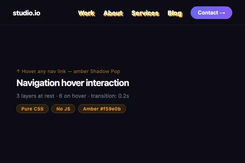
Stacked step-shadow that grows on hover and pushes the text forward — pure CSS 3D effect, no JavaScript.
Updated

This effect is part of Effect.Labs — 840 vanilla effects, some free, some premium. Text has 56 effects, including 4 free. Explore the category →
3 usage examples


How it works
The effect relies on multi-layer text-shadow: at rest, four identically colored shadows (#6366f1) are stacked at increasing offsets (1 px, 2 px, 3 px, 4 px) in the same bottom-right direction. The continuous stacking creates the illusion of a solid depth block behind the text.
On hover, two mechanisms act in parallel. transform: translate(-4px, -4px) moves the text diagonally top-left — the exact opposite of the shadow direction — simulating a lift out of the plane. Simultaneously, the :hover rule extends the shadows to eight layers (1 px to 8 px): perceived depth doubles, reinforcing the illusion that the text has been pulled out of the page.
The transition: .3s on the element animates both the text-shadow change and the translation in a single short declaration — browsers interpolate each individual shadow offset and the transform in parallel. Zero JavaScript, zero dependencies: the effect fits in two CSS rules.
Accessibility
- prefers-reduced-motion: absent from the provided code. For motion-sensitive contexts add
@media (prefers-reduced-motion: reduce) { .text-shadow-pop { transition: none; } .text-shadow-pop:hover { transform: none; } }to respect system preferences. - The effect is purely decorative: no ARIA attributes are required on the text element. If the text is a link or button,
roleandaria-labelstay on the native interactive element. - Keyboard: the effect only activates on CSS
:hover— keyboard-navigating users will not see the 3D transition. To also enable it on focus, add.text-shadow-pop:focus-visible { transform: translate(-4px,-4px); text-shadow: /* 8 layers */; }. - Contrast: the code defines no background. Text color
#fffand shadow#6366f1pass WCAG AA on dark backgrounds (≥ #1c1c1c). On light backgrounds, choose a contrasting shadow color and adjustcolor. - No automatic animation: the effect only triggers on user hover — it implicitly satisfies WCAG 2.3.1 (no flash) and 2.2.2 (no looping animation to stop).
Browser compatibility
Relies on text-shadow, transform, and transition — supported in all modern browsers without vendor prefixes.
Without transform (IE 8 and earlier), text stays in its default position with 4 static rest-state shadows — the 3D lift is not visible but content remains readable with no JS errors.
The code
HTML structure to paste into your page (the CSS + JS come with Premium):
<span class="text-shadow-pop">Your text</span>

<!-- On a heading -->
<h1 class="text-shadow-pop">Hero title</h1>

<!-- In navigation -->
<nav>
  <a class="text-shadow-pop" href="#">Home</a>
  <a class="text-shadow-pop" href="#">Services</a>
  <a class="text-shadow-pop" href="#">Contact</a>
</nav>

<!-- On a pull quote -->
<blockquote class="text-shadow-pop">
  "Memorable quote"
</blockquote>The full HTML + CSS + JS of Shadow Pop, ready to paste — plus all 840 effects. Or $299 once, lifetime access.
Customize
Options passed to the API or data-* attributes:
| Option / property | Default | Effect |
|---|---|---|
| Shadow color (#6366f1) | #6366f1 | Hex of the shadow in all text-shadow declarations of .text-shadow-pop and .text-shadow-pop:hover. Replace with your brand color — rgba also works for a semi-transparent halo. |
| Rest depth (4 layers, 1–4 px) | 4 shadows (1 px → 4 px) | The 4 lines #6366f1 Npx Npx 0 inside .text-shadow-pop { text-shadow: … }. Drop to 2–3 layers for a subtler rest state, raise to 6 for deeper resting depth. |
| Hover depth (8 layers, 1–8 px) | 8 shadows (1 px → 8 px) | Inside .text-shadow-pop:hover { text-shadow: … }, extend or shorten the shadow list. Each extra layer adds 1 px of perceived depth. |
| Lift offset (translate -4px, -4px) | translate(-4px, -4px) | In .text-shadow-pop:hover { transform: … }. Match the absolute value to the rest-state shadow depth (4 px here). Scale proportionally if you add more shadow layers. |
| Transition duration (0.3s) | 0.3s | The transition: .3s property on .text-shadow-pop. Drop to 0.15s for snappy nav links, raise to 0.5s for a more cinematic feel. |
| Text color (color: #fff) | #fff | In .text-shadow-pop { color: #fff; }. On light backgrounds, choose a dark color and verify the shadow still reads as depth (contrast ratio ≥ 4.5:1 between text and background). |
FAQ
text-shadow applies per line independently. transform moves the entire block as one. On a long paragraph the uniform vertical shift can feel heavy — prefer the effect on short titles (1–3 words) or isolated links for the best result..text-shadow-pop { text-shadow: … } and another in .text-shadow-pop:hover { text-shadow: … }. The transition will interpolate the hex or rgba value between the two states — useful for a tint shift that accompanies the depth change.background: linear-gradient(…); -webkit-background-clip: text; -webkit-text-fill-color: transparent; to .text-shadow-pop. The shadow continues to render beneath the gradient text and the transition remains functional. Test on Safari: text-shadow transition interpolation can vary when -webkit-text-fill-color is active.


