Text Explosion
On click, each letter flies out with a spring-elastic transition — a second click snaps them all back to their original position.
Updated

This effect is part of Effect.Labs — 840 vanilla effects, some free, some premium. Text has 56 effects, including 4 free. Explore the category →
3 usage examples

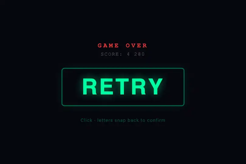
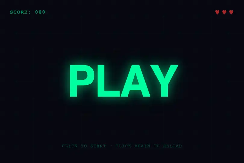
How it works
The .kt-text.kt-explosion container groups <span class="char"> elements — one per character. Each span inherits display: inline-block from the CSS, enabling independent 2D transforms without breaking the text flow. The splitChars(el) utility generates these spans dynamically from the container's data-text or textContent.
On the first click, the handler iterates over the .char elements and assigns each one a random inline transform: translate(x, y) rotate(angle) with independent values per letter (typically ±150–300 px for x/y, ±360° for rotation). The .exploded class is added to the container simultaneously — it serves as a state marker and switches the transition curve for the return animation.
Scattering uses cubic-bezier(.34, 1.56, .64, 1) over .4s: an overshoot curve that simulates a spring — each letter briefly overshoots its target before settling. Reassembly (second click) switches to cubic-bezier(.25, .46, .45, .94) over .8s: no overshoot, slower, giving the impression that letters converge by inertia back to their origin.
The CSS also covers .kt-wave, .kt-elastic, .kt-scatter, .kt-liquid, and .kt-whirlpool — each activates a different behavior via its own class. The splitChars() utility defined in the JS is shared across all these modes.
Accessibility
- prefers-reduced-motion: absent from the provided CSS — no static fallback is built in. Recommended before deployment:
@media (prefers-reduced-motion: reduce) { .kt-explosion .char { transition: none } }. - Text stays as native HTML (spans) readable by screen readers — no canvas hides the content. Add
aria-labelto the container if the word alone does not sufficiently describe the context. - No keyboard listener is wired in the provided JS: interaction is mouse-only. For keyboard accessibility, add
tabindex="0"to the container and akeydownlistener (Enter/Space). - Text contrast:
.charelements in#fffon#0a0a0fbackground reach a ratio of ≈ 18:1 — well above WCAG AA (4.5:1 for normal text). user-select: noneon.kt-textprevents text selection — if the content carries important information, add anaria-labelor an off-screen text equivalent.
Browser compatibility
Uses CSS Transforms Level 1 and CSS transitions — supported since IE10+. Zero external dependencies.
Without JS, the <span class="char"> elements display inline and the text remains readable — no fatal error. The page stays fully functional with no transform effects.
The code
HTML structure to paste into your page (the CSS + JS come with Premium):
<div class="kt-text kt-explosion" data-text="YOUR TEXT" style="cursor: pointer;">
<!-- Generated by splitChars() or pre-split in markup -->
<span class="char" data-char="Y">Y</span>
<span class="char" data-char="O">O</span>
<span class="char" data-char="U">U</span>
<span class="char" data-char="R">R</span>
<!-- One <span class="char"> per text character -->
</div>The full HTML + CSS + JS of Text Explosion, ready to paste — plus all 840 effects. Or $299 once, lifetime access.
Customize
Options passed to the API or data-* attributes:
| Option / property | Default | Effect |
|---|---|---|
| data-text | BOOM | Word to display and split into .char spans — change the attribute in the markup to update the effect word without touching the JS. |
| font-size (CSS .kt-text) | 2.2rem | Character size. Scale up to 5–8 rem for a full-screen hero; scale down to 1.5–2 rem for a compact section title. |
| color (CSS .kt-text) | #fff | Character color. Combine with background-clip: text; -webkit-text-fill-color: transparent on .kt-text for gradient letters. |
| letter-spacing (CSS .kt-text) | .02em | Inter-letter spacing. Positive value for an airy feel (hero); negative (-.02em) for a condensed game-style look. |
| scatter transition (CSS .kt-explosion .char) | .4s cubic-bezier(.34,1.56,.64,1) | Scatter duration and curve. Shorten to .2s for a sharper explosion; replace with ease-out to remove overshoot. |
| return transition (CSS .kt-explosion.exploded .char) | .8s cubic-bezier(.25,.46,.45,.94) | Reassembly duration and curve. Lengthen to 1.2–1.5s for an ultra-slow magnetic convergence. |
| splitChars(el) | — | Dynamically generates the <span class="char"> elements from data-text or textContent. Useful for server-rendered or CMS-driven text. |
| scatter radius (JS, ±px) | ±150–300 px depending on context | Scatter amplitude to define in your click handler. Typical value: 40–50% of the container width. |
FAQ
splitChars(el) to split text into spans. The click logic (assigning a random transform: translate(x,y) rotate(angle) to each .char, toggling the .exploded class) must be wired in your own script. This is intentional: scatter amplitude depends on your container size.splitChars() on each container then attach an independent click listener per element. The CSS classes .kt-explosion and .kt-explosion.exploded are scoped to the selector — each container manages its own state with no cross-instance interference..char elements are ordinary display: inline-block spans — they inherit color, background-clip: text, -webkit-text-fill-color: transparent, and any style applied to .kt-text. Transform transitions never reset color properties.


