Text Whirlpool
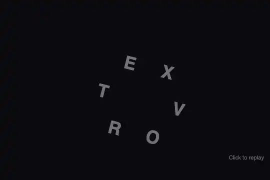
Characters fly out to a circular orbit then converge back into readable text in a single spring-like motion — 100% CSS transitions, no canvas.
Updated
This effect is part of Effect.Labs — 840 vanilla effects, some free, some premium. Text has 56 effects, including 4 free. Explore the category →
3 usage examples

How it works
The utility function splitChars() breaks the data-text attribute into individual <span class="char"> elements. The JS init then computes an angular position on a circle of radius ≈ 77 px for each span using the formula angle = phase + index × (2π / n) (n = character count, phase ≈ 14.4°), converted to Cartesian coordinates via Math.cos / Math.sin.
Each char receives an inline style position:absolute; transform:translate(x,y) rotate(14.4deg); opacity:0.424; transition:none. The inline transition:none is critical: it blocks any animation on load even though the CSS rule .kt-whirlpool .char { transition:1.2s cubic-bezier(.34,1.56,.64,1) } is already present. The JS sets the .kt-whirlpool parent to position:relative, collapsing it to zero size inside its flex-centered container — the chars therefore orbit around the visual center of the area.
To trigger the animation, two nested requestAnimationFrame calls remove the transition:none override (via c.style.removeProperty('transition')) then add the .active class to the container. The rules .kt-whirlpool.active .char { position:relative!important; transform:translate(0,0) rotate(0deg)!important; opacity:1!important } take effect: each char leaves its orbit and returns to its natural position in the HTML text flow. The cubic-bezier(.34,1.56,.64,1) produces a slight overshoot then rebound — the spring effect.
Clicking the container replays the cycle: .active is removed, circular inline styles are re-applied with transition:none, then the double-rAF re-triggers the animation. The effect is entirely DOM-based — no canvas, no external library.
Accessibility
- prefers-reduced-motion: not implemented in the provided code. Minimal solution to add:
@media (prefers-reduced-motion: reduce) { .kt-whirlpool .char { transition: none !important; } }and trigger.activeimmediately without the double-rAF delay. - No
aria-*attributes in the base HTML structure — addrole="img"andaria-label="[your text]"on the container if the effect serves as a decorative heading. - Text content lives in the DOM as readable
<span>elements — screen readers access it regardless of the animation state. - Keyboard interaction is not natively supported (non-focusable
<div>container) — addtabindex="0"and akeydownlistener (Enter/Space) to make replay accessible. - No
aria-liveregion: the visual state change is not announced to assistive technologies.
Browser compatibility
Requires CSS transitions and requestAnimationFrame — supported in all modern browsers. Zero external dependencies.
Without CSS transitions, characters jump directly to their readable final state with no animation — no JS errors, text remains displayed and legible.
The code
HTML structure to paste into your page (the CSS + JS come with Premium):
<div class="demo-preview">
  <div class="kt-text kt-whirlpool" id="whirlpool1" data-text="VORTEX" style="cursor: pointer;">
    <!-- One <span class="char" data-char="V">V</span> per character
         orbit-positioned by the JS init (position:absolute + translate) -->
  </div>
  <span class="demo-hint">Click to replay</span>
</div>The full HTML + CSS + JS of Text Whirlpool, ready to paste — plus all 840 effects. Or $299 once, lifetime access.
Customize
Options passed to the API or data-* attributes:
| Option / property | Default | Effect |
|---|---|---|
| data-text | "VORTEX" | Text to animate — change the HTML attribute directly. Character count automatically adjusts the angular spacing (360° / n). |
| font-size on .kt-text | 2.2rem | Character size. A larger size calls for a wider orbital radius — increase the RADIUS constant in the JS init proportionally. |
| color on .kt-text | #fff | Character color in the readable state. Orbit opacity (0.424) is set by the JS init inline style and applies regardless of color. |
| transition in .kt-whirlpool .char | 1.2s cubic-bezier(.34, 1.56, .64, 1) | Duration and curve of convergence. Increase to 1.8s for slow cinematic motion, decrease to 0.6s for a snappy animation. Modify the cubic-bezier for more or less rebound (2nd value > 1 = overshoot). |
| RADIUS (JS init constant) | ~77 | Orbital circle radius in pixels. Calibrate against character count and font-size — a 4-letter word at 5rem needs a radius of 100–120 px. |
| opacity: 0.424 (JS init inline style) | 0.424 | Character opacity during orbit before convergence. 0 = invisible at start (sudden appearance), 0.7 = semi-visible (softer effect). |
| rotate(14.4deg) (JS init inline style) | 14.4deg | Uniform rotation applied to all characters in orbit. 0deg = upright letters during orbit, 45deg = strongly tilted characters. |
FAQ

<span> elements, CSS transitions, and a few lines of JS for the orbital position math. Zero npm dependencies, no canvas. Compatible with any framework: wrap the container in a component, trigger .active class addition from your own logic, and remove it to reset.data-text attribute directly in the HTML (data-text="STUDIO"). The JS init reads that attribute, recreates the <span class="char"> elements, and recalculates the angular positions automatically — no script changes needed..kt-whirlpool by element (not by a shared global variable): give each container a distinct id. Each then gets its own .active state, isolated click listener, and independent chars. No state variable is shared between instances.


