Fluid Grid Morph
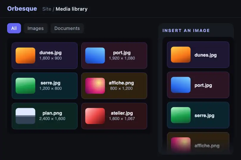
Tile grid that goes from 1 to 2 then 3 columns based on its container's width; at each change, the tiles glide from their old cell to the new one.
Updated

This effect is part of Effect.Labs — 840 vanilla effects, some free, some premium. Utilities has 43 effects, including 3 free. Explore the category →
3 usage examples

How it works
The layout is pure CSS: .fx-0758-root is a container (container: fgm / inline-size) and .fgm-grid has 1 column, then 2 from 280 px and 3 from 440 px of root width. Browsers cannot animate a change in the number of columns: left alone, the tiles would jump at once.
The script provides that animation with the FLIP technique. One ResizeObserver per root records each tile's position (offsetLeft, offsetTop). When the column count changes, it puts every tile back at its old position with a transform, then adds the .fgm-move class and removes the offset: the 0.4 s CSS transition (cubic-bezier(.4, 0, .2, 1)) brings the tile into its new cell.
If another switch happens mid-glide, the tile starts from where it is displayed. Between two tiers, the tiles stretch with the grid without animation. Each root has its own instance (data-fgm-ready attribute): pasting the code twice does not create a second one.
Accessibility
- Reduced motion: with
prefers-reduced-motion: reduce, the script offsets nothing and the CSS removes the transition; the grid changes columns instantly and nothing is lost. - Order kept: only the display glides, the HTML order never changes; screen readers read the tiles in the same order at every width, and the Tab key follows that order for any links or buttons you put inside.
- Free content: tiles are
<div>elements; put real links or buttons inside if they can be activated (the CRM scene uses one<button>per file). - Demo letters: tiles A to F are white text on 15 % tinted backgrounds; replace them with your content and keep enough contrast.
Browser compatibility
@container (Chrome 105, Firefox 110, Safari 16), ResizeObserver (Chrome 64, Firefox 69, Safari 13.1) and DOMMatrixReadOnly according to @mdn/browser-compat-data 8.1.8. Measured in Chromium 151, Firefox 153 and WebKit 26.5: going from 2 to 3 columns, all 6 tiles of the resized copy are moving at 30 and 150 ms and settled at 700 ms; the neighbouring copy does not move; with reduced motion, no tile glides.
Without JavaScript or without ResizeObserver, the grid still changes columns, but at once, without gliding. Without @container, it stays on one column.
The code
HTML structure to paste into your page (the CSS + JS come with your purchase):
<div class="fx-0758-root">
  <div class="fgm-grid">
    <div class="fgm-item">A</div>
    <div class="fgm-item">B</div>
    <!-- … as many tiles as you like -->
  </div>
</div>One-time payment, no subscription — the code is yours forever
Customize
Options passed to the API or data-* attributes:
| Option / property | Default | Effect |
|---|---|---|
Tiers (CSS — @container fgm (min-width: 280px) and (min-width: 440px)) |
2 columns at 280 px, 3 columns at 440 px | Add a 4-column tier (repeat(4, 1fr) at 620 px for instance): the script detects any change in column count, nothing to change in the JS. |
Glide duration and curve (CSS — .fgm-item.fgm-move { transition }) |
transform .4s cubic-bezier(.4, 0, .2, 1) |
0.25 s gives a snappier tidy-up; beyond 0.6 s, a switch during a finger drag feels late. |
Tile height (CSS — .fgm-item { height }) |
60 px | Go up to 70-90 px for thumbnails; remove the height so it follows the content (the glide also works with uneven heights). |
Tile colours (CSS — .fgm-item:nth-child(6n+1) … (6n)) |
Six hues at 15 % opacity, cycle of 6 | Replace them with a single colour or with your images: the cycle restarts at the seventh tile. |
Spacing (CSS — .fgm-grid { gap; padding }) |
8 px between tiles, 10 px around | A wider gap makes the glide easier to read; for a grid flush with its frame, set padding: 0. |
Number of tiles (HTML — children of .fgm-grid) |
6 (A to F) | Add or remove tiles before the script loads; a tile added later may settle without gliding at the first switch, then glides like the others. |
FAQ
transform: translate) without resizing it, so images are never distorted.

