Media Card
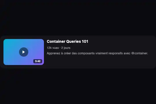
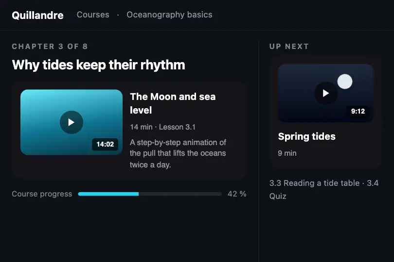
Video card that sits as a thumbnail above the title in a narrow column, then moves the thumbnail left and reveals the description from 280 px.
Updated
This effect is part of Effect.Labs — 840 vanilla effects, some free, some premium. Utilities has 43 effects, including 3 free. Explore the category →
3 usage examples
How it works
.fx-0751-root is the query container (container: mdc-card / inline-size) and fills its parent's width. In the starting shape, .mdc-card stacks an 80 px tall .mdc-thumb thumbnail (cyan-to-violet gradient), the title and a meta line (views, age). The thumbnail carries a dark circle with a play triangle in the middle and the running time bottom right, in .mdc-duration.
From 280 px of container width, the @container mdc-card (min-width: 280px) rule turns the card into a top-aligned row: the thumbnail takes 140 × 90 px on the left, the text spreads to the right and the .mdc-desc paragraph, hidden until then, appears under the meta. Two states, nothing in between.
The play circle is a drawing: the card plays nothing and holds no <video> element. To open the video, wrap the title (or the card) in a link to your watch page. 0.3 s transitions on the card and thumbnail soften the change of shape.
Accessibility
- No fake button: the “play” circle has
aria-hidden="true"and takes no focus, since it triggers nothing. The real link, to add on the title, will be the only keyboard target. - Readable duration:
3:42is real text read by screen readers (often as “3 colon 42”). For clearer speech, add visually hidden text (“3 minutes 42”) and putaria-hidden="true"on the short form; anaria-labelon thisspanwould be ignored by most screen readers. - Conditional description: under 280 px,
.mdc-descisdisplay: noneand not announced; keep anything essential out of it. - Reduced motion: transitions are removed under
prefers-reduced-motion: reduce; the card changes shape without animation.
Browser compatibility
Container queries, flexbox and inline SVG. Measured in Chromium 151, Firefox 153 and WebKit 26.5: switch between 260 and 300 px, as designed at 280 px, no overflow at 390 px.
Browser without @container: the card keeps the thumbnail above the title and the description never shows.
The code
HTML structure to paste into your page (the CSS + JS come with your purchase):
<div class="fx-0751-root">
  <div class="mdc-card">
    <div class="mdc-thumb">
      <div class="mdc-play" aria-hidden="true"><svg viewBox="0 0 24 24">…</svg></div>
      <span class="mdc-duration">3:42</span>
    </div>
    <div class="mdc-body">
      <h4>Video title</h4>
      <span class="mdc-meta">12k views · 2 days</span>
      <p class="mdc-desc">Description</p>
    </div>
  </div>
</div>One-time payment, no subscription — the code is yours forever
Customize
Options passed to the API or data-* attributes:
| Option / property | Default | Effect |
|---|---|---|
Step (CSS — @container mdc-card (min-width: 280px)) |
280 px | Move it to 360 px if your titles are long: the left thumbnail then leaves them enough room. |
Thumbnail (CSS or HTML — .mdc-thumb) |
#06b6d4 → #8b5cf6 gradient, 80 px tall |
Set the video still with style="background-image:url(…)" (cover cropping already set). |
Thumbnail size in the row (CSS — .mdc-thumb inside the step) |
140 × 90 px | 160 × 90 px for a true 16:9, 96 × 54 px for a compact list. |
Duration (HTML — .mdc-duration) |
3:42 |
Remove the tag for a live stream, or replace the text with “LIVE”. |
| Watch link (HTML) | None | Wrap the h4 content in an <a href="…"> to your video page. |
Text colours (CSS — .mdc-meta, .mdc-desc) |
White at 55 % | On a light background, use a dark grey (#475569) to keep contrast. |
FAQ
.fx-0751-root element for each video. Since each one measures its own width, a list in a narrow column stays as thumbnails and the same list in a wide column turns into rows.display: none from the .mdc-desc rule.