Responsive Nav
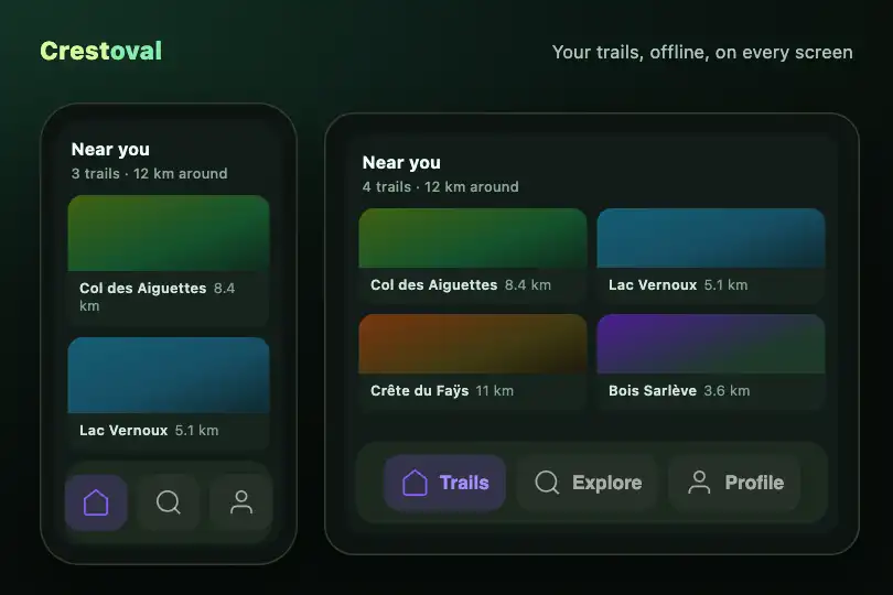
Tab bar that shows icons only in a narrow column and adds its labels once its container reaches 280 px — no media query.
Updated
This effect is part of Effect.Labs — 840 vanilla effects, some free, some premium. Utilities has 43 effects, including 3 free. Explore the category →
3 usage examples
How it works
The .fx-0746-root element is the queried container itself (container: ctb-nav / inline-size). It holds a <nav class="ctb-bar"> with one .ctb-item link per tab: a decorative SVG icon and a <span class="ctb-label">. What decides the layout is the width of the spot where you place the bar, not the screen width: the same bar can show its labels in the page and stay icon-only in a side column.
Below 280 px the labels are hidden from sight with the visually-hidden technique (1 px box, clip-path: inset(50%)): they stay in the page and name the links. The @container ctb-nav (min-width: 280px) rule puts them back next to the icon. Tabs stay centred, 6 px apart, on a rgba(255,255,255,.04) background with 14 px corners.
The active tab is the one carrying aria-current="page": violet rgba(139,92,246,.2) background, #8b5cf6 icon, #a78bfa label. The small script attaches to each root (once, even if pasted twice) and moves that attribute to the clicked link; on a multi-page site, simply set aria-current on the server.
Accessibility
- Real links: each tab is an
<a href>, reached with Tab and followed with Enter, by finger or mouse. In Safari, Tab only stops on links with Option+Tab or the macOS “Use Tab to select” setting. - Name kept in icon mode: the label is hidden from sight, not removed: a screen reader says “Search, link” even at 160 px wide. Icons carry
aria-hidden="true". - Current tab announced:
aria-current="page"is read out (“current page”). Visually, the active tab stands out through a violet background and text colour: if you want a cue that does not rely on colour, add an underline or a bar under.ctb-item[aria-current="page"]. - Visible focus: 2 px
#a78bfaoutline offset by 2 px on:focus-visible. - Reduced motion: under
prefers-reduced-motion: reduce, the 0.3 s background and colour fades are removed; labels have always appeared instantly.
Browser compatibility
Container queries (container-type, @container: Chrome 105, Firefox 110, Safari 16) and :focus-visible (Safari 15.4). Measured in Chromium 151, Firefox 153 and WebKit 26.5 with two copies on one page: labels hidden up to 279 px, shown from 281 px, still on one line at 800 px; click, tap and Enter move the active tab of the touched copy only; 0 errors.
Without container queries (older browser), the bar stays icon-only at every width; labels are still read by screen readers and the links work. Without JavaScript, only the active tab moving on click is lost.
The code
HTML structure to paste into your page (the CSS + JS come with your purchase):
<div class="fx-0746-root">
  <nav class="ctb-bar" aria-label="…">
    <a class="ctb-item" href="#…" aria-current="page">
      <svg aria-hidden="true">…</svg>
      <span class="ctb-label">…</span>
    </a>
    <a class="ctb-item" href="#…">…</a>
  </nav>
</div>One-time payment, no subscription — the code is yours forever
Customize
Options passed to the API or data-* attributes:
| Option / property | Default | Effect |
|---|---|---|
Breakpoint (CSS — @container ctb-nav (min-width: 280px)) |
280 px | Change the value to show labels earlier or later; it applies to the root's width. |
Tabs (HTML — .ctb-item) |
3 links: Home, Search, Profile | Add or remove links; with more tabs, raise the breakpoint so every label fits on one line. |
Active tab (HTML — aria-current="page") |
The first link | Put the attribute on the current page's link; the script moves it on click in a single-page app. |
Accent colour (CSS — .ctb-item[aria-current="page"]) |
Background rgba(139,92,246,.2), icon #8b5cf6, text #a78bfa |
Replace these three values for the active tab, and rgba(139,92,246,.15) for hover. |
Background (CSS — .fx-0746-root and .ctb-bar) |
#0a0a0f with 16 px corners, bar rgba(255,255,255,.04) |
Set the root to background: transparent so it takes your footer's colour. |
Icons (HTML — 24 × 24 stroke <svg>) |
House, magnifier, person; 1.5 stroke | Paste your own stroke icons (fill: none): their colour follows the tab state. |
FAQ
aria-current="page" on its own link and the script can go: the width adaptation is pure CSS.

