Responsive Pricing Table
Three pricing plans that stack, reveal their features, then sit side by side according to their area's width, gliding to their new place.
Updated
This effect is part of Effect.Labs — 840 vanilla effects, some free, some premium. Utilities has 43 effects, including 3 free. Explore the category →
3 usage examples
How it works
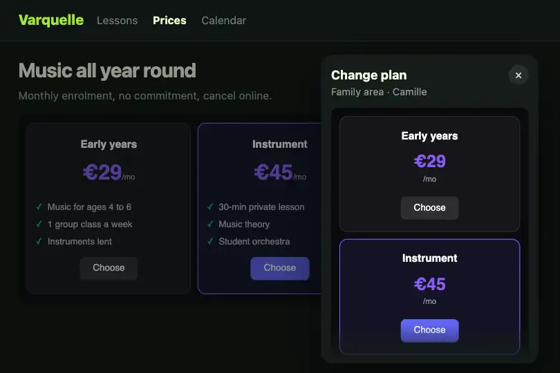
.fx-0763-root is the measured container (container: rpt / inline-size). Under 280 px: stacked cards, reduced to name, price and button. From 280 to 399 px: the .rpt-features list fades in over 0.4 s and the price grows from 1.3 to 1.6 rem. From 400 px: the three cards line up on one row, buttons aligned at the bottom.
The move from one tier to another is animated by the script: a ResizeObserver follows each root, spots the change (column count or list appearing) and applies the FLIP technique. Each card visually starts from its old position, then glides to the new one through the .rpt-move class (0.45 s transform transition). Card backgrounds are opaque so a card crossing another hides it cleanly.
The highlighted plan carries .rpt-popular (#6366f1 border, #5f63f0 button, slightly darker so its white text reaches a 4.6:1 contrast). Buttons are real <button type="button"> elements: wire them to your checkout or replace them with links.
Accessibility
- Named buttons: each button keeps its visible text (“Choose”) and gets an
aria-labelthat completes it (“Choose the Starter plan”) so a list of buttons still makes sense out of context. - Visible focus: 2 px
#a5b4fcoutline from the keyboard (:focus-visible). On Safari for macOS, Tab only reaches buttons if the system keyboard option allows it. - Reduced motion: with
prefers-reduced-motion: reduce, no card glide, no list fade and no button growth on hover; tiers switch instantly. - Features hidden when small: under 280 px the list is
display:none, so screen readers skip it too; if a plan stands out by its features, keep a short version in the name or button.
Browser compatibility
Container queries (Chrome 105, Firefox 110, Safari 16), ResizeObserver and CSS animation, according to @mdn/browser-compat-data 8.1.8. Measured in Chromium 151, Firefox 153 and WebKit 26.5: 1 column without features at 220 px, 1 column with features at 300 px, 3 columns at 400 and 600 px; at a tier change, the 3 cards of the resized copy glide (moving at 30 and 150 ms, settled at 700 ms) and the neighbouring copy does not move.
Without JavaScript, the tiers work but cards change place at once. Without @container, the plans stay stacked and compact, buttons usable.
The code
HTML structure to paste into your page (the CSS + JS come with your purchase):
<div class="fx-0763-root">
  <div class="rpt-grid">
    <div class="rpt-card">
      <h5>…</h5>
      <div class="rpt-price">…<small>/mo</small></div>
      <ul class="rpt-features"><li>…</li></ul>
      <button type="button" class="rpt-cta" aria-label="…">…</button>
    </div>
    <div class="rpt-card rpt-popular">…</div>
    <div class="rpt-card">…</div>
  </div>
</div>One-time payment, no subscription — the code is yours forever
Customize
Options passed to the API or data-* attributes:
| Option / property | Default | Effect |
|---|---|---|
Tiers (CSS — @container rpt (min-width: 280px) and (min-width: 400px)) |
Features at 280 px, three columns at 400 px | With long features, raise the column tier to 480 px; the script follows any tier change without settings. |
Glide (CSS — .rpt-card.rpt-move { transition }) |
transform .45s cubic-bezier(.4, 0, .2, 1) |
Shorten to 0.3 s for a plan grid inside a drawer that opens quickly. |
List fade (CSS — @keyframes rpt-apparait) |
0.4 s, from opacity 0 and 4 px higher | Remove animation on .rpt-features for an abrupt appearance. |
Highlighted plan (HTML — rpt-popular class) |
On the middle plan | Move the class to another card; border, background and button follow. |
Colours (CSS — .rpt-price, .rpt-popular, #16161b / #131326 backgrounds) |
#8b5cf6 price, #6366f1 border, #5f63f0 highlighted button |
Keep card backgrounds opaque: with a transparent one, cards would show their neighbours while gliding. |
Texts and buttons (HTML — h5, .rpt-price, li, aria-label) |
Starter $9, Pro $29, Enterprise $99 | Change the visible text and the aria-label together so the spoken name always starts with the displayed word. |
FAQ
repeat(4, 1fr) with a higher threshold (around 520 px). The glide applies to every card in the grid.<button> with an <a> link using the same class.