Shape Hero
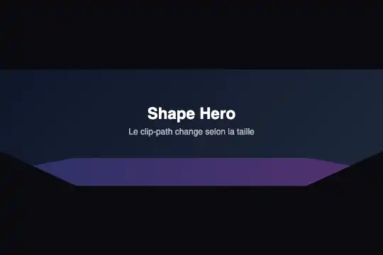
Header banner whose cut-out shape follows its container width: slanted bottom when narrow, rounded in between, cut corners when wide.
Updated
This effect is part of Effect.Labs — 840 vanilla effects, some free, some premium. Utilities has 43 effects, including 3 free. Explore the category →
3 usage examples
How it works
The transparent .fx-0756-root is the measured container (container: shh-hero / inline-size). It holds .shh-hero: a centred block with a navy gradient (#0f172a → #1e293b), an h3 title, a subtitle, and a 40 px decorative .shh-deco strip pinned to the bottom, indigo-to-fuchsia at 30 % opacity. The shape comes from clip-path: whatever falls outside the cut shows your page background.
Three shapes. Under 350 px, a polygon slants the bottom (right side raised to 80 %), and the strip follows the same slant. From 350 to 499 px, @container shh-hero (min-width: 350px) applies an ellipse (ellipse(70% 80% at 50% 40%)) that rounds the bottom and the corners, with a 1.2 rem title. From 500 px, the bottom gets cut corners (both lower corners bevelled by 20 %), the strip becomes a long hexagon and the title grows to 1.4 rem.
Inner spacing grows with the shape (30/50 px, then 40/60, then 50/70 top/bottom) so the text stays in the visible area. clip-path and that spacing animate over 0.5 s, the title size over 0.4 s. No JavaScript.
Accessibility
- Real heading: the text is an
h3and a paragraph, read normally; set the heading level to suit your page (oftenh1for a top banner). - Clipping and focus:
clip-pathhides anything outside the shape, focus outlines included. If you add a button, keep it centred, away from the cut edges. - Decorative strip:
.shh-decohasaria-hidden="true"andpointer-events: none; it gets in the way of neither reading nor clicks. - Contrast: white title and 70 % subtitle on navy, above 4.5:1.
- Reduced motion: under
prefers-reduced-motion: reduce, the cut, spacing and title size change without a transition.
Browser compatibility
Container queries and clip-path with polygon() and ellipse() (available long before @container). Measured in Chromium 151, Firefox 153 and WebKit 26.5: three shapes at the same steps, no error, two independent banners on one page.
Without @container, the banner keeps its narrow, slanted-bottom shape at every width.
The code
HTML structure to paste into your page (the CSS + JS come with your purchase):
<div class="fx-0756-root">
  <div class="shh-hero">
    <h3>Title</h3>
    <p>Subtitle</p>
    <div class="shh-deco" aria-hidden="true"></div>
  </div>
</div>One-time payment, no subscription — the code is yours forever
Customize
Options passed to the API or data-* attributes:
| Option / property | Default | Effect |
|---|---|---|
Steps (CSS — @container shh-hero (min-width: 350px) and (min-width: 500px)) |
350 px and 500 px | For a header that is only wide on desktop, move the second step to 720 px. |
Cut shapes (CSS — .shh-hero clip-path in each step) |
Slant, ellipse, cut corners | Any polygon() works; for a wave, try ellipse(90% 100% at 50% 0) in the wide step. |
Background (CSS — .shh-hero { background }) |
#0f172a → #1e293b |
A photo as background-image with a dark overlay keeps the text readable. |
Decorative strip (CSS — .shh-deco) |
40 px, indigo → fuchsia, 0.3 opacity | Delete the div for a bare cut, or raise opacity to 0.6 for a stronger edge. |
Inner spacing (CSS — padding per step) |
30/50 px, 40/60 px, 50/70 px (top/bottom) | With longer text, increase the bottom spacing so it never touches the cut area. |
Transition length (CSS — transition: clip-path .5s, padding .5s) |
0.5 s | 0.3 s for a snappier change while resizing. |
FAQ
clip-path makes everything outside the shape invisible, and the root is transparent, so the page background shows through. For a specific corner colour, give .fx-0756-root a background.

