Stats Panel
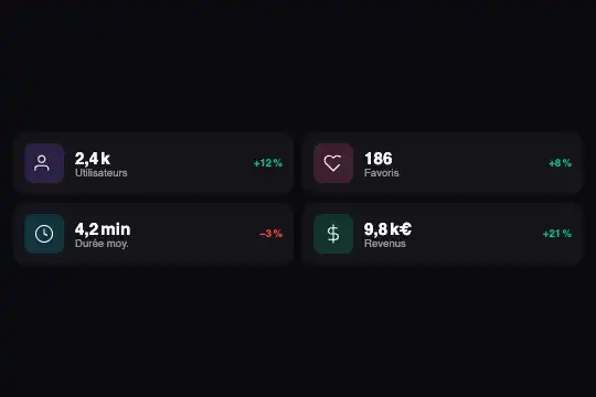
Four statistics with coloured icons that arrange themselves by the panel's real width: one column, then two columns where the trends (+12%, −3%) show.
Updated
This effect is part of Effect.Labs — 840 vanilla effects, some free, some premium. Utilities has 43 effects, including 3 free. Explore the category →
3 usage examples
How it works
The panel is its own measuring point: .fx-0750-root carries container: stp / inline-size and fills whatever width its parent gives it. Nothing depends on the screen size, only on the slot where you drop the code.
Three states. Under 260 px: one line per statistic (icon, value, label), trend hidden so the value stays readable. From 260 to 339 px: two columns, the icon shrinks to 30 px and the trend shows under the label. From 340 px: the icon goes back to 36 px and the trend sits at the right end of the line.
No script: display and grid-template-columns change from one tier to the next. Trend colour comes from a class: .stp-trend--up in green #10b981, .stp-trend--down in red #ef4444.
Accessibility
- Reading order: value, label then trend, in HTML order; the SVG icons are hidden (
aria-hidden="true") because they repeat the label. - Trend as text: the “+” or “−” sign is written out, colour only reinforces it. Under 260 px the trend is
display:none, so nobody reads it; keep the figure elsewhere if it matters. - Contrast: labels in 55 % white on
#0a0a0f; the small red#ef4444is the weakest point, darken it if your background is lighter. - Interaction: none; nothing to reach with the keyboard, nothing reacting to hover. With a finger or a mouse, only width decides.
Browser compatibility
@container and CSS grid only (container queries: Chrome 105, Firefox 110, Safari 16 according to @mdn/browser-compat-data 8.1.8). Measured in Chromium 151, Firefox 153 and WebKit 26.5: one column at 200 px, two columns with the trend under the label at 260 and 300 px, trend on the right at 340 and 600 px; labels intact at every tier, 390 px page with no horizontal scroll.
Without container query support, the panel stays in one column and the trends stay hidden: values and labels display normally.
The code
HTML structure to paste into your page (the CSS + JS come with your purchase):
<div class="fx-0750-root">
  <div class="stp-grid">
    <div class="stp-item">
      <div class="stp-icon stp-icon--purple"><svg viewBox="0 0 24 24" aria-hidden="true">…</svg></div>
      <div class="stp-text"><span class="stp-val">…</span><span class="stp-label">…</span></div>
      <span class="stp-trend stp-trend--up">…</span>
    </div>
    <!-- ×4: --purple, --pink, --cyan, --green; trend --up or --down -->
  </div>
</div>One-time payment, no subscription — the code is yours forever
Customize
Options passed to the API or data-* attributes:
| Option / property | Default | Effect |
|---|---|---|
Tiers (CSS — @container stp (min-width: 260px) and (min-width: 340px)) |
260 px: two columns + trends; 340 px: trend on the right | With long labels (“Average session length”), raise the second tier to 400 px to keep the trend under the label for longer. |
Icon colour (CSS — .stp-icon--purple, --pink, --cyan, --green) |
Backgrounds tinted at 20 % opacity | Add a .stp-icon--orange class on the same pattern, or change the hue of the four existing ones. |
Icons (HTML — the <svg> in each .stp-icon) |
Person, heart, clock, dollar (1.5 strokes) | Paste any stroke icon drawn on a 24×24 grid: the stroke colour comes from the CSS (stroke: #fff). |
Trend direction (HTML — .stp-trend--up / .stp-trend--down) |
Green for a rise, red for a fall | Pick the class according to what is good for you: a drop in delivery time can take --up to show in green. |
Number of statistics (HTML — .stp-item blocks) |
4 | Add or remove blocks: the two-column grid creates the rows it needs on its own. |
Background and spacing (CSS — .fx-0750-root, .stp-grid { padding }) |
#0a0a0f, 12 px inner spacing, 16 px corners |
Set the background to transparent to lay the cards straight onto your dark page. |
FAQ
display: none on .stp-trend and let the tier rule place them.inline-size), its content sets no minimum width: the cell shrinks even without min-width: 0..stp-val and .stp-trend from your server or script; the layout follows without recalculating anything.