Typography Adapts
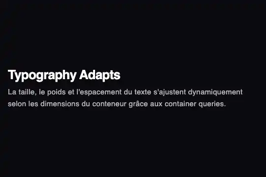
Heading and paragraph whose size, weight, letter spacing and line height change in four steps based on the width of the block that holds them.
Updated
This effect is part of Effect.Labs — 840 vanilla effects, some free, some premium. Utilities has 43 effects, including 3 free. Explore the category →
3 usage examples
How it works
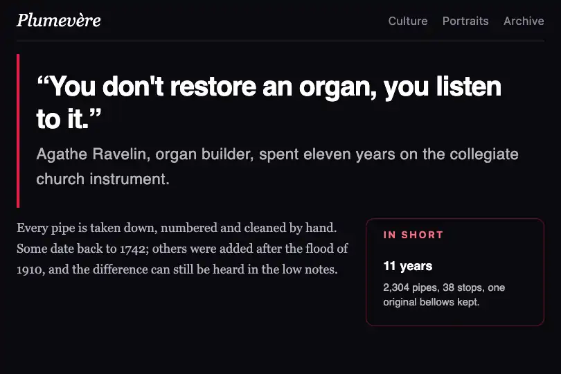
The .fx-0759-root element (#0a0a0f background, full width) declares container: tya-text / inline-size. Inside, .tya-block adds 16 px of padding around an h3 and a paragraph. At its narrowest, the heading is 12 px at weight 800 and the text 10 px with a 1.4 line height: enough to fit a thumbnail.
Three @container tya-text rules take over. At 250 px: a tighter 18 px heading (letter-spacing: -0.02em) and 13 px text with a touch of spacing. At 400 px: a 26 px heading at weight 700, 15 px text, 1.6 line height. At 550 px: a 34 px heading tracked in hard (-0.04em), 17 px text, 1.7 line height. The heading tightens as it grows while the text opens up, the way a magazine layout is adjusted by hand.
Each change eases in through transition: .4s on the block, the heading and the paragraph. The component has no script: just CSS rules applied to the block's real width.
Accessibility
- Very small first step: under 250 px the paragraph is 10 px, below what many readers read comfortably. If the block may be narrow on mobile, raise the base size of
.tya-block pto 12 or 13 px. - Pixel units: sizes are in
px; browser zoom enlarges them, but some systems' “text size” setting does not. Switch toremto honour that setting. - Structure untouched: only styles change; the heading stays an
h3(adjust to your hierarchy) and the text a paragraph. - Reduced motion: under
prefers-reduced-motion: reduce, size transitions are removed.
Browser compatibility
Container queries only. Measured in Chromium 151, Firefox 153 and WebKit 26.5: four states at the same widths (switches between 230 and 260, 380 and 430, 520 and 620 px), no error, no overflow.
Without @container the text stays at the smallest step (12 px / 10 px): set a larger base size if your audience uses old browsers.
The code
HTML structure to paste into your page (the CSS + JS come with your purchase):
<div class="fx-0759-root">
  <div class="tya-block">
    <h3>Heading</h3>
    <p>Paragraph</p>
  </div>
</div>One-time payment, no subscription — the code is yours forever
Customize
Options passed to the API or data-* attributes:
| Option / property | Default | Effect |
|---|---|---|
Steps (CSS — @container tya-text (min-width: 250px / 400px / 550px)) |
250, 400 and 550 px | Drop the last one if your blocks never exceed 500 px; add one at 720 px for a very large quote. |
Base sizes (CSS — .tya-block h3 and .tya-block p) |
12 px and 10 px | Go up to 15 px and 13 px to keep the small step readable on mobile. |
Heading tracking (CSS — letter-spacing per step) |
0 → -0.02 → -0.03 → -0.04 em | With an already tight typeface, keep 0 for the first two steps. |
Colours (CSS — .fx-0759-root, h3, p) |
#0a0a0f background, white heading, 70 % white text |
For a light background: white background, #111 heading, #444 text. |
Speed (CSS — transition: .4s) |
0.4 s | none if the block changes width often (dragging a column) and the animation gets in the way. |
| Continuous version (CSS) | Steps | For a size that follows the width continuously, replace the steps with font-size: clamp(12px, 6cqi, 34px) on the heading (container units). |
FAQ
clamp() in cqi units for size.h3 with your tag in the HTML and in the .tya-block h3 rules.