Animated Mesh Gradient
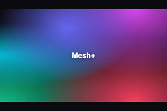
Five layered animated radial gradients form a fluid mesh background — color blobs shift across corners in pure CSS, no JavaScript needed.
Updated
This effect is part of Effect.Labs — 840 vanilla effects, some free, some premium. Backgrounds has 55 effects, including 7 free. Explore the category →
3 usage examples


How it works
The .bg-mesh-animated class stacks five radial-gradient layers over a solid #0a0a0f base, each anchored to a corner or edge using the at X% Y% syntax. Each blob fades from its saturated color to transparent at a 50% radius — the default CSS alpha blending blends the five hues wherever they overlap, with no mix-blend-mode needed.
The @keyframes meshMoveAnimated animation simultaneously repositions all five background-position values: at 0%/100% the blobs sit at their origin corners (0 0, 100% 0, 0 100%, 100% 100%, 0 100%); at 50% they migrate to opposite corners (100% 100%, 0 100%, 100% 0, 0 0, 100% 0). This cross-permutation movement creates shifting blend zones with no color interpolation — only position changes.
The 20 s duration and ease timing slow the start and end of each cycle, hiding the discrete keyframe steps and giving the impression of continuous organic drift. Animating background-position runs on the browser's compositing thread — no layout or paint is triggered, and performance stays stable even on mobile.
The structure is a single <div class="bg-mesh-animated">. Any overlay content (headings, CTAs) is positioned absolute on top. Width and height are fully driven by the parent container — replace min-height: 300px with height: 100% or min-height: 100vh as needed.
Accessibility
- prefers-reduced-motion not handled: the code contains no
@media (prefers-reduced-motion)block. If a user has enabled reduced motion in their OS, the animation keeps running. Fix for production:@media (prefers-reduced-motion: reduce) { .bg-mesh-animated { animation: none; } }. - The
<div class="bg-mesh-animated">carries noaria-hidden,role, oraria-label. As a purely decorative element it should receivearia-hidden="true"so screen readers ignore it. - The demo
.bg-label(text "Mesh+") renders white on a dark background — contrast is sufficient (> 4.5:1). In production, any text placed over the mesh must be manually verified: the color blobs continuously alter local luminance. - The effect exposes no interactive zone: no button, no focus, no keyboard trap. Page keyboard navigation is unaffected.
- Pure CSS, zero JavaScript — the effect works even when JS is disabled, with no errors.
Browser compatibility
Requires CSS multi-background support and the radial-gradient(at …) syntax — available in all modern browsers since 2013.
Without CSS gradient support, the <div> displays its base color #0a0a0f — no JS error, the page stays usable.
The code
HTML structure to paste into your page (the CSS + JS come with Premium):
<div class="bg-mesh-animated" style="width:100%;min-height:300px;" aria-hidden="true">
  <!-- Optional: overlay content positioned absolute -->
  <span class="bg-label">Your text</span>
</div>The full HTML + CSS + JS of Animated Mesh Gradient, ready to paste — plus all 840 effects. Or $299 once, lifetime access.
Customize
Options passed to the API or data-* attributes:
| Option / property | Default | Effect |
|---|---|---|
Blob colors (5 hex values in background) |
#6366f1, #d946ef, #06b6d4, #f43f5e, #10b981 | Replace the hex value in each radial-gradient(at … , #HEX 0, transparent 50%) line — one blob per line, in order of appearance. |
Animation duration (20s) |
20s | Increase (e.g. 40 s) for barely perceptible, calming drift; decrease (e.g. 8 s) for a more energetic feel. |
Blob extent (transparent 50%) |
50% | Increase to 70–80% for blobs that overlap and blend more; decrease to 30–35% for tighter spots with visible dark gaps between them. |
Base background color (#0a0a0f) |
#0a0a0f | Last value in the background shorthand. Swap to #fff for a light-background mesh, or any brand color. |
Number of blobs (5 radial-gradient lines) |
5 | Remove one or two lines for a minimal mesh (3 blobs); add more for greater complexity — up to 7 before mobile GPU load increases noticeably. |
Starting positions (at X% Y%) |
40% 20%, 80% 0, 0 50%, 80% 100%, 0 100% | Adjust percentages to change each blob's origin point — play with asymmetry for a less grid-like result. |
Timing function (ease) |
ease | Switch to linear for constant motion, or ease-in-out for even more pronounced pauses at cycle extremes. |
FAQ
.bg-mesh-animated class and the @keyframes meshMoveAnimated into your global stylesheet or a CSS module, then apply the class to any <div>. No library, no hook, no lifecycle method needed.radial-gradient(at … , #HEX 0, transparent 50%) line in the background property. Replace the five hex values with your brand colors. For a two-tone mesh, repeat the same color on multiple lines with different positions — the blending will remain subtle.background-position runs on the browser's compositing thread without triggering layout or paint on modern browsers (Chrome 88+, Firefox 87+, Safari 15+). On very low-end devices, increase the duration to 30–40 s to reduce GPU load.


