Aurora Borealis
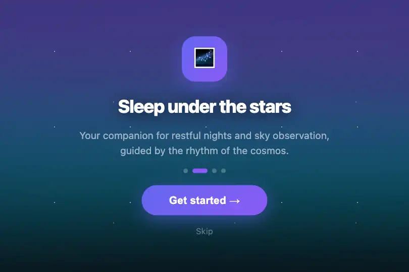
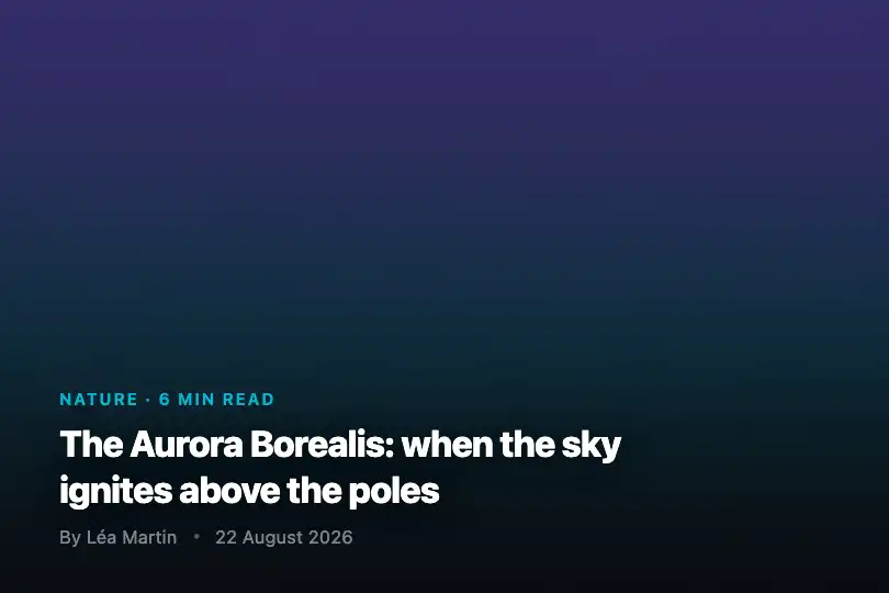
Pure CSS northern lights background — two indigo-violet-cyan glowing bands animate out of phase, simulating the rippling curtains of polar auroras.
Updated

This effect is part of Effect.Labs — 840 vanilla effects, some free, some premium. Backgrounds has 55 effects, including 7 free. Explore the category →
3 usage examples

How it works
The effect relies on two ::before and ::after pseudo-elements attached to .bg-aurora, each sized at 150% × 150% of the container and positioned at top: −50% to overflow the frame. The parent applies overflow: hidden — only the useful area is visible, and animated edges always stay out of frame.
Each pseudo-element is filled with a linear gradient transparent → #6366f1 (indigo) → #8b5cf6 (violet) → #06b6d4 (cyan) → transparent, with opacity: 0.3 and filter: blur(60px). The extreme blur turns the color bands into a diffuse halo that naturally evokes aurora light curtains.
Both layers share the same @keyframes aurora animation (10 s, ease-in-out, infinite): rotate(−5deg) to rotate(5deg) combined with a translateY(−20px) at mid-cycle. The animation-delay: −5s on ::after puts them in opposite phase — they sway in opposite directions, creating the organic aurora movement with zero JavaScript.
The .bg-aurora-new variant replaces the linear gradient with three superimposed radial gradients (violet · cyan · pink) animated by @keyframes auroraNew (15 s, alternate): the result is more diffuse and centered, better suited to wide full-screen containers.
Accessibility
- prefers-reduced-motion not present: no
@media (prefers-reduced-motion: reduce)block is included — animations run even if the OS requests reduced motion. Manually add.bg-aurora::before, .bg-aurora::after { animation: none; }inside that media query. - The base
.bg-auroracontainer carries no ARIA attributes. Addrole="img"andaria-label="Animated aurora borealis background"for screen readers. - No keyboard interaction is generated by the effect (pure CSS, zero JS) — the page tab order is not affected.
- The effect operates in the background at
opacity: 0.3on a#0a0a0fbase — it does not alter overlay text contrast. Verify your text contrast ratio on that background color (WCAG AA ≥ 4.5:1). - No
<canvas>or dynamically injected content — screen readers see only the static HTML text content of your child elements.
Browser compatibility
Requires filter: blur() and CSS animations — available in all modern browsers. Zero JavaScript dependency.
Without CSS animation or filter: blur() support, the background stays solid #0a0a0f — the aurora does not appear but the page stays functional and readable.
The code
HTML structure to paste into your page (the CSS + JS come with Premium):
<div class="bg-aurora" role="img" aria-label="Animated aurora borealis background">

  <!-- Overlay content: text, titles, buttons -->
  <!-- Position your elements with position: relative; z-index: 1 -->

</div>The full HTML + CSS + JS of Aurora Borealis, ready to paste — plus all 840 effects. Or $299 once, lifetime access.
Customize
Options passed to the API or data-* attributes:
| Option / property | Default | Effect |
|---|---|---|
| Gradient colors (linear-gradient) | #6366f1 → #8b5cf6 → #06b6d4 | Edit the three hex values in the .bg-aurora::before, .bg-aurora::after selector. E.g.: green #10b981 → teal #14b8a6 → cyan #06b6d4 for a cold-toned aurora. |
| opacity (::before / ::after) | 0.3 | Overall glow intensity. 0.15 = very subtle (light-background use), 0.5 = vivid (dark full-screen). |
| filter: blur() (::before / ::after) | 60px | Blur radius. 80–100 px = more diffuse and nebulous, 30 px = more defined graphic bands. |
| animation-duration | 10s | Movement speed. 6 s = dynamic, 18 s = contemplative. Apply the same value to both ::before and ::after to keep synchronization intact. |
| animation-delay (::after) | −5s (i.e. −T/2) | Phase offset between the two layers. −T/2 = opposite motion (smooth default). 0 s = synchronous, T/4 = intermediate offset. |
| rotate() in @keyframes aurora | rotate(−5deg) → rotate(5deg) | Oscillation amplitude. ±10° = more agitated, ±2° = near-static. |
| .bg-aurora-new (variant) | alternative class | Replace .bg-aurora with .bg-aurora-new for the radial-gradient variant (violet · cyan · pink), 15 s alternate animation — more diffuse and center-focused. |
FAQ
@keyframes rules. It works with JavaScript disabled or under a strict Content-Security-Policy on scripts..bg-aurora sits naturally above the pseudo-elements. Add position: relative; z-index: 1 if needed, and a text-shadow or a light scrim (background: linear-gradient(transparent, rgba(10,10,15,.6))) to ensure text readability.indigo-500 / violet-500 / cyan-500 for seamless integration into contemporary design systems.